By Ambar Mitchell · Updated July 2026 · 22 min read
Two-tone walls are one of the most powerful, most affordable, and most underused design techniques available to anyone painting their own home. They add architectural interest to flat, featureless walls.
They make rooms look taller, wider, or more defined without spending a dollar on furniture. They let you use a bold color you love without committing to it on every surface.
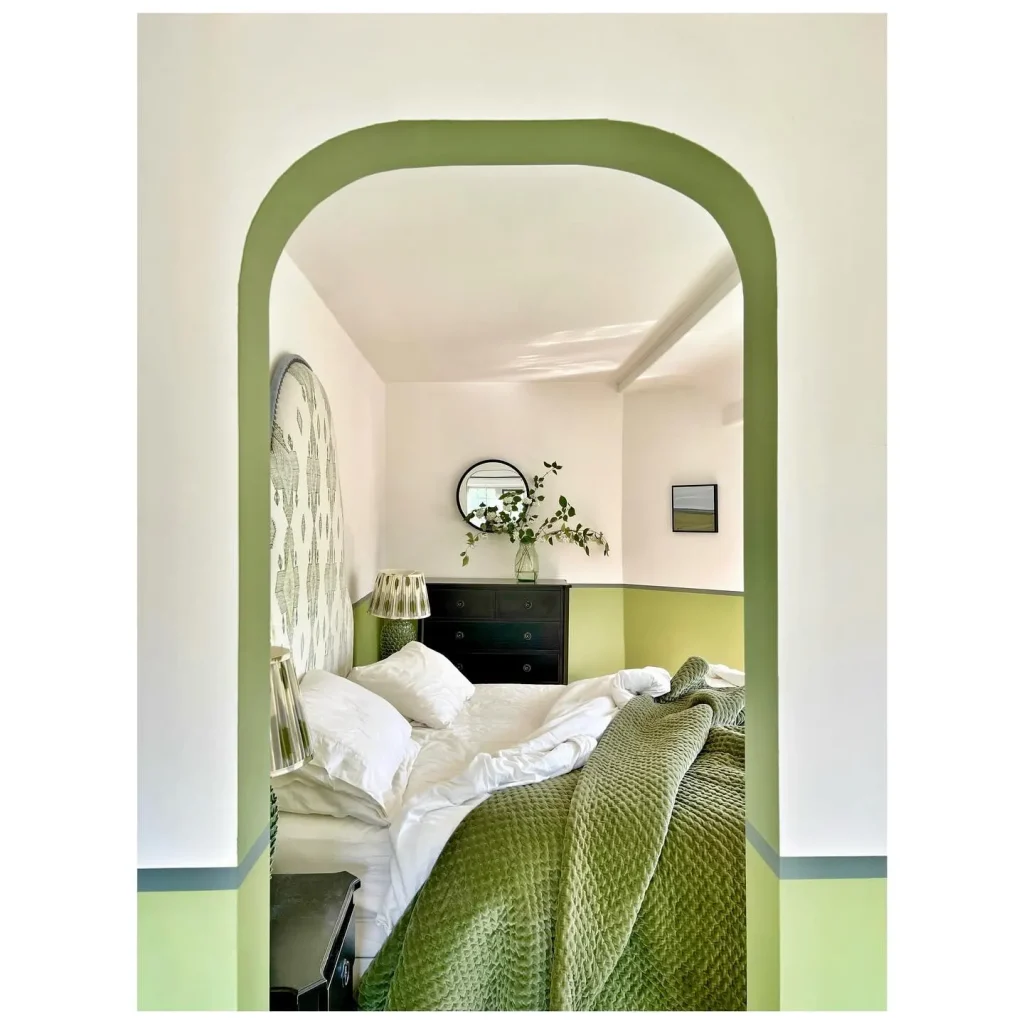
Credits: @helen.brayshaw.studio
This guide covers 30 combinations of Two Tone Wall Paint ideas that actually work — organized by room, style, and effect — plus the exact step-by-step process I use to get crisp, professional-looking lines every single time. No expensive tools required. Just the right technique in the right order.
What Is a Two-Tone Wall, Exactly?
A two-tone wall is any wall painted in two distinct colors, separated by a visible line or transition point. That dividing line can be:
- Horizontal — the most common approach, splitting the wall across its width at a set height
- Vertical — splitting the wall from floor to ceiling in two sections
- Diagonal — a more dramatic effect, splitting the wall on an angle
- Geometric — using shapes like arches, rectangles, or panels as the dividing element
- Color block — bold, graphic division with strongly contrasting colors

The horizontal split is what most people picture, and it’s where I’d recommend starting. The lower third or lower half of the wall is painted in one color; the upper section in another. But there are 30 variations in this guide, and several of the most interesting ones aren’t horizontal at all.
Before You Pick Your Colors: Three Questions to Ask
I’ve learned these the hard way.
1. What do I want this room to feel like? Two-tone walls change the perceived dimensions of a room depending on how you use them. Dark lower wall + light upper wall = the room feels taller. Light lower wall + dark upper wall = the room feels more intimate and enclosed. Two colors of similar intensity = the room feels balanced and defined. Knowing the effect you want narrows your color choices significantly.
2. Where do I want the line to sit? This is the decision that most people spend the least time on and regret most. The most common split heights:
- One-third of the way up: Creates a low visual weight — sophisticated, grounded. Works well with taller colors on the bottom.
- Chair rail height (30–36 inches from the floor): The classic choice. Visually echoes traditional architectural molding even without actual molding present.
- Halfway up: Balanced, graphic, slightly bold. Better for bedrooms and bathrooms than living rooms.
- Two-thirds of the way up: Creates a dramatic ceiling effect — the upper color reads almost as part of the ceiling.
3. Do my two colors actually work together? There are three reliable approaches: same color family (two shades of the same hue), complementary colors (opposite on the color wheel), or neutral plus color (one neutral anchor, one color accent). I’ll give you specific combinations for all three approaches throughout this guide.
Part 1: Classic Combinations That Always Work
These are the pairings I’d recommend to anyone doing their first two-tone wall. They’re proven, they’re versatile, and they work in almost any room.
1. Sage Green Below + Warm Cream Above
This is the combination that appears most consistently in high-end bedroom and living room design in 2026, and it’s popular for good reason: it’s calming, organic, and endlessly easy to decorate around.
The sage grounds the room — it creates a sense of being anchored to the floor while adding the warmth that flat cream walls can’t achieve alone. The cream upper wall keeps the room bright and airy. Together they create an almost biophilic quality, like the room is connecting to something natural. See more sage green bedroom ideas for perfect view.
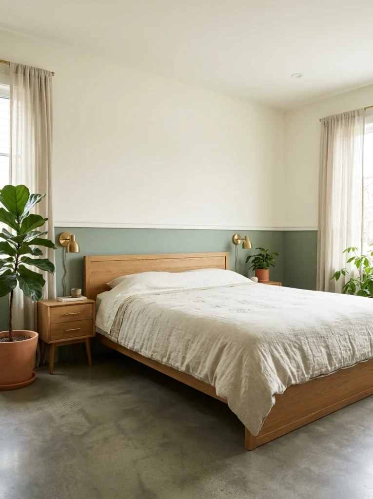
Split height: Chair rail height (30–36 inches) or one-third of the wall from the floor.
Pairs well with: Warm oak or walnut furniture, natural linen upholstery, warm brass hardware, indoor plants.
Best for: Bedrooms, living rooms, dining rooms.
Try: Sherwin-Williams Rosemary (SW 6187) below, Benjamin Moore White Dove (OC-17) above.
2. Charcoal Gray Below + White Above
The most graphic, architectural two-tone combination available. Charcoal below creates a visual base that makes the room feel deliberately designed — it adds weight and grounding. White above keeps everything fresh and prevents the room from feeling oppressive.
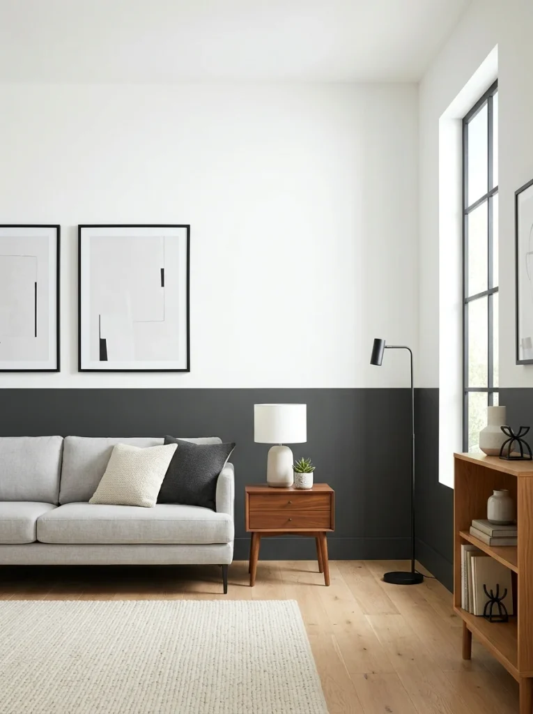
This is the combination that looks the most like professional architectural design, which is why it works so well in rooms without actual architectural detail (crown molding, wainscoting, panel moulding). The paint does the structural work that the room lacks.
Split height: One-third from the floor or chair rail height.
Pairs well with: White or light-colored furniture, warm wood accents, black metal fixtures, minimal art.
Best for: Living rooms, bedrooms, hallways, home offices.
Try: Sherwin-Williams Iron Ore (SW 7069) below, Benjamin Moore Chantilly Lace (OC-65) above.
3. Navy Below + Warm Cream Above
Navy and cream is one of the most reliably expensive-looking two-tone combinations — it appears in traditional manor houses, high-end hotel suites, and boutique restaurants because it has a timeless elegance that doesn’t read as trendy.
The navy creates a dramatic, grounding base. The warm cream above prevents the room from feeling too heavy and adds a classic contrast that feels almost tailored.
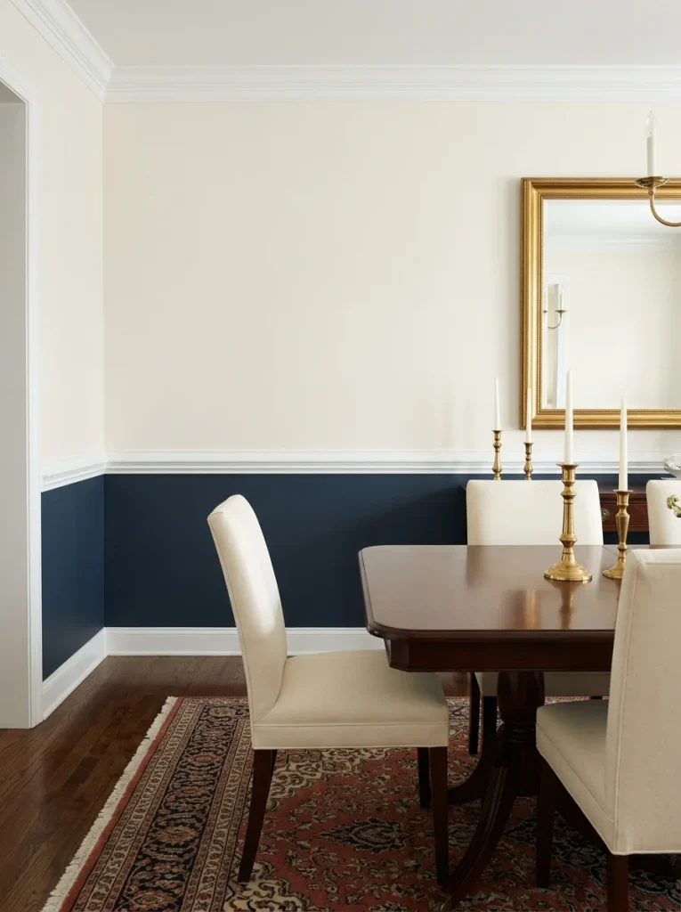
Split height: Chair rail height or halfway up the wall.
Pairs well with: Warm wood furniture, brass or gold fixtures, cream or ivory upholstery, vintage rugs.
Best for: Bedrooms, dining rooms, studies, living rooms.
Try: Benjamin Moore Hale Navy (HC-154) below, Benjamin Moore White Dove (OC-17) above.
4. Warm White Below + Soft Greige Above
This is the gentle inversion of the usual rule (dark below, light above). When done well, it creates a softly enveloping quality — almost like the walls are wrapping around the room — that works beautifully in bedrooms and reading nooks.

The white lower wall feels clean and grounded; the greige upper wall adds warmth without adding a visible color. It’s one of the most subtle two-tone approaches on this list, but one of the most effective for rooms where you want to feel genuinely cozy.
Split height: Halfway up or two-thirds of the way up.
Pairs well with: Warm, cream-toned furniture, natural textures, warm artificial lighting.
Best for: Bedrooms, nurseries, reading rooms.
Try: Benjamin Moore Chantilly Lace (OC-65) below, Sherwin-Williams Accessible Beige (SW 7036) above.
5. Terracotta Below + Off-White Above
The 2026 version of this combination borrows from Mediterranean and Southwestern design and makes it contemporary. Terracotta below creates a warm, earthy base that makes a room feel genuinely personal and inviting. Off-white above keeps the room bright and ensures the terracotta doesn’t overwhelm.
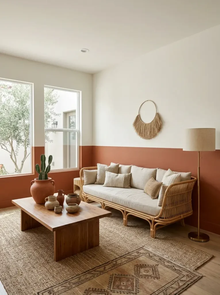
This works especially well in rooms with natural materials — rattan furniture, woven rugs, clay or ceramic accessories. The earthy quality of the terracotta ties everything together.
Split height: One-third from the floor.
Pairs well with: Natural fiber rugs, rattan or wicker furniture, warm brass, terra cotta pots, linen upholstery.
Best for: Living rooms, dining rooms, bedrooms.
Try: Behr Burnished Clay (MQ1-25) below, Sherwin-Williams Alabaster (SW 7008) above.
6. Deep Olive Green Below + Warm White Above
This is the combination that makes a room look like a boutique hotel without the boutique hotel budget. Deep olive below is rich, complex, and sophisticated. Warm white above lifts the room and prevents it from feeling heavy.
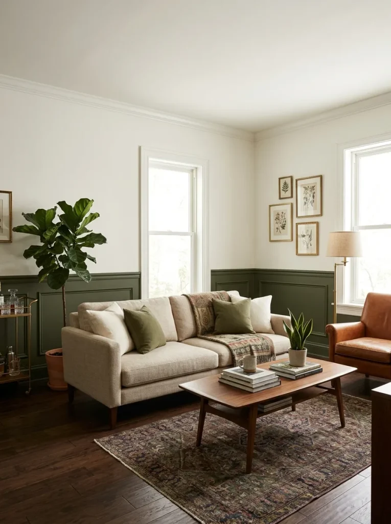
It works particularly well in rooms with vintage or mid-century furniture — the olive has an old-world quality that makes vintage pieces look like they belong there. The contrast with warm white trim ties everything together cleanly.
Split height: One-third from the floor or chair rail height.
Pairs well with: Warm wood furniture, vintage rugs, brass fixtures, cream or ivory upholstery.
Best for: Living rooms, dining rooms, bedrooms, home offices.
Try: Benjamin Moore Salamander (2050-10) below, Benjamin Moore White Dove (OC-17) above.
7. Dusty Blue Below + Soft White Above
Dusty blue — not bright blue, not navy, but the kind of muted, gray-toned blue that looks like it’s been softened by years of sunlight — creates a deeply calming lower wall. Soft white above keeps the room from reading as cool or clinical.

This combination is particularly effective in bathrooms and bedrooms, where the combination of cool blue and warm white creates a spa-like quality.
Split height: Chair rail height or halfway up.
Pairs well with: White fixtures and trim, warm wood accents, white or cream linens, simple brass hardware.
Best for: Bedrooms, bathrooms, nurseries.
Try: Sherwin-Williams Rarified Air (SW 6525) below, Benjamin Moore White Dove (OC-17) above.
8. Rich Burgundy Below + Warm Cream Above
Deep burgundy as a lower wall color is one of the most dramatic options on this list, and one of the most historically significant — burgundy lower walls appear in Victorian dining rooms and Georgian drawing rooms, giving the combination a sense of genuine heritage.

Used at chair rail height with warm cream above, it creates a deeply intimate, warm atmosphere that’s particularly effective in dining rooms and studies.
Split height: Chair rail height.
Pairs well with: Dark wood furniture, candlelight or warm bulb lighting, antique or vintage accessories, gold or antique bronze fixtures.
Best for: Dining rooms, studies, bedrooms.
Try: Benjamin Moore Raspberry Truffle (2083-20) below, Benjamin Moore Navajo White (OC-95) above.
Part 2: Room-by-Room Ideas
Two-tone walls work differently depending on the room. Here’s how I’d approach each space specifically.
Living Room Two-Tone Ideas
The living room is the room where two-tone walls have the most impact, because it’s the largest room and the one visitors see first. The key in a living room is to choose a split height that anchors the seating area — which is why chair rail height (approximately 30–36 inches) works so well.
Combination 9: Mushroom Taupe Below + Warm White Above The “quiet luxury” combination. Mushroom taupe below adds depth and sophistication without drama. Warm white above keeps the room feeling open and airy. This is the combination I’d choose for a living room I wanted to look expensive without looking designed.

Combination 10: Deep Teal Below + Cream Above For living rooms where you want genuine personality. Teal is rich enough to feel luxurious, complex enough to work with multiple furniture colors, and warm enough (when chosen with care) to not feel clinical. Cream above softens and grounds it.

Combination 11: Warm Greige Below + Crisp White Above The safest, most versatile living room combination. Warm greige provides just enough depth to stop the room feeling flat; crisp white above makes the room feel fresh and larger than it is. Works with any furniture color.
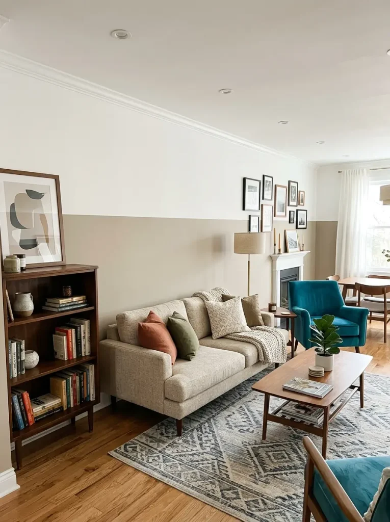
Combination 12: Dark Charcoal Below + Sage Green Above An unexpected inversion. Most people put the darker color below, but reversing it — dark charcoal on the lower third, sage green above — creates a moody, immersive quality that works beautifully in north-facing living rooms that need warmth.

Combination 13: Black Below + Warm Amber Above The boldest living room option on this list. Black lower wall at one-third height creates a dramatic, gallery-like base. Warm amber above fills the room with a golden, luminous quality. Best in rooms with good natural light and layered artificial lighting.

Bedroom Two-Tone Ideas
In a bedroom, the goal of a two-tone wall is usually one of three things: make the room feel more cozy, make it feel more sophisticated, or make the bed feel like a real focal point. Here are combinations for each.
Combination 14: Soft Blush Below + Ivory Above (For Coziness) Blush — the dusty, muted version, not the bright pink — at chair rail height with ivory above creates an intimate, enveloping quality in a bedroom. It works particularly well in rooms with warm artificial lighting, which brings out the warmth in both colors.

Combination 15: Espresso Brown Below + Warm White Above (For Sophistication) Deep espresso brown at one-third height with warm white above is one of the most sophisticated bedroom combinations available. It grounds the room and makes the warm white above feel almost luminous by comparison.

Combination 16: Deep Navy Behind the Headboard + Warm Cream on Three Sides (For Focal Point) Rather than a horizontal split, this technique treats the wall behind the bed as an accent wall painted in deep navy, with the other three walls in warm cream. It makes the bed feel like the intentional center of the room — an effect that usually costs hundreds of dollars in headboard upgrades — for the cost of a quart of paint. You’ll love to see bedroom accent wall ideas for perfect selection of color.

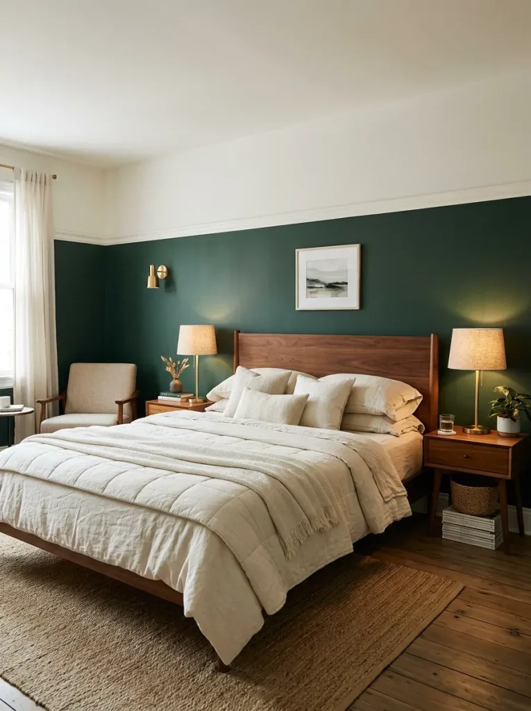
Combination 17: Hunter Green Below + Off-White Above (For Personality) Hunter green at chair rail height with off-white above is the bedroom version of the boutique hotel look. Add warm brass bedside lamps, cream or ivory bedding, and warm wood furniture, and you’ll have a room that photographs like a magazine spread.
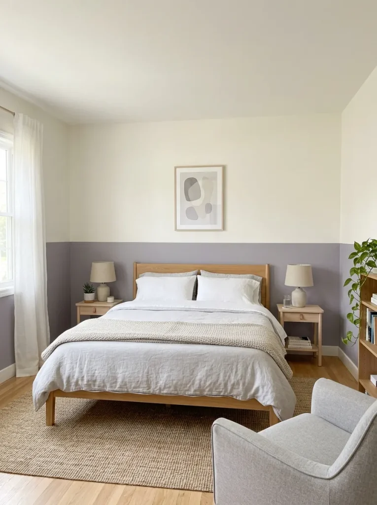
Combination 18: Soft Lavender Below + Warm White Above (For Calm) Muted lavender — with enough gray in it to prevent it from reading as purple — creates a deeply relaxing lower wall. Warm white above prevents the room from feeling too cool. This combination promotes rest in a way that few others do.
Bathroom Two-Tone Ideas
Bathrooms are one of the best rooms for two-tone walls because the smaller scale makes bold choices feel more manageable — and because the division between lower and upper wall in a bathroom often coincides naturally with the top of the tiles.
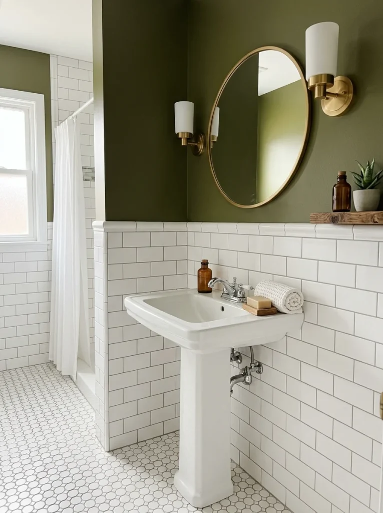
Combination 19: Tile + Deep Olive Green Above the Tile Line If you have white or cream subway tiles, the tile itself becomes your lower “color,” and painting the wall above the tile line in deep olive green creates a rich, spa-like atmosphere. The tile-to-paint transition is your dividing line, which means no masking tape math required.
Combination 20: Black Below + Warm White Above Black lower walls at chair rail height with warm white above is one of the most striking bathroom combinations available. In a bathroom with chrome or brushed nickel fixtures, it creates a modern, high-contrast look. With brass or bronze fixtures, it reads as vintage-inspired and warm.
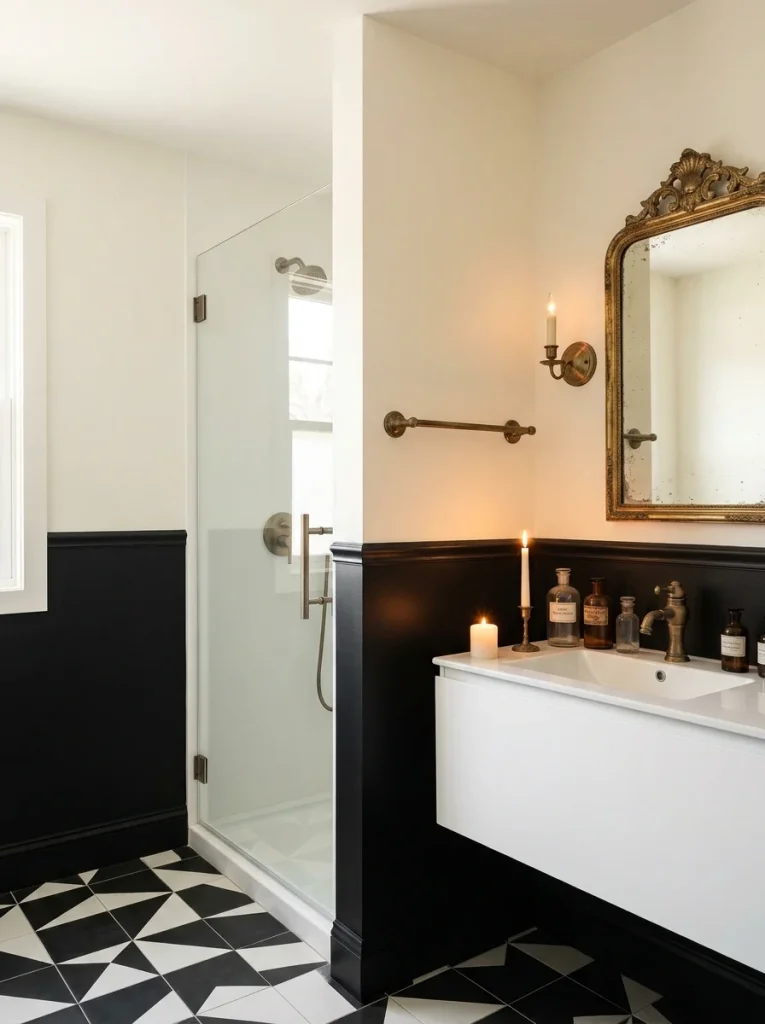
Combination 21: Sage Green Below + Soft White Above The gentlest bathroom combination on this list. Sage below creates a natural, botanical quality; soft white above keeps the room feeling clean and light. Works beautifully with white tiles, warm wood accessories, and brass fixtures.

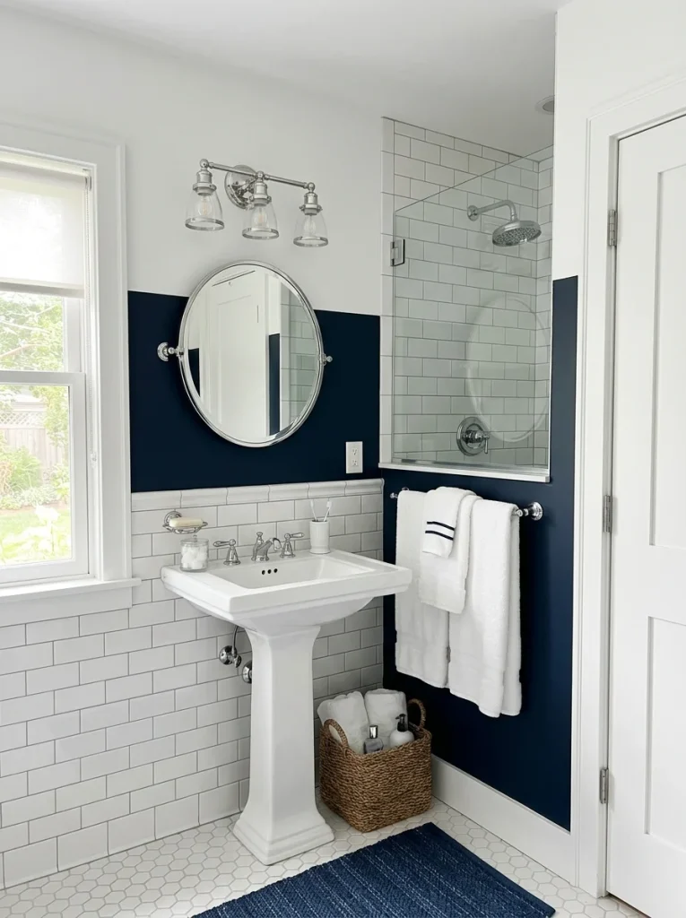
Combination 22: Dark Navy Below + Crisp White Above A classic bathroom combination that reads as coastal without the cliché. Navy at roughly tile height, crisp white above. Add white tiles, chrome or brushed nickel fixtures, and white fluffy towels.
Kitchen Two-Tone Ideas
In a kitchen, two-tone walls most commonly appear as two colors on the cabinetry (upper and lower), or as a wall color above the backsplash tile. Both approaches work extremely well.
Combination 23: White Upper Cabinets + Sage Green Lower Cabinets The most popular kitchen two-tone combination of 2025–2026. White upper cabinets with sage green lower cabinets is the updated version of the all-white kitchen — it adds personality and warmth without sacrificing the light, airy quality that makes kitchens feel functional.

Combination 24: Deep Blue Lower Cabinets + White Upper Cabinets A bolder version of the same approach. Deep blue (navy, deep teal, or slate) lower cabinets with white upper cabinets and a white or light-colored backsplash creates a rich, layered kitchen that reads as genuinely custom.

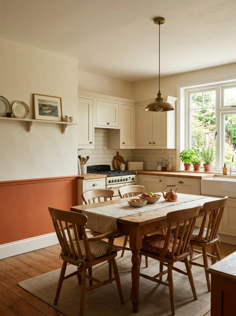
Combination 25: Warm Cream Walls + Terracotta Below the Chair Rail For kitchens with a dining area or visible wall space, a warm cream upper wall with terracotta below a chair rail creates a warm, inviting quality that makes the kitchen feel like a gathering place.
Part 3: Unexpected and Advanced Two-Tone Techniques
These are the ideas that go beyond the standard horizontal split. They’re still achievable as DIY projects, but they require a bit more planning.
Combination 26: Vertical Split
Rather than horizontal, divide the wall vertically — left half one color, right half another. This works particularly well in rooms where you want to define two functional zones: one color for the reading area, another for the desk area, for example.
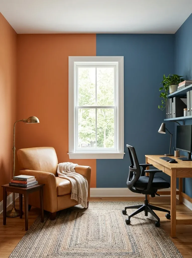
For a vertical split, the division typically falls at a natural architectural point — a window, a door frame, or a corner — rather than in the middle of a blank wall.
Pairs well with: Furniture arranged to correspond with the color zones. The furniture in each “zone” should relate to its wall color.
Combination 27: Diagonal Split
A diagonal line from the lower corner to the upper opposite corner divides the wall into two triangular sections. This is the most dramatic two-tone approach, and it works best when the two colors are from the same family — two shades of blue, two shades of green — rather than strongly contrasting colors.
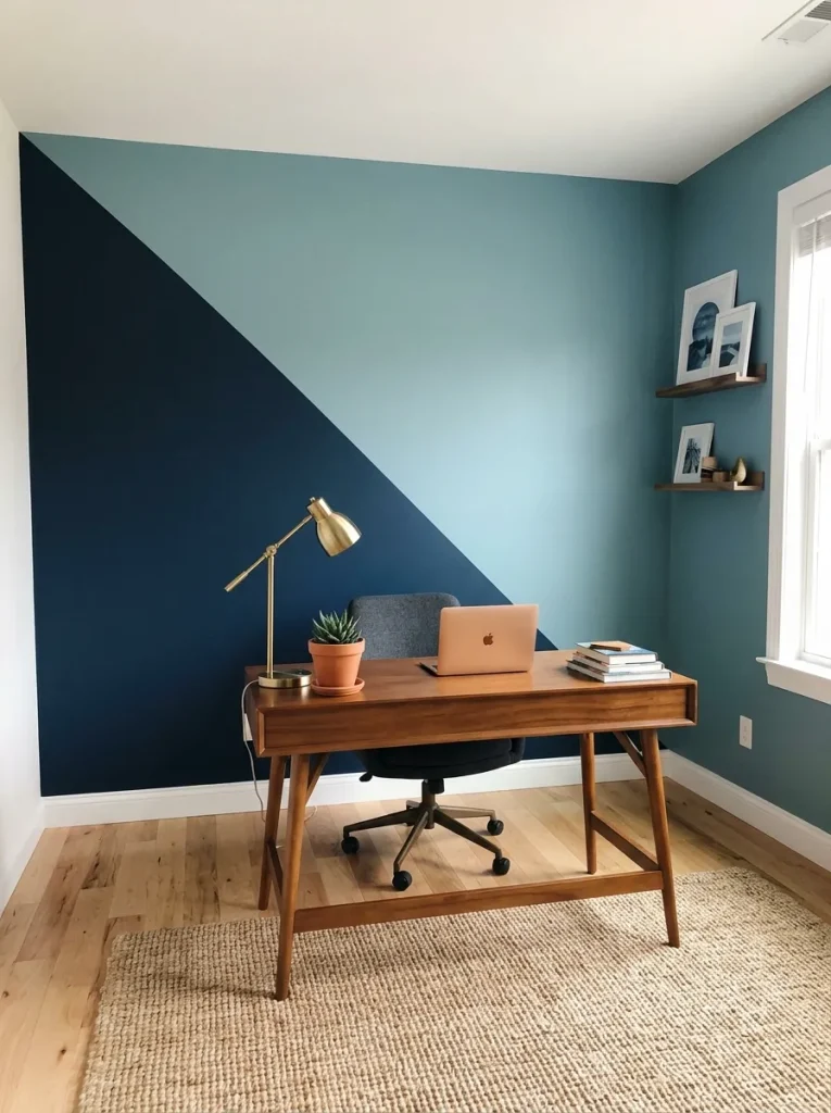
I’ve done this exactly once, in a small study, and it looked extraordinary. The room felt larger and more dynamic than its dimensions should have allowed.
Combination 28: Arched Color Block
Rather than a straight line, the dividing element is a painted arch — a half-circle or full arch shape in the feature color against the main wall color. This reads as more artistic than architectural, and it works best in rooms where the overall aesthetic is maximalist or eclectic.
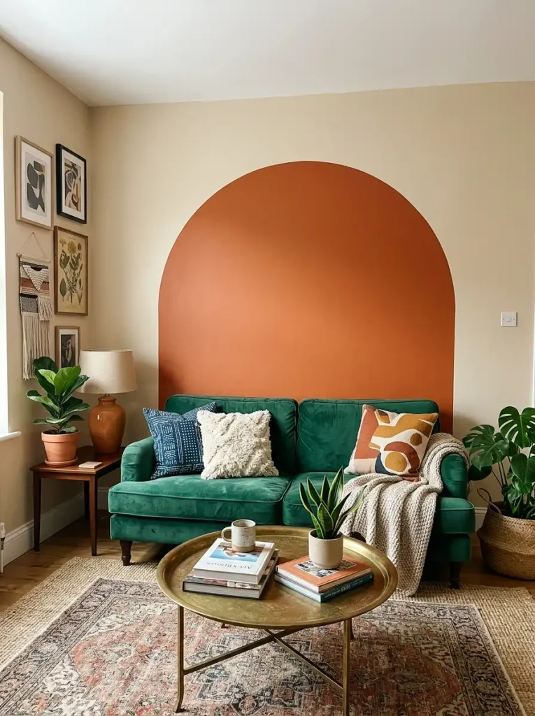
The arch technique is particularly effective behind a bed (where it frames the headboard) or behind a sofa (where it creates a natural focal point).
Combination 29: Shadow Box / Panel Effect
Instead of dividing the whole wall, paint a series of rectangular frames in a darker color against a lighter wall, at even intervals. The effect mimics panel molding at a fraction of the cost and works in both traditional and contemporary rooms.
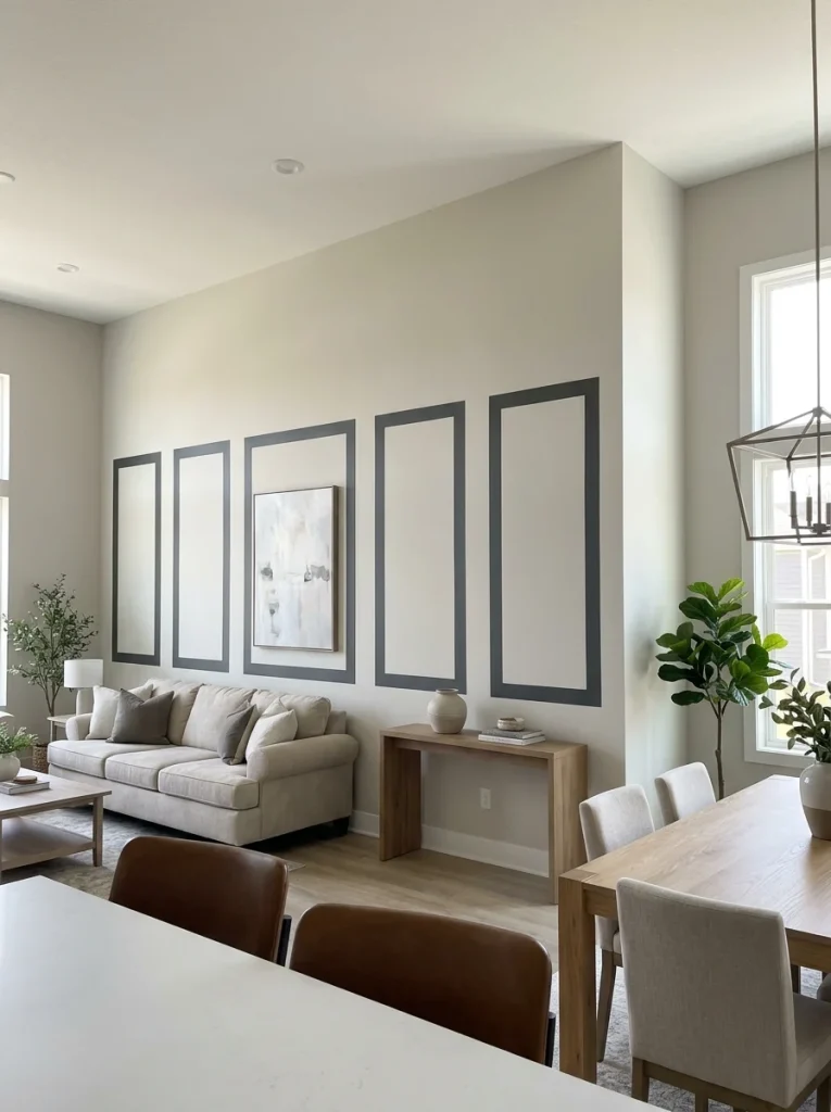
This technique is particularly popular in 2026 for living rooms and dining rooms in newer construction homes, where the flat walls benefit from the visual structure that panel painting provides.
Combination 30: Tone-on-Tone (Same Color, Different Finish)
The subtlest two-tone approach, and possibly the most sophisticated: paint the upper and lower sections in the same color, but in different finishes. Matte above, eggshell below. Or eggshell above, satin below.
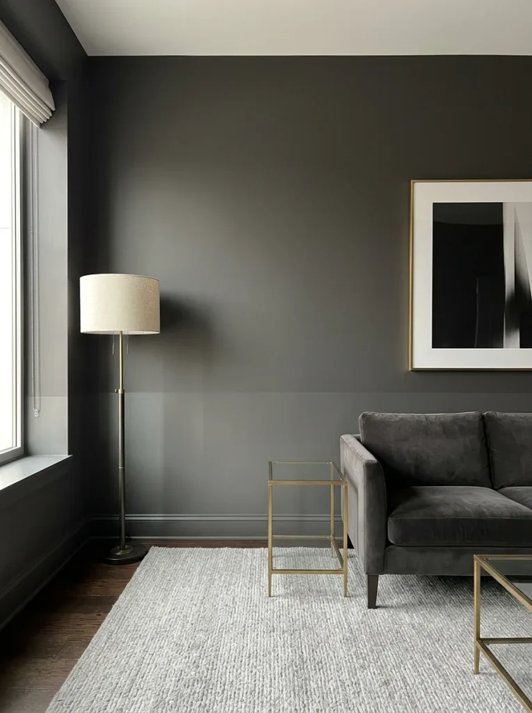
The difference is barely perceptible — the lower section catches light slightly differently — but it creates a depth and layering that reads as genuinely expensive. It’s the technique used most commonly in high-end hotel rooms, and it’s available to anyone willing to buy two cans of the same paint in two different finishes.
How to Paint a Two-Tone Wall: The Exact Process I Use
I’ve tried every method, made every mistake, and landed on this process. It consistently produces professional-looking results without professional tools.
What you need
- Paint for both colors (sample pot for testing first)
- FrogTape Delicate Surface painter’s tape (this is the one that matters — cheap tape causes bleed)
- Chalk line or string + chalk
- Measuring tape
- Pencil
- Level (a laser level is ideal; a standard bubble level works)
- Two rollers (one for each color)
- Small angled brush for cutting in
- Old credit card or hard plastic scraper
Step 1: Decide your split height and test it
Measure from the floor to your intended split height at three or four points across the wall and make light pencil marks. Step back. Look at it from where you normally sit in the room. The line that looks right from standing often looks wrong from a seated position. Test from the position you’ll actually occupy in the room.
Step 2: Create a perfectly straight chalk line
Take a length of string, coat it with chalk, and stretch it tightly between your pencil marks across the wall. Snap it against the wall. This leaves a perfectly straight chalk guideline that wipes off easily.
A laser level makes this step much easier — especially in older homes where the floor or ceiling isn’t perfectly level. A straight horizontal line that’s technically off-level looks wrong; a line that follows the visual level of the room looks right.
Step 3: Paint the lighter color first
Paint the lighter of your two colors on its section of the wall first, rolling slightly past your guideline. Paint the full section, allow it to dry completely — at least 24 hours for best results. Do not rush this step.
Step 4: Apply FrogTape precisely along the chalk line
Once the lighter color is completely dry, apply FrogTape along the chalk line with the tape sitting on the already-painted lighter color side. Press it firmly against the wall. Then run an old credit card along the full length of the tape to seal the edge completely — this is the step that prevents bleed-through and is the most commonly skipped.
Step 5: Seal the tape with the lighter color
Here is the technique that separates professional-looking results from amateur ones. Before painting your darker second color, brush a thin coat of your lighter color along the edge of the tape. This seals any tiny gaps between the tape and the wall. When it dries, any paint that would have bled through becomes the lighter color — invisible against the lighter wall. Then paint your darker color over it.
Step 6: Paint the second color up to the tape
Roll the darker color on its section of the wall, using your angled brush to cut in along the tape. Don’t press too hard along the tape — let the brush do the work without bending the bristles into the gap.
Step 7: Remove the tape while the paint is still wet
This is critical. Don’t wait for the paint to dry before removing the tape. Pull the tape off slowly at a 45-degree angle while the paint is still wet. A wet edge peels cleanly; a dried edge can pull paint off the wall with it.
Step 8: Touch up
Using a small angled brush, touch up any imperfections along the line. Dip the brush in the appropriate color and use short, light strokes that feather toward the line from both sides. Then step back and let it dry completely before evaluating.
Common Mistakes (I’ve Made All of These)
Choosing two colors that are too similar in value. If both colors have a similar light-reflective value (LRV), the two-tone effect disappears at normal viewing distance. You want visible contrast — at least 15–20 LRV points between the two colors.
Splitting the wall exactly in half. A 50-50 horizontal split usually looks unstable and arbitrary. One-third or two-thirds is almost always more visually satisfying.
Skipping the tape seal step. I cannot say this strongly enough: sealing the tape with the lighter color before painting the darker color is the difference between a crisp line and a line with bleed-through. Skip it and you’ll spend an hour touching up. Do it and the line is clean on the first try.
Using cheap painter’s tape. I’ve tried every tape. FrogTape Delicate Surface Painter’s Tape is the one. Others either don’t seal well enough or damage the underlying paint when removed. The extra $2 is always worth it.
Forgetting to account for the baseboard and ceiling. If your lower color is bold and your baseboard is white, decide in advance whether to include the baseboard in the lower color or keep it white. If the baseboard is white and the lower wall color is dark, you may want to paint the baseboard in the lower color — it stops the dark wall from looking cut off at the bottom.
Not testing the colors on the actual wall. A two-tone combination that looks good on a sample board can look completely different when the two colors are side-by-side on an actual wall under your room’s actual lighting. Always test both colors at the same time, on the actual wall, before committing to full gallons.
The Color Combinations I’d Choose for My Own Home
If I were doing two-tone walls in each room of my home right now, here’s exactly what I’d choose:
Living room: Deep olive green (Benjamin Moore Salamander) at one-third height, warm white (Benjamin Moore White Dove) above. Warm brass fixtures, vintage rug, cream linen sofa. The combination looks like it has always been there.
Bedroom: Sage green (Sherwin-Williams Rosemary) at chair rail height, warm ivory (Benjamin Moore Navajo White) above. Warm oak bed frame, cream linen bedding, brass bedside lamps.
Bathroom: Deep navy (Benjamin Moore Hale Navy) below the existing tile line (using the tile itself as the lower section), warm white above. Brass fixtures, white towels, small eucalyptus plant.
Home office: Charcoal (Sherwin-Williams Iron Ore) at one-third height, warm cream above. The dark lower section makes the room feel serious and focused; the cream above keeps it from feeling oppressive.
Frequently Asked Questions
What is the standard height for a two-tone wall horizontal split?
Chair rail height — 30 to 36 inches from the floor — is the most common standard. However, one-third of the total wall height is the most visually pleasing proportion in most rooms. For a standard 8-foot ceiling, that’s about 32 inches. For a 9-foot ceiling, about 36 inches. Always measure from the floor rather than from the ceiling, and always check how the line reads from your seated position in the room, not just standing.
Should the darker color go on top or bottom?
Almost always on the bottom. A darker lower section grounds the room visually — it creates a sense of visual stability, like the room has a solid base. A darker upper section creates a more intimate, enclosed feeling that works in some bedrooms but can feel oppressive in living rooms. The exception is combination 12 in this guide (dark upper, lighter lower) which works when done with intention.
Do I need a chair rail for a two-tone wall?
No. A painted line does the same visual work as a chair rail, and it’s actually what gives the two-tone look its contemporary freshness — the absence of actual molding makes it look intentional rather than traditional. If you want to add actual chair rail molding later, a painted two-tone wall makes the installation easier because the line is already there.
What is the best painter’s tape for two-tone walls?
FrogTape Delicate Surface Painter’s Tape is the one I use and recommend. It’s treated with technology that seals the edges more effectively than standard tape, and it peels cleanly off walls without taking the existing paint with it. Run a credit card along its full length after application to seal any gaps.
Can you do a two-tone wall in a small room?
Yes — and in some cases a two-tone wall makes a small room look larger. A dark lower section + light upper section draws the eye upward and makes the ceiling feel higher. Keeping the dividing line at one-third of the wall height rather than halfway up also helps small rooms feel more spacious.
A Final Note on Commitment
I know from experience that the thing stopping most people from trying a two-tone wall isn’t budget and it isn’t skill. It’s the fear of getting it wrong.
Here’s what I’ve learned: the only mistake that’s hard to fix is using the wrong tape and getting ragged lines. Everything else — the wrong color combination, the wrong split height, even the wrong technique — is fixable with another coat of paint and an afternoon.
The two-tone wall in my apartment that started as an accident because I ran out of paint? It became the most-complimented room I’ve ever had. People who visited thought I’d done something architectural and expensive.
It was one can of sage green and a Sunday afternoon.
Start with the combination that makes you feel something when you look at the chip. Then follow the steps above. The line will be cleaner than you expect, and the room will look better than you can currently picture.