
There is a wall in my house that stared at me for almost two years.
You know the one. That expanse above the sofa, or along the staircase, or across from the bedroom door that you keep meaning to do something with. You pull up Pinterest. You screenshot forty-seven things. You feel overwhelmed. You close the tab. The wall remains empty.
I finally figured out my photo wall about fourteen months ago and now I genuinely think it is the best thing in our entire house. Not because it is fancy — it is not. But because every time I walk past it, I feel something. I see my kids at ages they will never be again. I see a trip my husband and I took before the babies came. I see my grandmother’s handwriting in a framed letter she sent me years ago.
That is what a photo wall does when it is done right. It turns a blank surface into a piece of your actual life.

Here is everything I have learned about making them work.
Before You Hang a Single Frame, Figure Out These Two Things
Most photo wall projects stall before they start because people skip the planning entirely and go straight to buying frames. Then they end up with a collection of frames that do not quite go together, hung in a pattern that felt right in the store and looks wrong on the wall, featuring photos they printed in a rush at the drugstore.
Slow down. Two decisions made upfront save enormous amounts of time, money, and frustration later.
Decision One: Cohesion Strategy
How are you going to make this feel like one intentional display rather than a bunch of things hanging near each other? There are three reliable approaches:
Frame uniformity — every frame is the same finish. Black, white, gold, natural wood, or anything else — pick one and stick to it. The photos and art inside can vary wildly in subject, size, and style because the frames create the visual unity.

Content uniformity — all black and white photos, or all film photographs, or all family portraits, or all travel shots. The frames can vary because the content creates the cohesion.

Both — matching frames plus matching content. This creates the most formal, most polished gallery wall look. Think hotel lobby chic. Beautiful if that is your thing.
Most people do best with frame uniformity because it is the most flexible. You can mix art prints, photos, and text, and change things out over time without worrying about whether the new piece matches everything else. You’ll also love to see different wall paneling ideas for best accent view.
Decision Two: Layout Approach
Are you going for a grid or an organic arrangement?
A grid uses frames of the same or very similar sizes arranged in perfectly even rows and columns. It looks clean, architectural, and modern. It requires more precision during hanging and less creative experimentation.
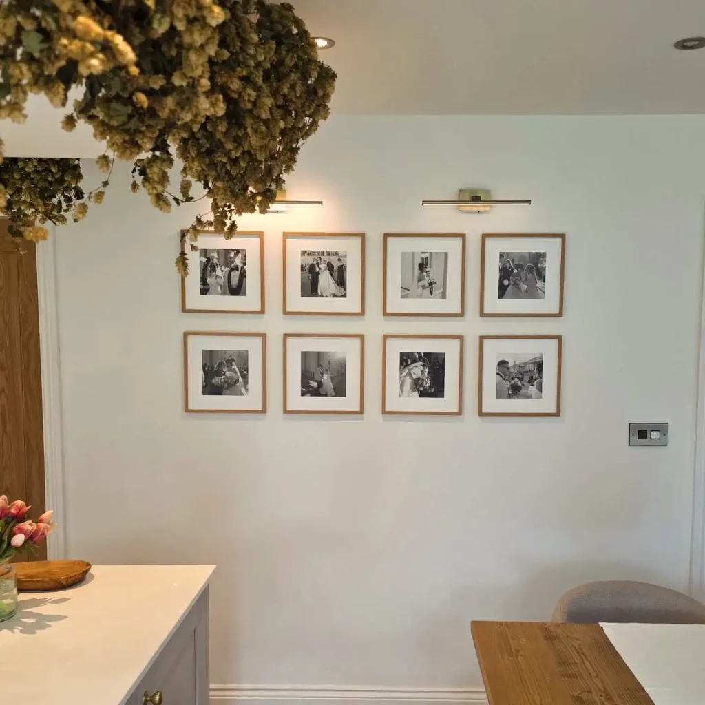
An organic arrangement uses mixed frame sizes arranged in a more freeform composition. It looks collected and personal. It requires more experimentation during planning but is actually more forgiving during hanging because slight imprecision is part of the aesthetic.

Neither is better. Both can be stunning. Just know which one you are attempting before you start putting holes in the wall.
The Gallery Wall: The One That Works in Almost Any Room
If you asked me to recommend one photo wall approach to someone who had never done this before, I would recommend a classic gallery wall every time. It is the most versatile, most forgiving, and most genuinely beautiful option across every room, style, and budget.
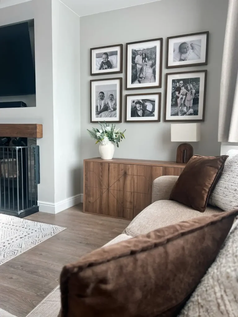
A gallery wall is simply a curated collection of frames in mixed sizes arranged in a cohesive composition on the wall. Done well, it looks like something you would see in an interior design magazine. Done badly, it looks like frames were hung somewhat near each other without much thought.
The difference is in the planning.
Here is the method I use and actually recommend:
Lay everything on the floor first. I mean everything — every frame you are planning to include, arranged roughly the way you think you want it on the wall. Step back. Look at it. Move things around. The floor is your testing ground and it costs nothing to rearrange.
A few things to watch for on the floor:
- Make sure you have variation in frame sizes. An arrangement of all medium frames feels flat. Having at least one large anchor piece makes everything else feel deliberate around it.
- Check the visual weight distribution. If all your large frames are clustered on one side, the arrangement will look imbalanced. Spread the weight roughly evenly.
- Look at the negative space — the gaps between frames — as actively as you look at the frames themselves. Even gaps feel planned. Very uneven gaps can look chaotic.

Once it looks right on the floor, trace each frame on kraft paper, cut out the shapes, tape them to the wall with painter’s tape, and live with the paper layout for a day or two before committing. This step feels unnecessary and is absolutely worth it.
The Grid: For the Person Who Likes Things Precise
There is something deeply satisfying about a perfectly executed photo grid. Nine matching frames in a three-by-three arrangement. Four matching frames in two rows of two. Twelve frames in three rows of four. The geometry is pleasing in a way that an organic arrangement simply is not.

The grid is the right choice if:
- Your space has strong architectural lines — low ceilings, a room with a lot of built-in geometry, a very modern interior
- You tend to feel anxious when things are not quite lined up and you know you will always notice if one frame is a centimeter off
- You want a look that feels more designed than personal
- You are filling a relatively narrow vertical space, like the wall beside a staircase
The key to a great grid is getting the spacing exactly consistent. The gap between every frame in every direction should be identical. Most people find that a gap between 5 and 8 centimeters looks best for most frame sizes — close enough to read as one cohesive piece, far enough apart that each frame has room to breathe.
Use a level. Every single frame. I know it feels obsessive. Do it anyway.
The Single Large Print: More Powerful Than People Think
I want to make a case for the dramatically undersized-in-terms-of-how-rarely-people-try-it option of a single very large photograph or print.
Not a gallery wall. Not a grid. Just one image, printed very large, hung intentionally.

A single large print above a sofa, above a dining table, or at the end of a hallway creates a completely different visual effect from any multi-frame arrangement. It is bold. It is confident. It makes a definitive statement that a gallery wall, for all its beauty, cannot quite replicate.
This works especially well with:
- Black and white photography — a large black and white print in a simple frame is genuinely timeless
- Family portraits from a professional session — a 50 by 70 centimeter or larger print of a beautiful family photo is an investment that most people never make and always wish they had
- A single piece of art that means something — your grandmother’s painting, a print from a favorite artist, something purchased at a market on a trip you will never forget
- Abstract or landscape photography where the scale genuinely adds to the image
The trap people fall into with large prints is buying frames that are too small. If you are going to commit to this approach, commit. A 40 by 50 centimeter print is not large. Start at 50 by 70 and seriously consider going bigger.
Photo Walls for Specific Rooms: What Works Where
The space you are decorating genuinely affects which photo wall approach works best. Here is what I have found.
Living Room
The wall above the sofa is the most classic gallery wall location in any home and for very good reason — it is what you see from across the room, it is at a comfortable viewing height, and the sofa grounds whatever hangs above it. Go wider than you think.
A gallery wall that is roughly the same width as the sofa looks intentional. One that is significantly narrower looks like it is floating apologetically above the furniture.

For living rooms I tend to recommend the organic gallery wall with mixed frame sizes. It creates warmth and personality in a space that is primarily about comfort and gathering.
Bedroom
The bedroom is where I love to see something more personal and more quiet. A small, tight grouping of particularly meaningful photographs above the bedside table. A grid of family portraits above the headboard. A single large black and white photograph on the wall opposite the bed — the first thing you see each morning.

The bedroom is not a place for a sprawling, maximalist gallery wall unless that genuinely matches your personality. It is a place for something that means something and does not ask too much of you when you are tired.
Hallway and Staircase
Hallways and staircases are genuinely great locations for photo walls and they are underused. The staircase wall in particular gives you a vertical canvas that grows naturally taller as the stairs ascend, which can be used in a deliberately ascending arrangement or simply used as a very long wall to spread a gallery across.
For staircase gallery walls, I recommend planning the arrangement on the floor as a horizontal spread and then tilting it mentally to follow the stair angle. Maintain a consistent distance from the stair treads as you work upward for the most polished result.
For hallways, a linear arrangement — a single row of frames hung at eye height along the hallway length — looks clean and architectural. A more organic arrangement works beautifully in a wider hallway where the display has room to breathe.

Home Office
The home office photo wall often gets overlooked because offices feel like they should be about function rather than feeling. I would push back on that strongly. A thoughtful photo wall in a home office — a mix of inspiration, meaningful moments, and art you genuinely love looking at — creates a workspace that actually nourishes creative thinking.

In a home office I particularly love inspiration-focused walls that mix photos with art prints, printed quotes, small objects clipped or stuck to the wall, and mood-board elements. Less formally arranged than a living room gallery wall, more like a curated evolution of ideas that reflects your actual interests and ways of thinking.
What to Actually Put in the Frames
This sounds obvious until you actually start selecting content and realize you have 4,000 photographs on your phone and exactly none of them printed.
Here is my honest advice: do not put only photographs in your frames.
Some of the best gallery walls mix photographs with art prints, typography, pages from a beautiful book, pressed botanicals, children’s drawings, fabric swatches, and meaningful paper ephemera. This variety creates texture and visual interest that a photograph-only wall rarely achieves, especially when the photographs are all printed on the same slightly glossy paper from the same online service.

Content ideas that work beautifully in a photo wall:
Family photographs — yes, obviously, but think about which ones. Not just the formal posed family portrait. The candid of your child laughing at something out of frame. The blurry photo from your wedding where everyone is genuinely having fun. The photo that captures a real moment rather than a perfect one.
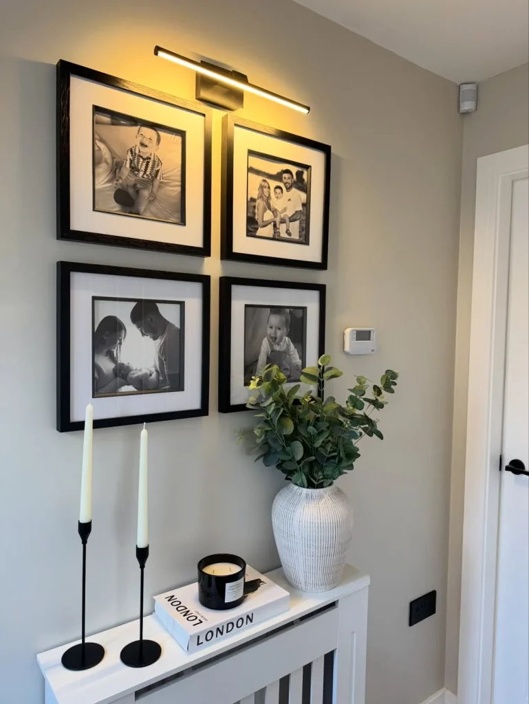
Travel photography — a great travel photograph does not need to be technically perfect. It needs to take you back somewhere. A photograph you took yourself is almost always more meaningful in your home than a purchased print of the same location.

Black and white conversions — consider printing some of your existing color photographs in black and white. Converting family photographs to black and white creates instant cohesion in a mixed gallery wall and lends a timeless quality that color photographs sometimes lack.

Art prints — downloaded from Etsy or from free art sites, printed at home or at a print shop, and framed in the same finish as your photographs. Botanical illustrations, abstract shapes, hand-lettered quotes that mean something to you specifically.

Children’s art — frame it properly. Not tucked into the side of a bulletin board, not hung with a magnet on the fridge. Genuinely framed and included in your gallery wall as the real art that it is. Your child will notice this and feel something about it that you may not expect.

Text pieces — a printed quote in a beautiful font, a handwritten letter, a meaningful page from a book, the invitation from your wedding.

The Printing Question: Where to Actually Get Good Prints
This is the most practical section of this article and possibly the most useful.
Phone photographs printed at a standard drugstore photo kiosk often look flat and slightly muddy compared to the same image printed by a quality photo lab. If you are going to spend time and money on frames and hanging, spend the small additional amount it takes to get good prints.
A few options I have personally used and like:
For everyday photographs that you want to look beautiful but are not necessarily heirloom quality, most online photo printing services offer good quality at very reasonable prices. Upload, choose your size, wait a week or so for delivery.
For photographs you genuinely love and want to look as good as possible — large prints, meaningful photographs, anything that is going to be featured prominently — look for a print lab that offers fine art printing on matte or lustre paper rather than glossy. The difference in quality is immediately obvious once you see them side by side.
For art prints you have purchased digitally, ask the seller about their recommended print specifications. Most digital art sellers include a note about paper type and sizing. Follow their guidance and the print will look the way the artist intended.
One thing I will say firmly: size up when you are uncertain. A photograph that seems the right size in the Amazon frame preview looks smaller in real life on a real wall. If you are deciding between an 20 by 25 centimeter and a 25 by 30 centimeter print, order the larger one. Almost without exception, people who size down wish they had sized up.
Hanging It: The Part That Stresses Everyone Out
Let me reduce the anxiety level here.
Yes, you should use a level. Yes, you should hang the heaviest frames into wall studs or appropriate anchors if the frames are genuinely heavy. Yes, you should use the kraft paper template method for complex arrangements.
But also: a photo wall is not surgery. If a frame ends up 2 centimeters higher than you planned, you can move it. The hole is small and easy to fill. No permanent damage is done.
The tools that actually make this easier:
A laser level — if you are doing a grid or any arrangement where precise horizontal alignment matters, a laser level projects a perfectly level red line across the wall that you hang to. Game-changing for precision arrangements.
A measuring tape and pencil — for marking center points and spacing. Have a small jar of water nearby to wipe pencil marks before they dry if you make an error.
Painter’s tape — for the paper template method. Apply to the back of your kraft paper cutouts, stick to the wall, verify the layout, adjust, and then hang directly.
Command Strips for lighter frames — for frames that do not have very heavy glass, Command strips eliminate the need for nails entirely. They hold well and remove cleanly. For rental homes or plaster walls where you want to minimize holes, they are genuinely excellent.
For heavier frames, use proper picture hooks with the nail angled at 45 degrees into the wall. They hold significantly more weight than a straight nail and are specifically designed for this purpose.
The Mistakes Worth Warning You About
I have made most of these myself so this is not judgment — it is hard-won experience.
Hanging everything too high. The most common photo wall mistake, full stop. Gallery walls should be centered at approximately eye level — roughly 145 to 150 centimeters from the floor to the center of the arrangement. When arranged above furniture, the bottom frame should be roughly 15 to 25 centimeters above the furniture piece. Most people hang everything about 10 centimeters too high.
Starting from the edges and working in. Start from the center and work outward. This ensures the arrangement is visually centered on the wall rather than drifting to one side.
Using frames with no connection to each other. A bright pink frame, a heavy distressed dark wood frame, a modern minimal black frame, and a gilded ornate gold frame hanging together do not look eclectic — they look like they arrived separately and never introduced themselves. Commit to a frame family.
Forgetting about the space between frames. The negative space in a gallery wall is as compositionally important as the frames themselves. Tight spacing creates intimacy and a full, lush feeling. Wider spacing creates a more editorial, airy feeling. Inconsistent spacing creates visual anxiety. Pick a spacing and apply it consistently.
Printing everything at the same size. Especially problematic in organic gallery wall arrangements. Variety in scale — a large anchor piece, medium transitional pieces, small detail pieces — is what creates the visual rhythm that makes a gallery wall feel designed rather than assembled.
A Few Photo Wall Ideas You Might Not Have Considered
Beyond the classic gallery wall and the grid, there are a handful of approaches that I think are genuinely underexplored.
The Shelfie Wall — instead of hanging frames directly to the wall, install a few narrow floating shelves and lean frames against the wall surface. This allows rearranging without any additional holes, easy updating of content, and the ability to mix framed pieces with small three-dimensional objects — a small plant, a candle, a ceramic object — in the same display.
The Single Row — one long horizontal row of frames, all at exactly the same height, running across the wall at eye level. Especially beautiful in a hallway, above a bed’s headboard, or along a long dining room wall. Precise, architectural, and very satisfying when executed well.
The Oversized Mat Approach — taking a relatively small photograph and printing it in a standard size but matting it within an oversized frame so that most of what you see is the mat rather than the photograph. The white or cream mat draws attention to the image while creating a grand, gallery-style presentation. A 15 by 20 centimeter photograph matted within a 40 by 50 centimeter frame looks completely different — and considerably more impressive — than the same photograph in a 20 by 25 centimeter frame.
The Kids’ Art Gallery — an entire wall dedicated to your children’s artwork, rotated regularly, framed seriously. Not a magnetic board, not a string and clip system, but actual frames hung on the actual wall. The art changes as new work comes home from school. The conversation it starts with children about their own creative work is genuinely wonderful.
The Black and White Only Wall — committing to entirely black and white photography for one wall creates a cohesion and a timeless quality that is very difficult to achieve with color photography. Even mediocre color photographs often become quietly beautiful when converted to black and white. This is particularly effective in bedrooms and home offices.
The Last Thing I Want to Say About Photo Walls
The best photo wall in your home is not the one that looks most like a magazine page. It is the one you actually stop and look at. The one that makes a guest ask you about a photograph. The one that your child points to when they bring a friend home. The one you will look at in twenty years and feel something about.
Include the real things. The imperfect photograph taken at exactly the right moment. The children’s drawing that only you know the full story behind. The letter from someone you lost. The ticket stub from the concert where you first kissed someone important.
Give the wall permission to be genuinely yours.
It will be more beautiful for it.
If you are looking for more ways to bring personality and warmth into your home, our guides on coffee table decor ideas and vintage cottage decor cover some of our favorite approaches for spaces that feel genuinely lived-in and loved.