
There is a color that has been appearing on my saved folders, my screenshot collection, and my mental list of things I want to do to my own house for going on three years now.
It is sage green. Specifically that particular version of sage green that is not quite grey, not quite green, not quite blue, not quite anything definable — just a color that sits at the exact intersection of all the most calming things in the world and makes every room it enters feel like somewhere worth being.
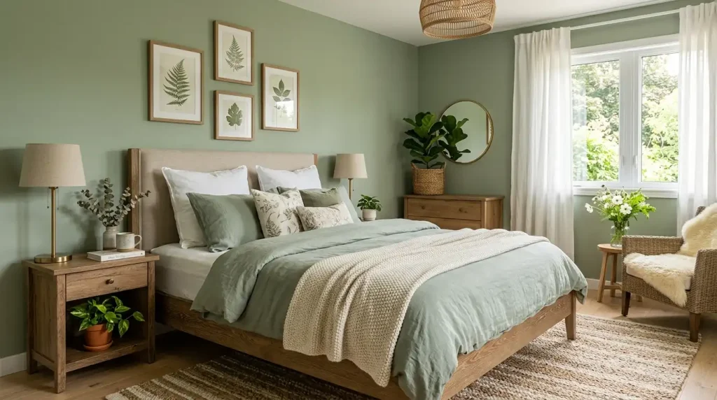
I finally painted my bedroom in it last spring.
My husband, who said nothing when I bought the paint, came home the evening I finished the walls and stood in the doorway for a moment and then said: “oh, that is really good.”
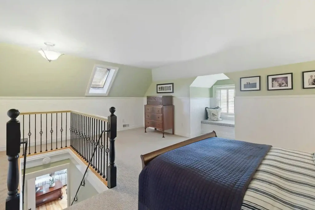
Coming from a man who has never voluntarily commented on a paint color in his life, I took that as high praise.
Here is everything I have learned about making sage green work in a bedroom — the versions of it that work, the ones that do not, the colors it loves and the ones it fights with, and the specific elements that make a sage green bedroom feel genuinely beautiful rather than just green.

What Sage Green Actually Is (And Is Not)
Let me start here because “sage green” is one of those color names that has drifted significantly from its original reference point.
Actual sage — the herb — is a specific muted grey-green with silvery undertones that comes from the fine white hairs on the leaf surface. The color is dusty. It is cool. It leans grey more than it leans green. It does not shout.

The “sage green” available in paint decks, wallpapers, and home products ranges from this accurate botanical reference all the way to colors that are better described as olive, or hunter green, or seafoam, or grey-green, or occasionally just green. The name has become elastic in the way that popular color names always become elastic when they hit a cultural moment.
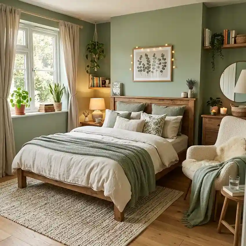
So when I say sage green bedroom and you picture one thing and your friend pictures another, we might both be right about what we have seen, and we might be talking about genuinely different colors.
For the purposes of this article, I am talking about the following: a muted, grey-toned green that sits in the cool-to-neutral temperature range, does not have significant blue or teal in it, and does not have significant yellow or lime in it. The colour of dried herbs, old garden walls in the South of France, the inside of an oyster shell.

The test I use: hold the paint sample next to a piece of grey cardboard and next to a piece of green cardboard. Sage green should read as both — as more green than the grey and more grey than the green. If it reads as unambiguously either colour, it is probably not sage.
Why This Color Works So Well in Bedrooms Specifically
Colour psychology is an imprecise science and I try not to lean on it too heavily because the evidence is genuinely more mixed than most design articles suggest.
But I will say this from personal experience and from having looked at a great many sage green bedrooms: there is something specific to this colour family that suits the bedroom context in ways that other colours do not quite manage.

Sage green is recessive. It does not advance toward you the way red or orange does. It does not claim the room. It creates the impression, instead, that the room has retreated slightly from you — that there is slightly more space, slightly more air, slightly more distance between you and the wall.
Sage green is natural without being literal. It references the outdoors — the garden, the landscape, the botanical world — without being aggressive about it. You are not staring at bright leaf-green that makes your bedroom feel like a greenhouse. You are in a room that has the quality of a space where plants have been growing nearby for a long time, which is calming in a way that is hard to fully articulate.

Sage green reads differently in different light, which matters in a bedroom. In morning light it tends toward grey — quiet, calm, slightly restrained.
In afternoon light it warms and becomes more overtly green. In lamplight in the evening it goes almost bronze in some formulations, which is deeply beautiful. A colour that changes with the light and keeps the room interesting across the full day is genuinely valuable in a room you use across the full day.
The Specific Sage Green Shades Worth Knowing
I have looked at more paint chips than is reasonable, and I want to give you specific starting points rather than the vague general direction of “muted green with grey undertones.”
On the lighter, more grey-toned end:
Farrow and Ball Mizzle (226) — this is a light, very grey sage that reads almost as a warm grey until you put something warm next to it, at which point the green reveals itself. It is subtle to the point where some people would not call it sage at all. In a north-facing room with limited light it can go flat and cold. In a room with good natural light it is genuinely beautiful.
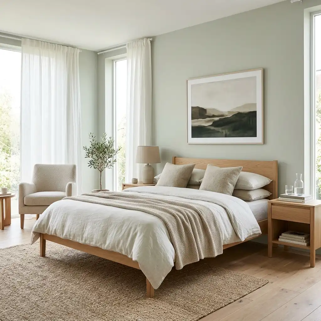
Benjamin Moore Aganthus Green (HC-120) — similar territory, slightly warmer, with a dusty quality that photographs beautifully. Does not change dramatically with the light, which some people prefer.
In the middle range:
Farrow and Ball Mizzle — did I mention Mizzle twice. Yes. Because there is a version of it that is specifically the shade I am describing, and it is actually Mizzle rather than any of the others I am about to mention.
Sherwin-Williams Acacia Haze (SW 9132) — more overtly sage, less grey, still firmly in the muted category. This one is what I think most people are picturing when they say “sage green bedroom.”

Benjamin Moore October Mist (1495) — the color of the year for Benjamin Moore in 2022, which tells you this trend is real and has sustained. A balanced sage that sits neither dramatically cool nor warm.
On the deeper, more saturated end:
Farrow and Ball Mizzle (yes, again, just a bit more of it on the wall with better light) — but honestly at this end of the spectrum you are looking at Farrow and Ball Pigeon (25), which is a more decided grey-green that is deeper and more definite than the lighter sages. Beautiful in a room with generous natural light or high ceilings.
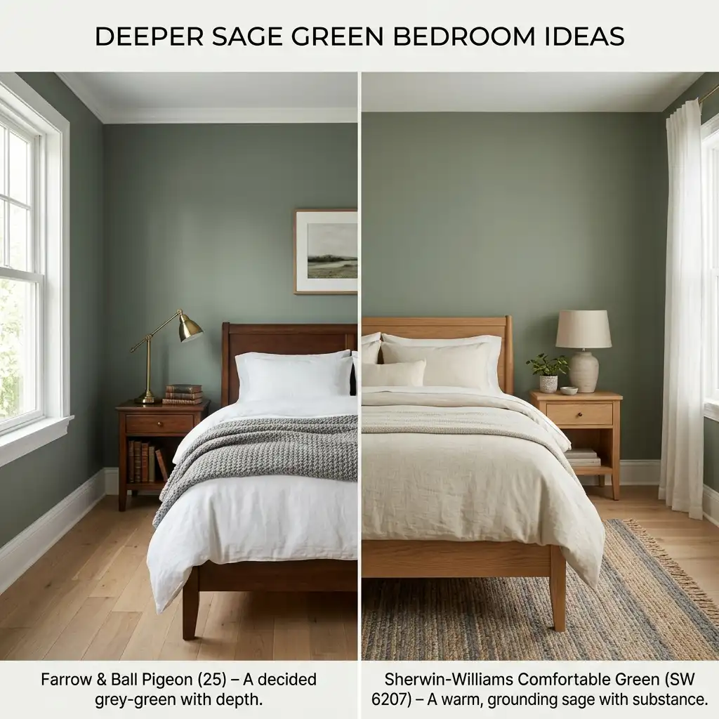
Sherwin-Williams Comfortable Green (SW 6207) — slightly deeper than Acacia Haze, slightly warmer, with enough substance to anchor a room without feeling heavy.
The one to avoid: Any sage green with a noticeable yellow undertone at this scale will trend toward olive or celery rather than sage. These are perfectly good colours but they are not sage green. In bright light they can feel quite yellow-green, which suits some people and jarrs against the grey-green palette most sage green bedrooms are built from.
What Sage Green Loves
This is the most practically useful section of this article because the colours, materials, and elements that work with sage green are genuinely specific and genuinely consistent.
White. Not cool white. Warm white. The difference is significant. Sage green against a cool, bright white — the kind that comes in most paint cans labeled simply “white” — often looks harsh. The grey undertones in sage green fight the blue-white undertones in standard white trim and the room reads as discordant in a way that is hard to name but immediately noticeable.

Warm white trim — creamy, slightly yellow-toned, old-fashioned white rather than clinical white — complements sage green beautifully. The warmth in the white meets the warmth in the sage and the two colours relax into each other. Benjamin Moore White Dove, Sherwin-Williams Alabaster, Farrow and Ball All White — these are the whites that work.
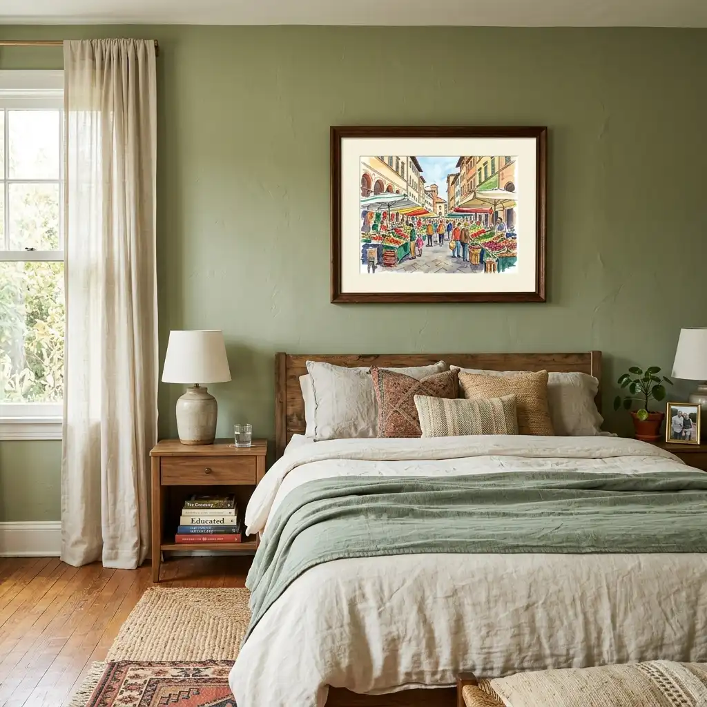
Natural wood. Light to medium tones. Pine, oak, ash, anything that carries warmth without being too red or too dark. Pale wood furniture in a sage green bedroom creates a Scandinavian-botanical effect that is immediately beautiful and consistently calming.

Dark walnut can work against sage green when the room has enough natural light to stop the combination going heavy. In rooms with limited light, very dark wood against sage green can make the room feel somber rather than restful.
Linen and undyed cotton. The specific quality of natural linen — slightly rough, slightly warm, with an irregular surface texture that catches light differently at different points — pairs with sage green the way a good wine pairs with good food. They belong to the same world. Both reference something natural and slightly imperfect and honest.
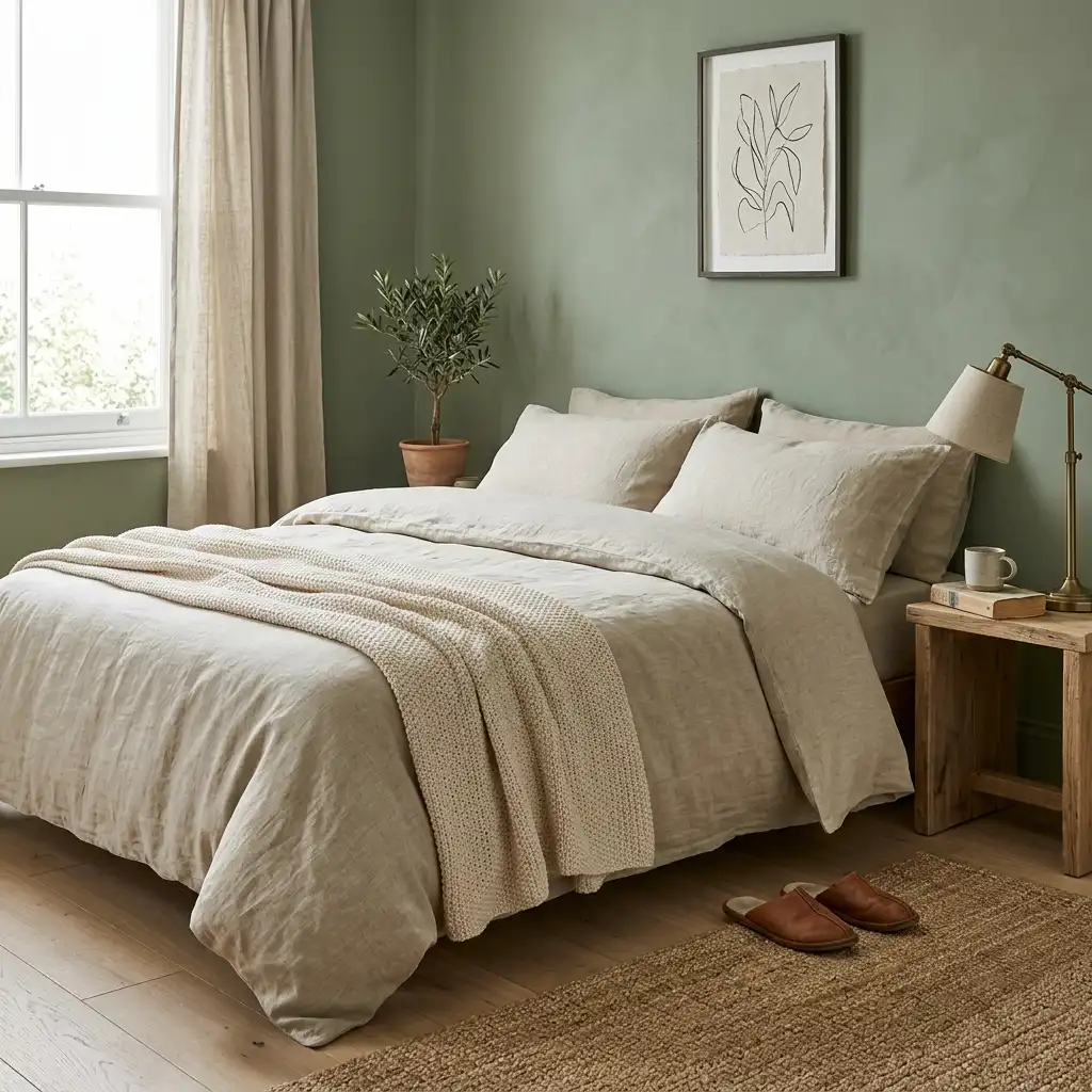
Crisp white bedding against sage green walls reads as hotel-clean, which is appealing in a specific way. Linen bedding in warm cream or natural undyed tones against sage green reads as deeply personal and comfortable in a different way. Both are genuinely good. The choice depends on whether you want the bedroom to feel pristine or inhabited.
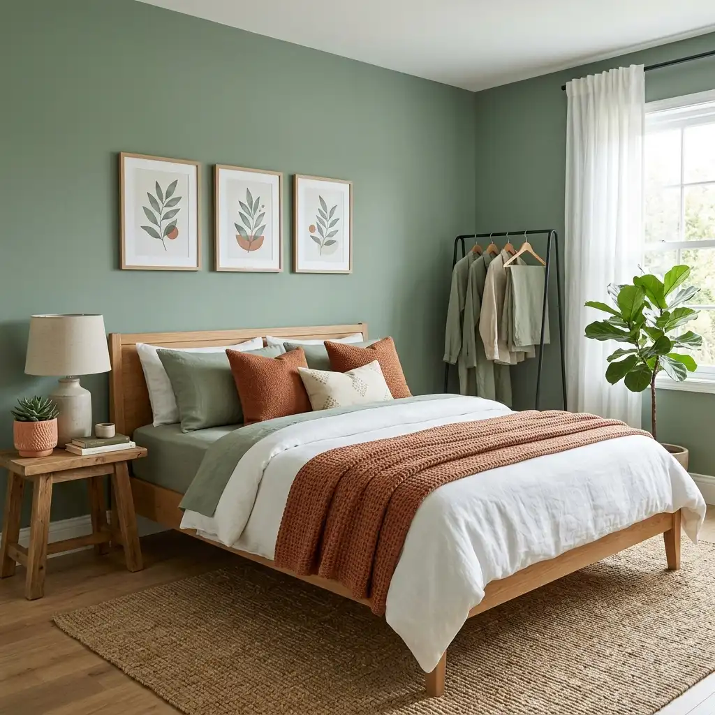
Terracotta and warm clay tones. This combination — sage green and terracotta — is perhaps the most satisfying colour pairing in contemporary interior design. Sage provides the cool, recessive backdrop. Terracotta provides the warm, earthy counterpoint. Together they reference the colour palette of Mediterranean landscapes, old painted plaster, autumn gardens, and a hundred other things that are beautiful.
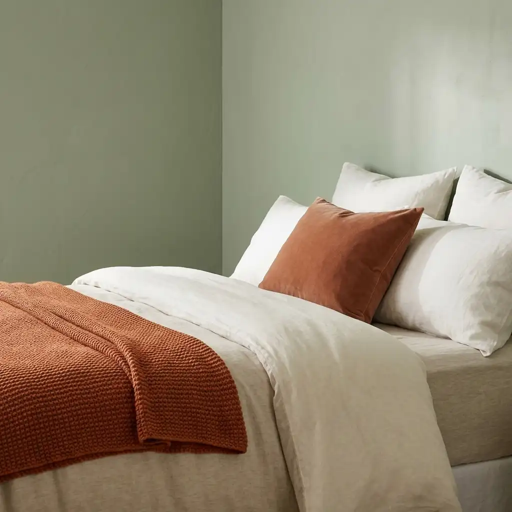
The terracotta does not need to be everywhere. A terracotta throw, a terracotta pot with a plant on the windowsill, a terracotta-toned cushion among the neutral bedding — small amounts work as well as large amounts and have the advantage of being adjustable.
Aged brass and warm metals. Cool silver metals — chrome, brushed nickel — fight with sage green slightly. Warm metals — aged brass, antique gold, brushed gold, warm copper — work with it as though they were always intended to be together.
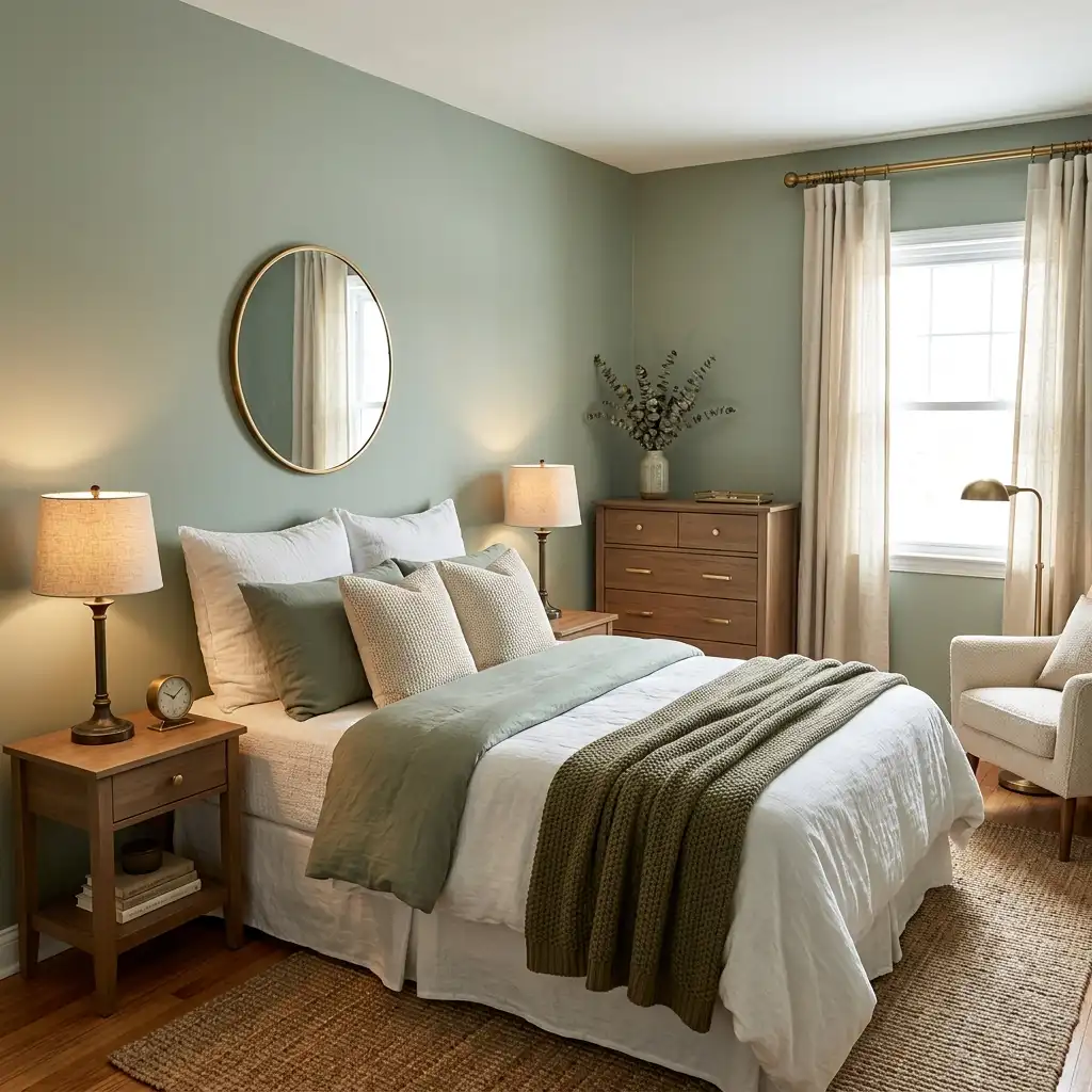
Bedside lamps in aged brass. Drawer pulls on the dresser in brushed gold. A small mirror with a warm brass frame. A curtain rod in antique gold. Each individual element is modest. Together they create a warmth in the room that sage green — a cool-leaning colour — genuinely benefits from.
Plants. This is where I will say the obvious thing: sage green walls and real plants are a combination that always works, probably because they are referencing the same world and reinforcing each other’s natural quality.
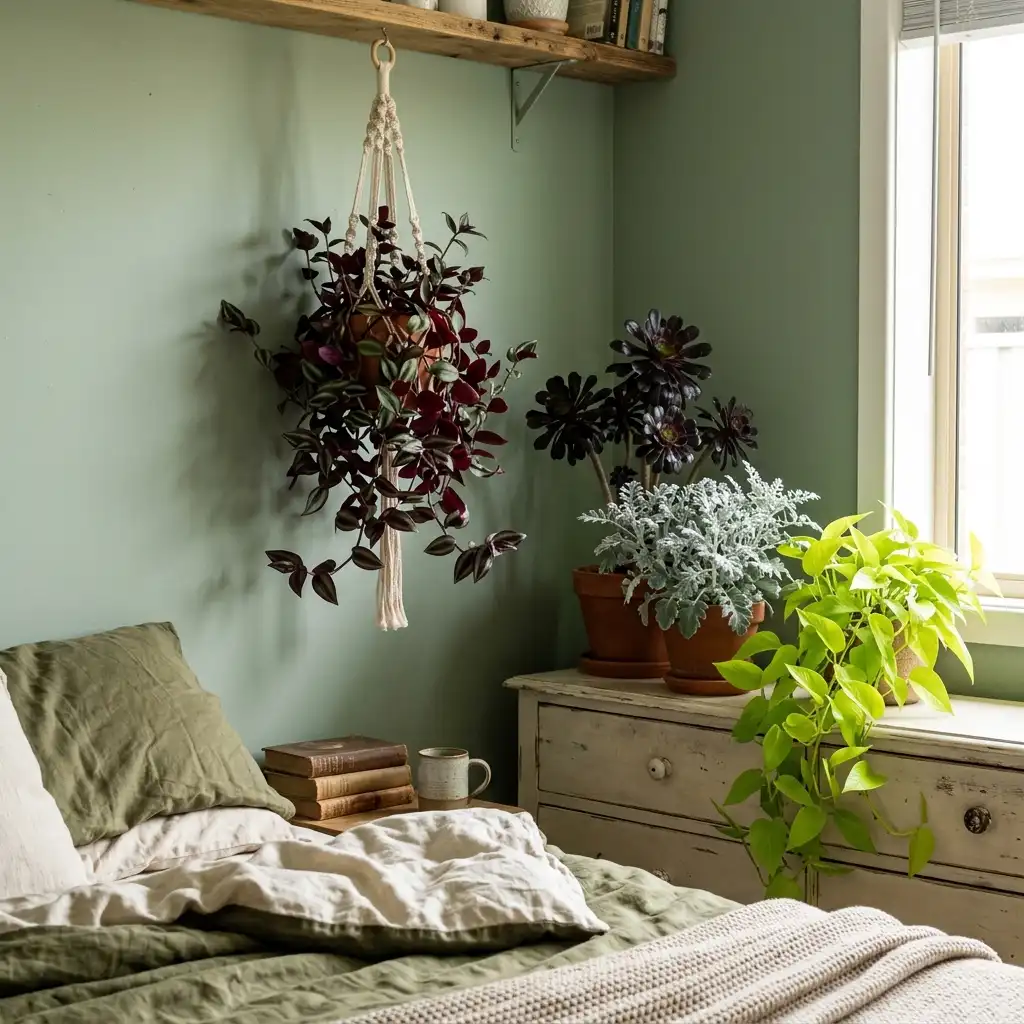
But the specific plants matter. Very dark-leafed plants — deep burgundy Tradescantia, black-leafed Aeonium — provide rich contrast. Very bright green plants emphasize the grey in sage green and can look beautiful or slightly competitive depending on the specific plant and the specific sage shade. Silver-leafed plants — dusty miller, certain ferns, some succulents — mirror the grey-green of the walls and create a harmonious, almost monochromatic botanical effect.
What Sage Green Does Not Love
Being honest about what a colour does not suit is as useful as being enthusiastic about what it does.
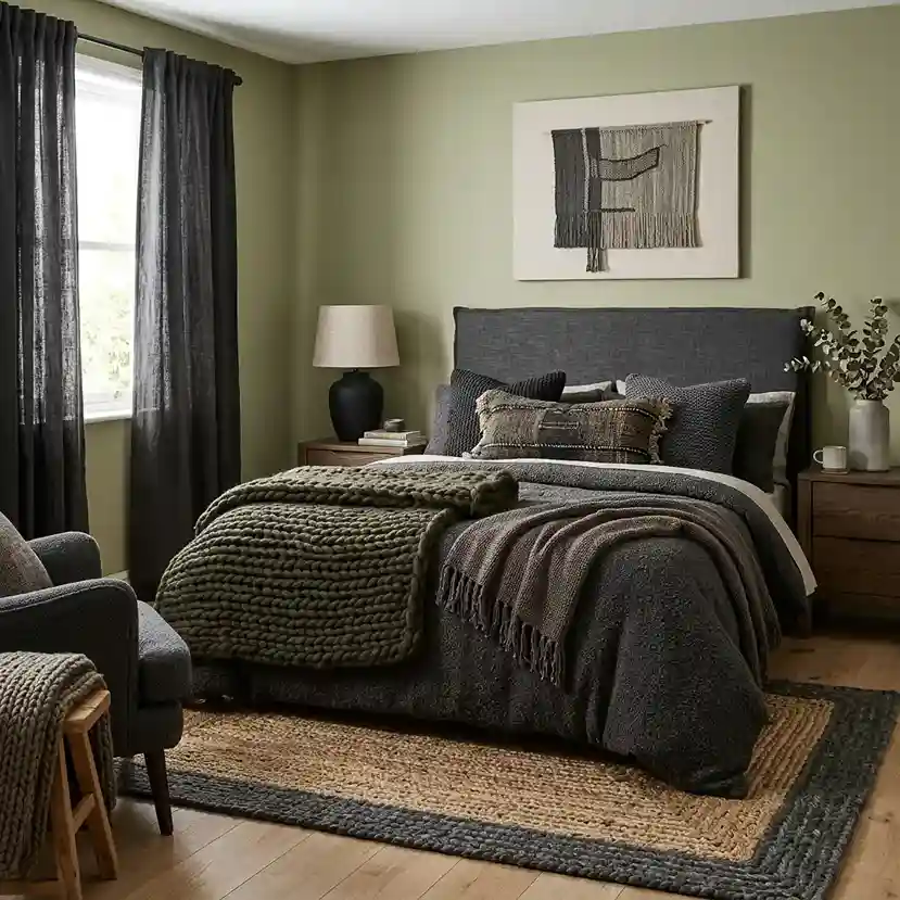
Very dark, heavily patterned soft furnishings. Sage green wants room to breathe. Dark heavy curtains, a very dark patterned rug, deep-colored upholstery — these can overwhelm a sage green room and make it feel heavier than it should. If you want drama in a sage green bedroom, achieve it through depth of the wall colour itself rather than adding dark elements on top of it.

Orange. Specifically orange. Terracotta is orange’s muted, earthy cousin and it works beautifully, as mentioned. Actual saturated orange — burnt orange, vivid orange — fights with sage green in the same way that colours that are equally saturated and warm tend to fight when there is no neutral mediating between them. A small amount might be fine. A lot is genuinely jarring.
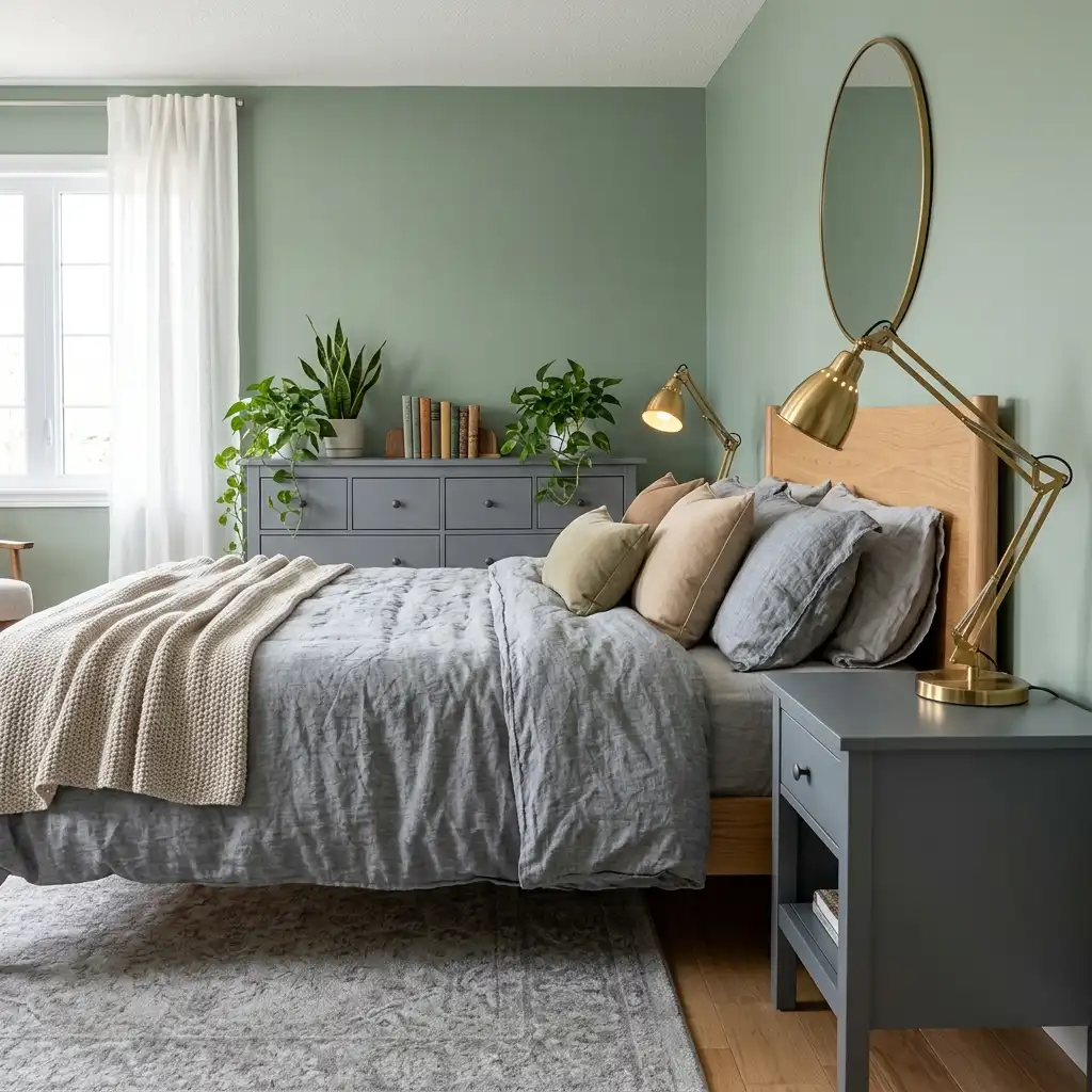
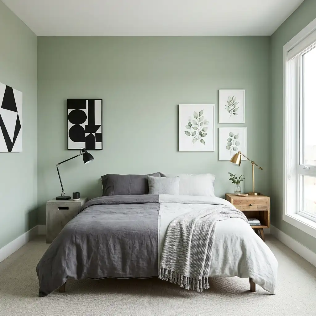
Cool grey bedding and cool grey furniture together. Sage green is already making a case for grey in the room. When the bedding is cool grey and the furniture is cool grey and the floor is grey, the room goes beyond calm into cold. One anchor of warmth — the linen bedding, the wood furniture, the brass lamp — prevents the room from tipping into the category of rooms that look beautiful in daylight photographs and feel slightly clinical to actually sleep in.
Purple and mauve. This combination appears occasionally and I consistently find it does not resolve — the two colours are not quite complementary and not quite analogous and they sit in a slightly uncomfortable relationship with each other. Blue-purple is slightly better than red-purple, but neither is a natural companion for sage.

Heavily textured, chunky-woven fabrics in dark neutrals. The very popular dark-charcoal chunky-knit throw does not land as naturally in a sage green bedroom as it does in a warm neutral bedroom. The combination is not wrong exactly but it does not sing the way the combination with linen and terracotta and warm wood does. If you love chunky knit, go for it in cream or warm oatmeal rather than dark charcoal.
The Sage Green Bedroom By Room Situation
The naturally dark bedroom. Sage green in a north-facing room or a room with limited windows needs careful handling. The colour that is calm and atmospheric in good light can go slightly gloomy in poor light. For darker rooms, go lighter within the sage family — the most grey, least saturated version of the colour — and compensate with warm artificial lighting. Multiple lamp sources with 2700K bulbs create the warmth that natural light is not providing.
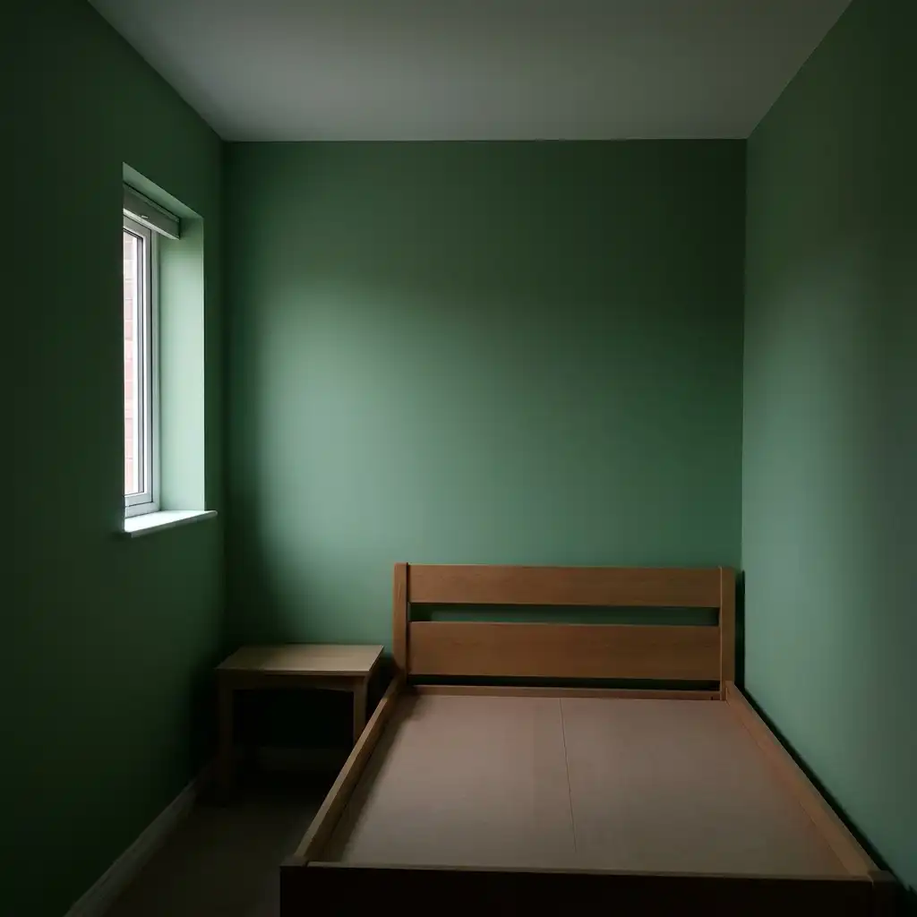
The small bedroom. Sage green is one of the better colours for small bedrooms because of its recessive quality. It does not make a small room feel enclosed the way darker colours can and does not make a small room feel like a surgical suite the way very bright colours can. Carry the sage green to the ceiling as well as the walls — this is the approach that makes a small room feel most cohesive and least compartmentalized.

The large bedroom. In a large bedroom with high ceilings and generous natural light, sage green can go deeper and more saturated. The version of sage that would overwhelm a small room with limited light becomes exactly right in a room that has enough light and space to accommodate it. Consider painting the ceiling in the same sage colour as the walls in a large room — the enveloping quality of a room where ceiling and walls are the same colour is particularly beautiful in green.

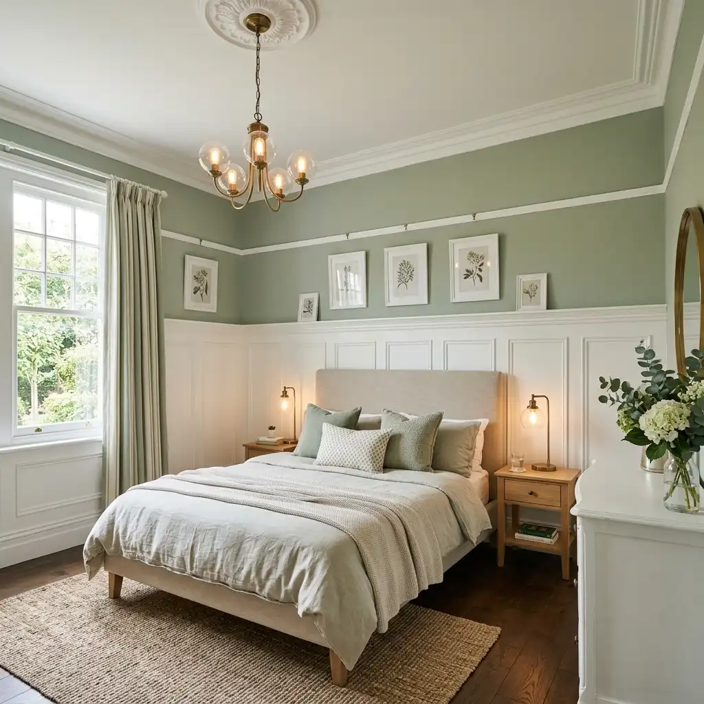
The bedroom with architectural features. Sage green and white-painted architectural features — crown molding, ceiling rose, picture rail, wainscoting — are an excellent combination. The white details read crisply against the sage ground and the sage makes the white architectural work look more intentional and more architectural. If you have good bones in a room, sage green shows them off.
The bedroom shared by two people with different preferences. This is where sage green earns particular praise because it is genuinely one of the most broadly acceptable colours in bedroom design. It does not read as strongly gendered in either direction. It does not feel aggressively maximalist or aggressively minimalist. It is calm, it is pleasant, and it is a colour that very few people actively dislike.
The Sage Green and White Bedroom
This is the most popular version and for good reason.
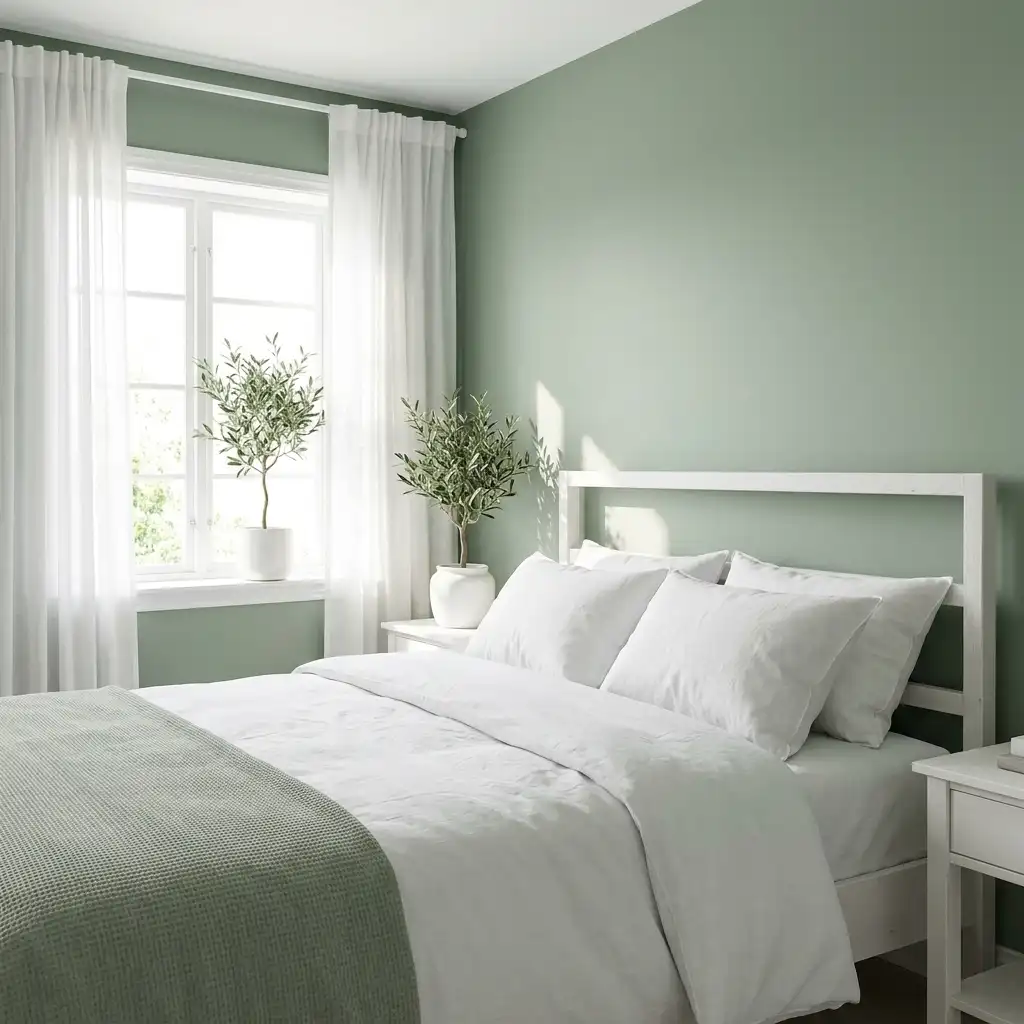
Sage green walls, white bedding, white or warm wood furniture, white trim. Natural light. A few plants. A jute or wool rug. The windows uncovered or with simple linen curtains.
The sage and white bedroom is fresh without being cold. It is clean without being clinical. It photographs beautifully because the contrast between the muted green and the crisp white creates visual interest without chaos.
To avoid the version of this that feels like a show home rather than a bedroom: add something personal. A stack of genuinely-read books on the bedside table. A plant that is actually alive and being cared for. A piece of art that means something to you rather than the most neutrally beautiful print available. A secondhand lamp rather than a new one.
The sage and white bedroom at its best looks like it belongs to someone with good taste who also actually lives there. The version that misses is the version where everything is too perfect and too matched and there is no evidence of habitation.
The Sage Green and Natural Wood Bedroom
This is the version I am personally most drawn to.
Sage green walls. Pale wood furniture — a light oak bed frame, a pine dresser, a simple wooden bedside table. Linen bedding in undyed cream or warm white. A jute rug on natural floorboards or on light wood flooring.
The wood tones carry warmth into a colour scheme that would otherwise be entirely cool. The sage walls make the wood look warmer than it is on its own. The linen bedding sits between the two, referencing both the organic quality of the wood and the muted palette of the walls.
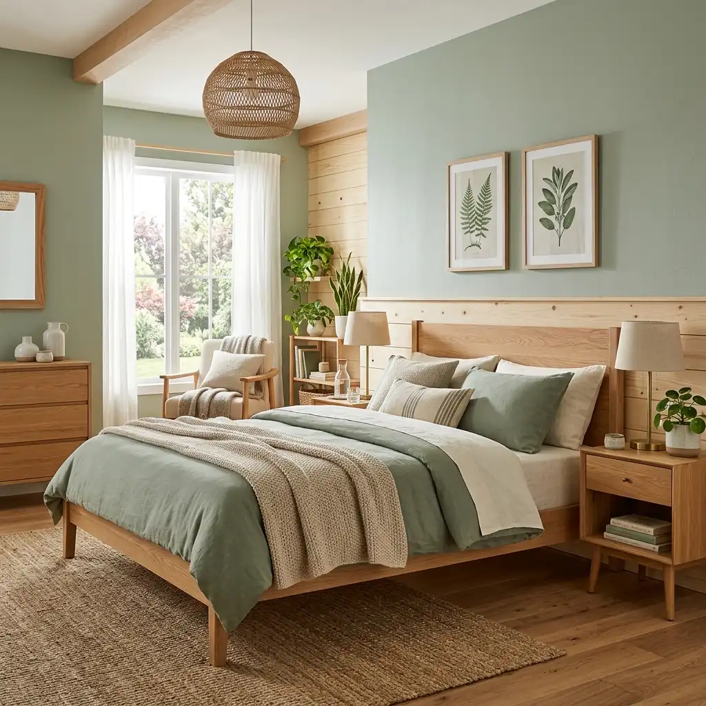
What to add:
A single aged brass lamp on the bedside table makes everything around it look better. The warmth of the metal against the cool sage and the warm wood creates a balance point that the room organises itself around.
A plant in a terracotta pot in the corner or on the windowsill. Not a large statement plant — something medium, something that is clearly alive and clearly being tended to.
Simple cotton or linen curtains that skim the floor. Not blocking the light — filtering it. The filtered light through natural-fibre curtains in the morning in a sage green room is genuinely one of the more pleasant ways to wake up.
The Sage Green and Terracotta Bedroom
More adventurous than the previous two versions and more rewarding for it.
Sage green walls. Terracotta accents — a terracotta throw on the bed, terracotta-toned cushions, a terracotta pot, maybe a terracotta-toned lampshade on an otherwise neutral lamp.
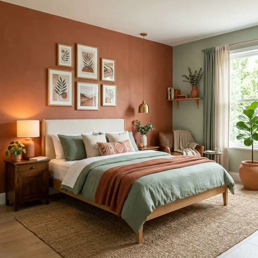
The combination is rooted. It feels ancient in the best possible way — as if these colours have been appearing together in human spaces since people first painted walls, which they more or less have. Mediterranean plaster. Moorish tiles. English Arts and Crafts interiors. The sage and terracotta palette is not a trend. It is an old truth about which colours belong together.
The amount of terracotta matters. Too little and the accent reads as accidental. Too much and the bedroom starts to feel like it is working very hard at an aesthetic rather than simply expressing it naturally. The sweet spot is typically one or two deliberate terracotta elements — the throw and one cushion, or a lamp and a pot — against a sage and linen ground.
The Darker Sage: When You Want the Bedroom to Envelop You
Everything above has assumed a mid-range or lighter sage. But there is a version of the sage green bedroom that goes deeper — a sage that is closer to a muted hunter green or a grey-green that approaches the darkness of slate.
This bedroom is for people who want to be enclosed rather than opened up. Who find that darker rooms help them sleep better. Who want the bedroom to feel like somewhere you disappear into rather than somewhere you inhabit lightly.
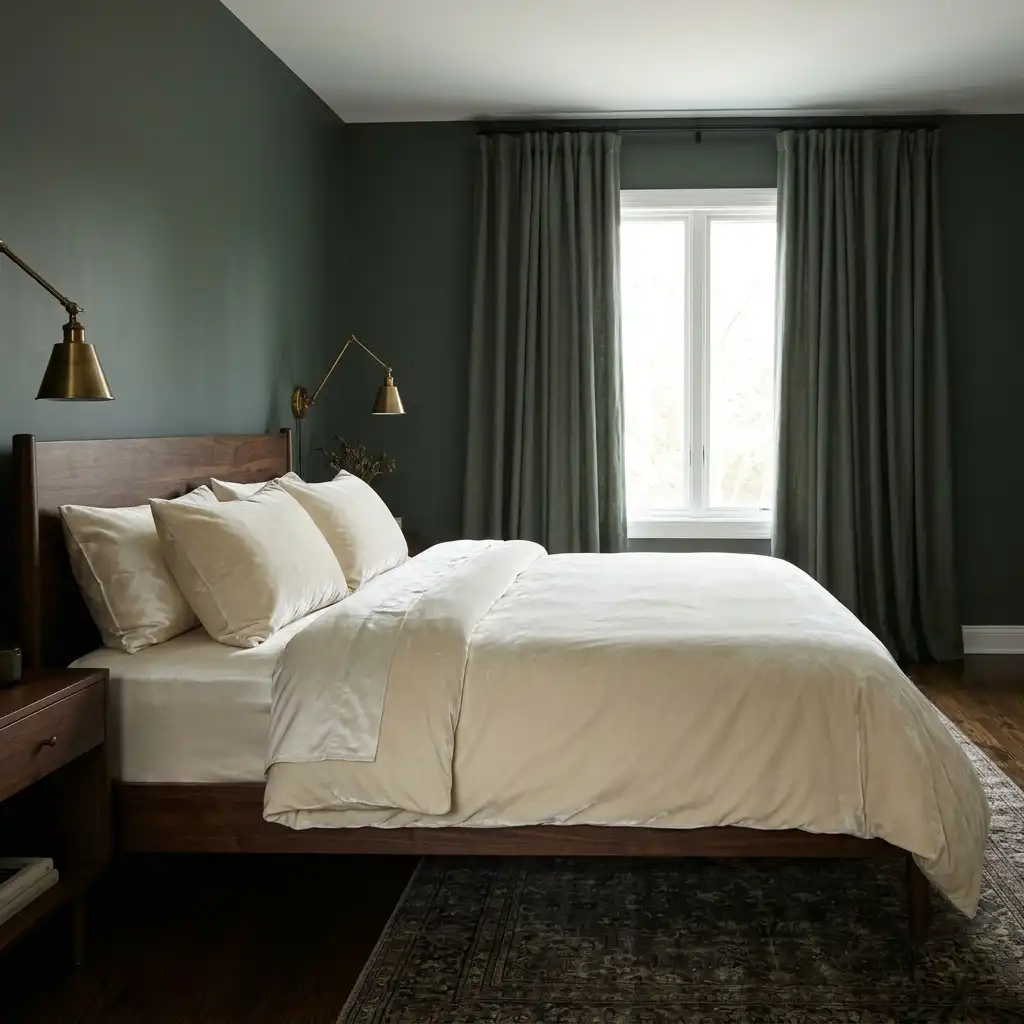
Deeper sage walls. Dark wood furniture. Velvet bedding in cream or ivory — not linen, which would compete for rusticity against the deeper colour, but smooth velvet that contrasts texturally. Aged brass lamps. Blackout linen curtains in the same sage or in a deep neutral.
This bedroom photographs as dark and moody and in person feels cocooning and luxurious. It requires genuine natural light during the day — a room facing south or west with large windows — to prevent it from feeling oppressive. But in the right room it is extraordinary.
Small Details That Make a Sage Green Bedroom Feel Complete
These are not large design decisions. They are the finishing layer — the things you add last that communicate that someone with genuine taste lives here.
A single stem in a simple vase on the bedside table. Not a florist’s arrangement. One stem of something — a eucalyptus branch, a garden flower, a dried botanica — in a ceramic or glass vessel. The plant element at the smallest scale.

Books that are actually being read. Two or three on the bedside table, one face-down to hold the page, perhaps a bookmark visible. A bookshelf nearby if the room has space for one. The sage green bedroom is consistently a room for readers and the reading material makes it feel like one.
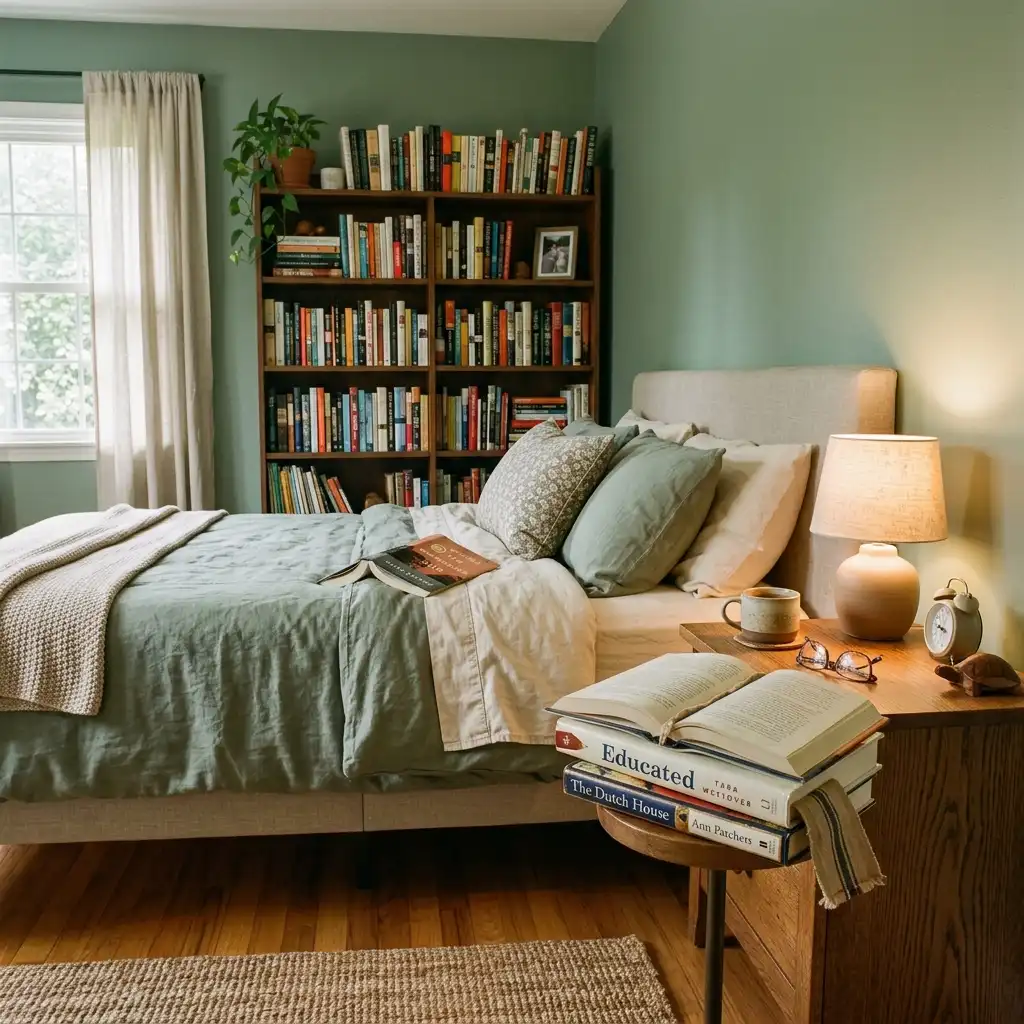
A piece of art that is personal. Not the most neutral, most broadly beautiful botanical print. Something that reflects an actual preference — a print from a favourite artist, a family photograph in a beautiful frame, a watercolour from a trip, something bought from a market somewhere that you love.
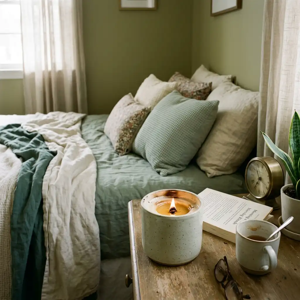
A candle that is actually burned. The wax pooled around the wick. Evidence of use. A sage green bedroom with a pristine unused candle looks like a hotel. One with a clearly-used candle with a proper wax pool looks like someone’s home.
The rug that is right rather than matching. A natural jute rug under the bed. A wool rug in cream or warm grey. An antique or antique-looking rug in faded colours where the original colour might have been anything and has weathered to something beautiful. The rug does not need to match the walls. It needs to belong to the same world — earthy, natural, muted, warm.

How to Test Before Committing
This is the most practical advice in this entire article and I am putting it last because I want it to be the thing you are thinking about when you close the browser.
Paint a large sample. Not the small paint chip. Not the little test pot applied to a 6-inch square. A large, proper sample — at least 12 by 24 inches, ideally larger — on the actual wall in the actual room.
Live with it for a week. Look at it in the morning when the early light comes in. Look at it at midday. Look at it in the afternoon. Look at it by lamplight in the evening. Look at it when the room is artificially lit with the curtains closed.
Take photographs at different times of day.
Only then decide.
Sage green is one of those colours that can look precisely right in one light and completely different in another, and the only way to know how your specific sage will behave in your specific room under your specific light is to put it on the wall and watch it for a while.
The investment of a week’s patience before committing to a full room of paint is one of the best decisions you can make about any wall colour and it is the one most people skip. The reason most people regret their paint choices is not that they chose wrong — it is that they did not give themselves enough time to see how right or wrong it actually was before the whole room was painted.
Sage green rewards patience. Go slowly. Look carefully. Let the colour tell you whether it is right before you cover every wall with it.
When it is right, you will know. You will stand in the doorway of your own bedroom and feel something quiet and settled, and you will think: yes. That is exactly it.
For more ideas on creating a bedroom that genuinely feels like somewhere you want to be, our guides on vintage cottage decor and French country decor ideas both cover aesthetics that pair naturally with the quiet sophistication of sage green.