Most people choose a bedroom color based on what looks good on a paint chip.
But a growing body of research from journals in neuroscience, architecture, and environmental psychology suggests the color on your bedroom walls is doing more than decorating the room. It is affecting the quality of your sleep.
This guide pulls together the key findings from that research. It covers which colors are supported by data, which ones are not, and how to apply the science to a room that actually looks good.
Best supported by sleep research: soft blue, sage green, and pale warm yellow.
Worst supported by sleep research: purple, black, and deep red.
The variable most people miss: saturation, not just hue.
Why Bedroom Color Is Not Just Aesthetic
A study published in the Journal Buildings reviewed how interior wall color affects the body’s circadian rhythm. The researchers found that highly reflective wall colors, particularly white, produced the highest “melanopic lux” in a room. That is the measure of light that stimulates the photoreceptors in the eye that control the body’s internal clock.
In simple terms, a bright white bedroom reflects more of the light in the room back at your eyes, and that can work against the hormonal process that helps you wind down at night. The study suggested designers should be cautious when using white as a default bedroom color.
A separate pilot study published in Building and Environment in 2024 tested bedroom conditions and sleep quality across several months. The conclusion was direct: bedroom conditions affect sleep quality, and the environment inside the bedroom plays a crucial role in supporting good sleep.
This is why the color on the walls matters. It is not just decoration. It is part of the environment your body responds to.
What the Sleep Data Shows
The most widely cited survey on bedroom color and sleep comes from Travelodge, the UK hotel company. It surveyed 2,000 British homeowners about their bedroom colors and their sleep habits. The results have been referenced in peer-reviewed discussions of color psychology ever since.
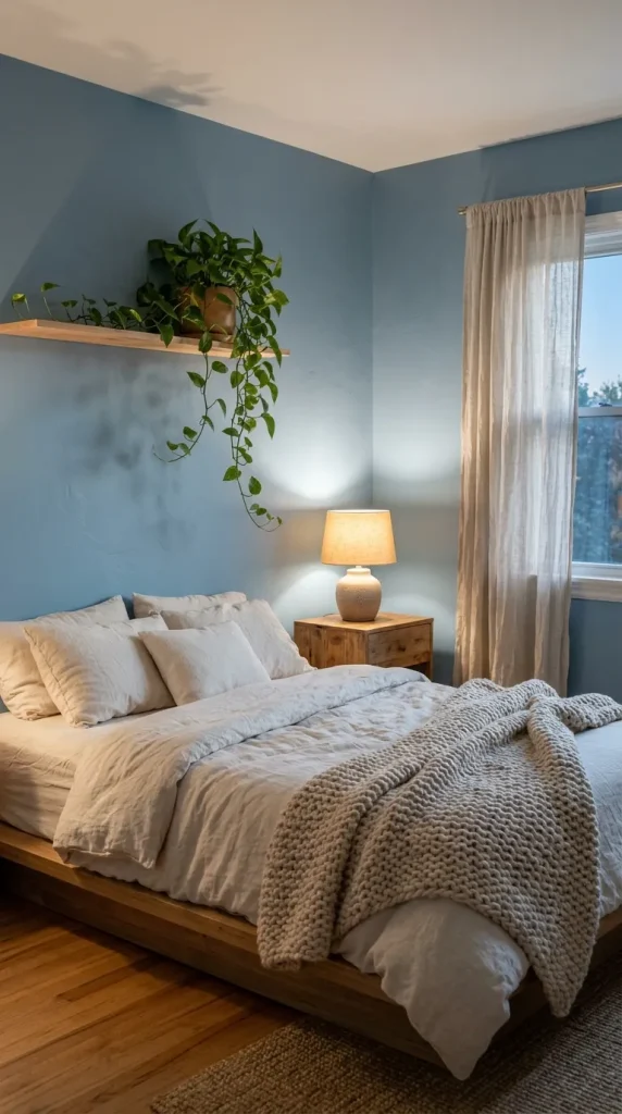
Blue performed best, with people in blue bedrooms averaging nearly two hours more sleep per night than people in purple bedrooms. The neurological explanation is that blue is associated with open skies and water, which tend to trigger the parasympathetic nervous system, the part of the body that governs rest and digestion. A 2025 review of 72 peer-reviewed studies supported this finding and linked blue environments to lower cortisol levels and increased relaxation.
Green came in second, with a strong body of evidence behind it. The biophilia hypothesis suggests humans are wired to find natural greenery restorative. A 2014 study comparing red and green room environments found that subjects in the red room reported significantly higher stress scores than those in the green room.
Yellow performed well in the survey, but the key word is soft. A pale, warm yellow creates comfort and nostalgia. A saturated, bright yellow does the opposite. It activates alertness and energy, which is the last thing a bedroom needs.
The Colors That Work Against Sleep
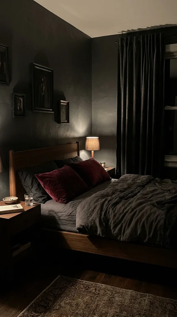
The research is just as clear about which colors harm sleep quality. Purple came in last in the survey, with sleep averaging just under six hours. The likely explanation is that purple combines the calming properties of blue with the arousing properties of red, creating an ambiguous signal that neither fully relaxes nor fully energizes.
Black, deep red, and dark gray were consistently linked to higher anxiety, cognitive strain, and emotional tension in the review of 72 studies. Red in particular was associated with a measurable increase in heart rate, blood pressure, and cortisol. Those are the exact physiological responses a bedroom should avoid.
⚠️ Watch Out
A single dark accent wall in a deep navy or forest green can work well in a small bedroom. But four walls of deep red or charcoal is a different choice, and the research suggests it works against rest rather than supporting it.
The Variable Most People Get Wrong: Saturation
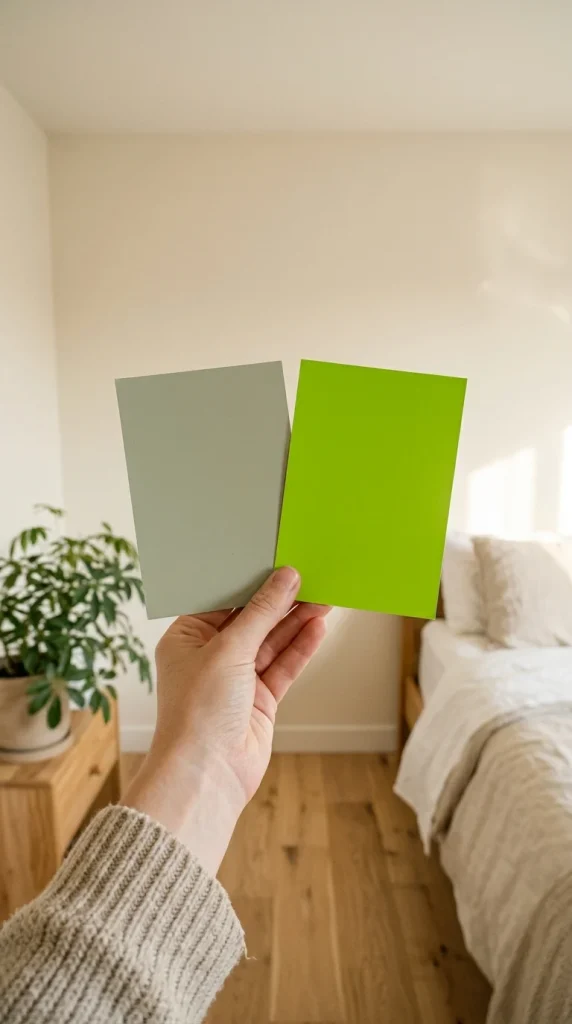
If the research points to one consistent conclusion, it is this. Saturation matters as much as hue. A soft, dusty blue is a very different experience from a vivid electric blue, even though both are technically blue.
The 2025 review found that lighter, muted colors support calm and reduce stress. Highly saturated colors stimulate the visual cortex more intensely and require more cognitive processing, which raises arousal levels. That is fine in a kitchen or a home gym. It is not ideal in a bedroom.
When you look at paint chips, look for the words dusty, muted, soft, sage, pale, or grayed. Those are the low-saturation versions of a color. They are the versions the research supports.
Matching Color to Your Room
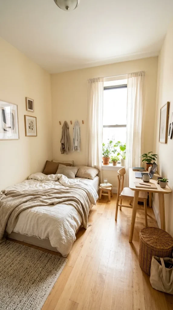
The research on room size and color is more nuanced than the old advice that light colors make a room look bigger. Light colors do reflect more light, which can make a small room feel more open. But a small bedroom painted a deep navy or charcoal can also work, because it blurs the edges of the room and turns it into a deliberate, intimate space instead of a cramped one.
Large bedrooms are the opposite. A very large room painted in bright white can feel clinical and cold. A large room can absorb deeper colors and richer tones without feeling oppressive, because there is more wall surface for the color to develop depth.
Natural light is the other variable. A south or west-facing bedroom gets warm afternoon light, which softens cool colors like blue and gray. A north-facing bedroom gets cool, diffuse light, which can make the same colors feel even cooler. Always test paint samples on the actual wall, and look at them in the morning, at noon, and at night under your bedside lamp.
The 60-30-10 Rule
Interior designers have long used the 60-30-10 rule for color distribution, and the psychology of visual processing supports it.
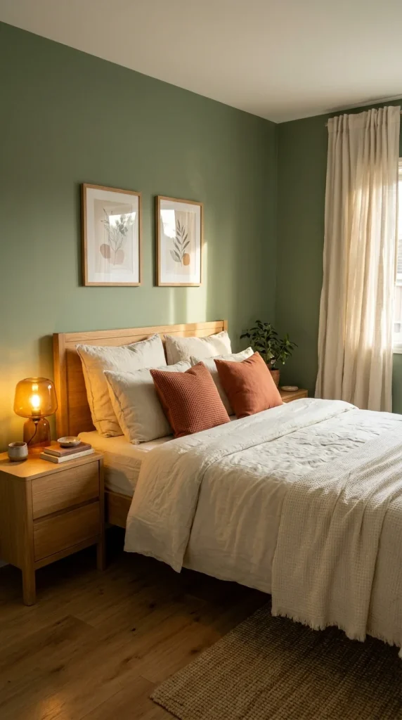
For a bedroom, that could mean sage green walls, cream bedding and curtains, and terracotta pillows with a warm amber lamp. That combination is both supported by the research and aesthetically coherent.
Common Mistakes to Avoid
Choosing color from a screen or a chip alone. Every screen displays color differently. Always test on the wall.
Ignoring undertones. A gray can lean blue, purple, or green. Those undertones become dominant on a large wall. Check them against your flooring and fixed furniture.
Choosing the most saturated version of a color. Go for the muted version every time.
Neglecting the ceiling. The ceiling is the surface you see most when lying in bed. Paint it the same color as the walls for an immersive look, or a slightly lighter version for a classic one.
Frequently Asked Questions
Is white a good bedroom color?
White is popular, but the 2023 Buildings study found that white walls reflect the most light and can work against melatonin production at night. If you love white, a warm off-white or cream is a better choice than a bright, cool white, because it reflects less of the blue light that suppresses melatonin.
Does the color of my bedroom really affect my sleep?
The research supports a real effect, but it is one factor among many. Light exposure, temperature, noise, and routine have larger impacts. Bedroom color is best understood as a supporting factor that can make the environment slightly more or less conducive to rest.
What is the best color for a small bedroom?
A soft, muted blue or sage green on all four walls is a strong choice. It reflects light, which helps a small room feel less compressed, and it is the color family with the best research backing for sleep. Test the color on the wall at night before committing.
Final Thoughts
The research on bedroom color points to a simple conclusion. Soft, muted blues, greens, and warm yellows are the safest choices, backed by the most data. Purple, black, and deep red are the colors most likely to work against rest. The variable that matters most is saturation, so choose the dusty version of any color you love.
None of this requires a designer. It requires a little patience, a sample pot, and a willingness to look at the color on your wall at night before you commit.