
By Ambar Mitchell · Updated July 2026 · 18 min read
I’ve painted living room walls more times than I care to count. I’ve trusted paint chips under fluorescent store lighting. I’ve fallen for Instagram colors that looked nothing like the photo once they dried. I’ve also found shades so perfect for a space that I physically didn’t want to leave the room anymore.
This guide is everything I’ve learned — organized so you can skip the mistakes and go straight to what works.
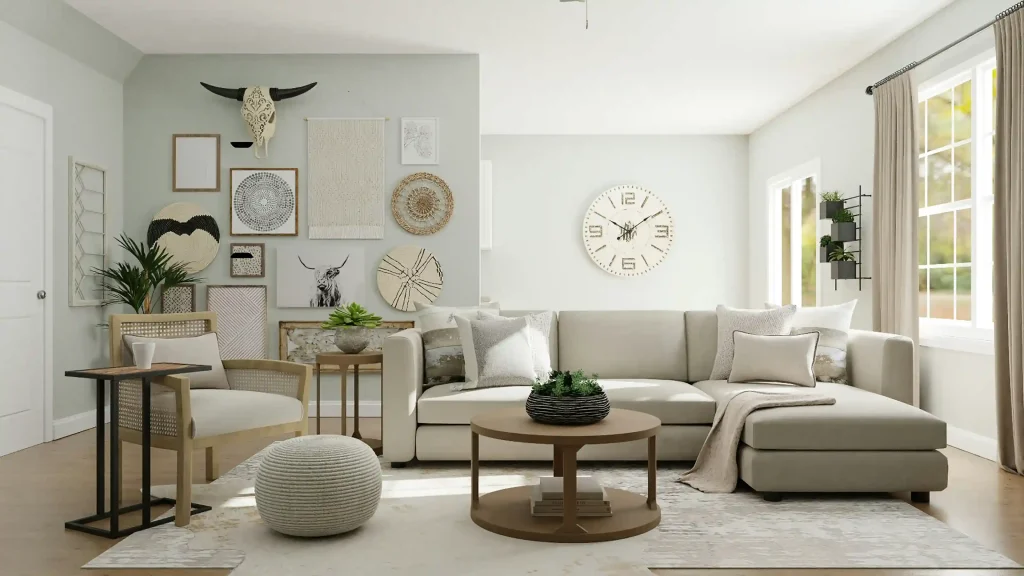
I’m not going to give you a listicle of 50 generic colors. I’m going to tell you why each color works, what it pairs with, what kind of room it suits, and what I’d actually reach for if I were painting my walls today.
Every shade in this guide has either been tested in my own home, recommended by someone I trust from real design research, or is backed by data from paint companies and design trend reports I actually read.
Let’s get into it.
Why Your Living Room Color Matters More Than Any Other Room
Your living room is the room that does the most jobs. It’s where people sit, talk, watch, eat, argue, relax, and exist. It’s usually the first room a guest sees. It’s the room you spend the most time in but often the one you think about the least when it comes to color — because repainting it feels like a bigger commitment than anywhere else.
Here’s the thing I’ve found: the right color doesn’t just look good. It changes how you feel in the room.

I painted my old living room a cool gray because it felt “safe.” It was safe. It was also somehow both boring and slightly clinical. When I finally repainted it a warm, dusty terracotta, the room started feeling like mine. Same furniture. Same lighting. Completely different experience.
Color is the highest-ROI change you can make to a living room. A gallon of paint costs $40–$70. A new sofa costs $1,000. Paint wins.
Before You Pick a Color: The 3 Rules I Follow Every Time
Rule 1: Test on the actual wall, not a chip
Paint chips are photographed under controlled lighting and printed on glossy paper. Your wall is neither of those things. I always buy a sample pot — most brands sell them for $5–$8 — and paint a 12×12 inch swatch directly on the wall. Then I look at it in the morning, afternoon, and evening before committing.
I’ve saved myself from at least four expensive mistakes this way.
Rule 2: Decide what feeling you want before you decide what color you want
“I want it to feel warm and cozy” narrows your palette significantly. “I want it to feel bigger and airier” points you in a completely different direction. Start with the feeling, then find the color — not the other way around.
Rule 3: Finish matters as much as color
For living rooms, I always recommend eggshell or satin on the walls. Flat/matte paint hides roller marks and looks beautiful when it’s new, but it marks and scuffs easily in a high-traffic room. Eggshell gives you a very slight sheen that makes the surface washable without looking shiny. Save the satin for trim and semi-gloss for doors.
The 27 Living Room Color Ideas Worth Considering
I’ve organized these by mood and effect rather than just color family, because that’s how you actually make decisions about paint.
Warm Neutrals: The Foundation Colors
These are the colors that work in almost any living room. They’re not boring — the key is choosing a warm neutral rather than a cool one.
1. Accessible Beige — Sherwin-Williams SW 7036
This is the best-selling paint color in America for multiple years running, and it earned that. What makes it special is its undertones: it reads as warm beige in some lights and soft greige in others, which makes it uniquely adaptable to changing light conditions throughout the day.
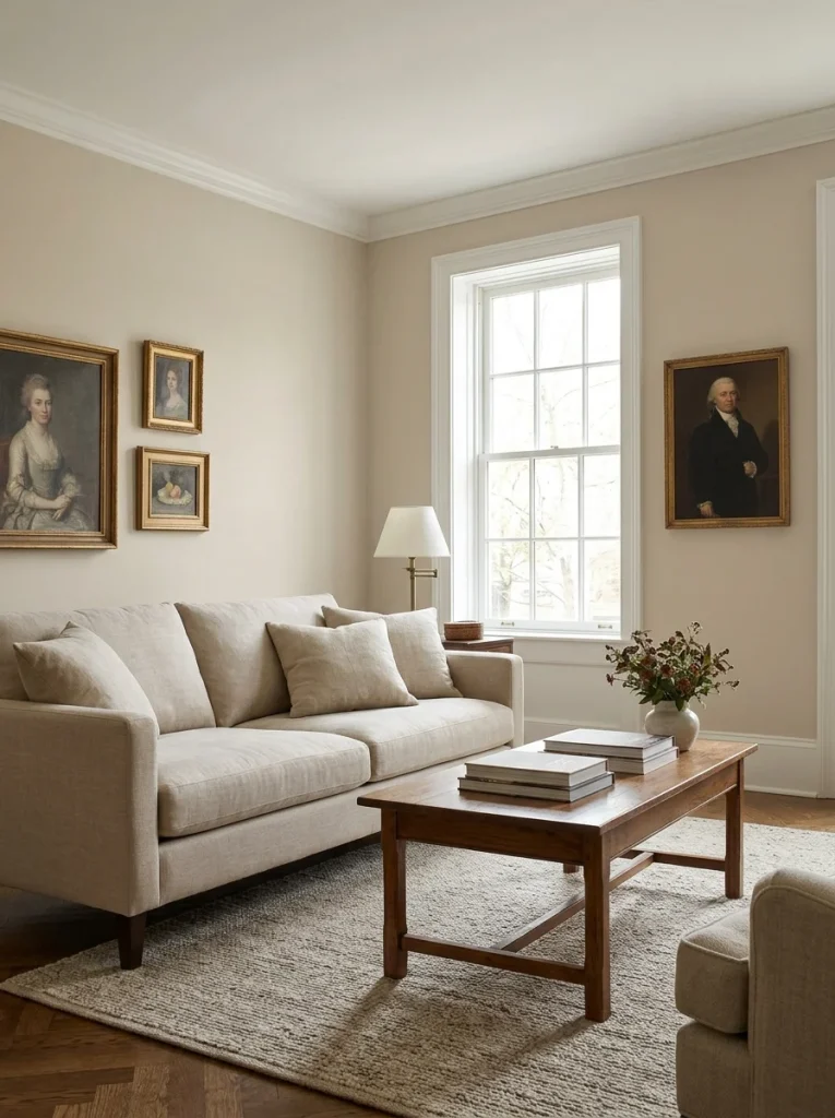
I’d use this in a living room that gets variable light — morning sun on one side, shade in the afternoon. It adjusts with the room. Pairs beautifully with white oak floors, warm brass hardware, and cream-colored upholstery.
Best for: transitional, traditional, and farmhouse-style living rooms. Works in both small and large spaces.
2. White Dove — Benjamin Moore OC-17
Not a stark white. Not a cold white. White Dove has warm, creamy undertones that stop it from looking clinical or institutional. If you want white walls but you’re afraid of that hospital feeling, this is your color.
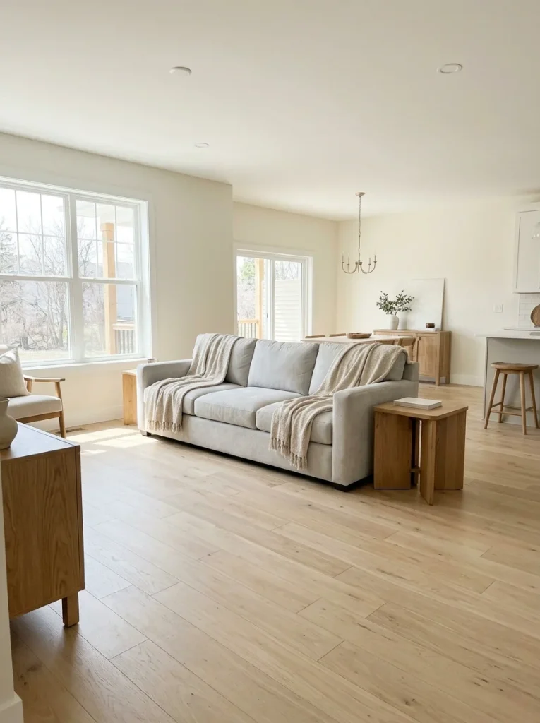
It works particularly well in living rooms that don’t get a lot of natural light, where a true white would look flat and lifeless. White Dove adds warmth without adding color, which sounds paradoxical until you see it on a wall.
Best for: smaller living rooms, north-facing rooms, contemporary and Scandinavian styles.
3. Balanced Beige — Sherwin-Williams SW 7037
One shade warmer than Accessible Beige and slightly sandier. It creates a calm, grounded feeling that I associate with rooms that feel genuinely lived-in rather than staged.
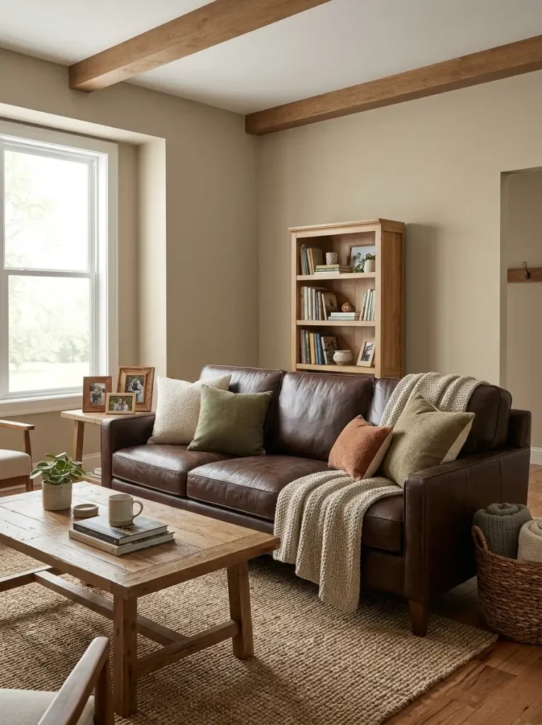
If you want a room that feels cozy without being dark, Balanced Beige is worth a sample pot. It pairs beautifully with dark leather sofas and warm wood tones — a combination that photographs exceptionally well.
Best for: den-style living rooms, open-plan spaces, rooms with warm wood flooring.
4. Moonlight — Backdrop Home
A warm off-white that interior designer Brittny Button describes as providing “a kind of sweeping wash that embraces the space in warmth.” It’s for people who want the freshness of white walls without the coldness.
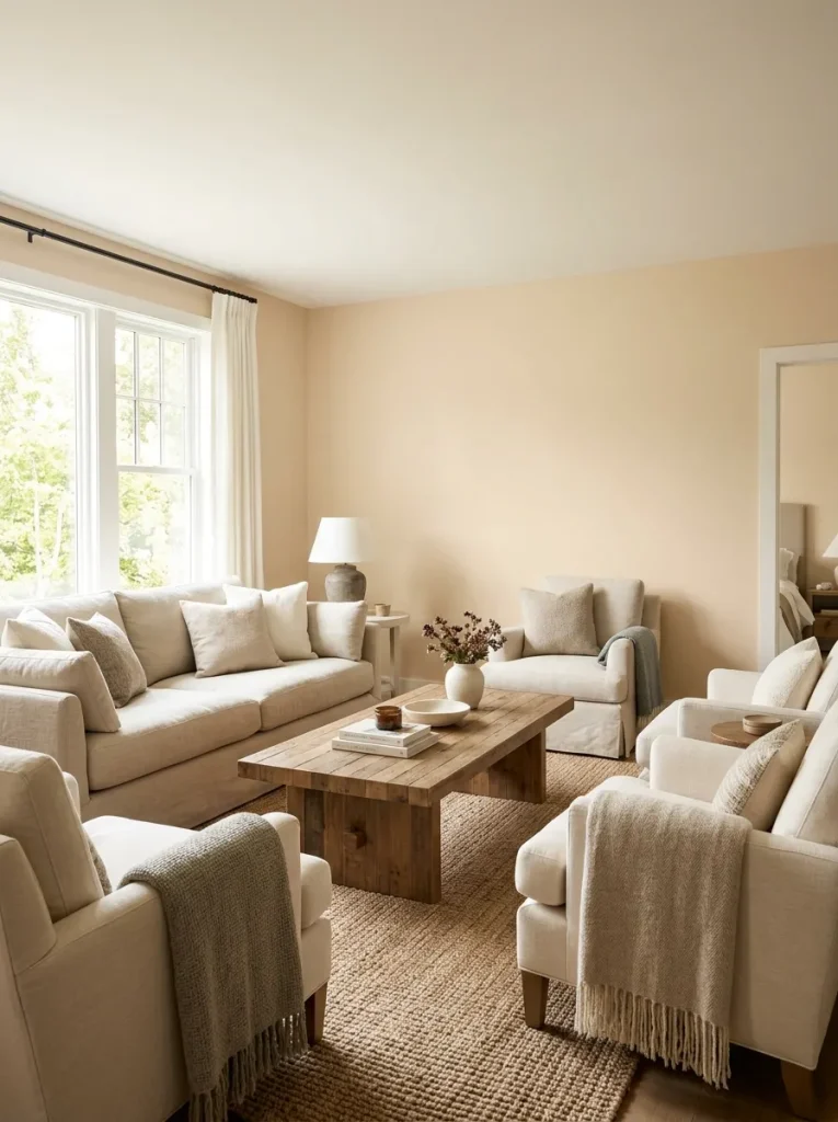
Where White Dove is creamy, Moonlight is softer and slightly more neutral — it doesn’t lean as visibly yellow. Good choice if you want warmth without the room reading as “beige.”
Best for: maximalist living rooms where the walls are a backdrop for bold furniture and art.
Earthy Tones: The 2026 Trend With Real Staying Power
This is the direction almost every designer I follow has moved toward. The cold grays of 2015–2022 are being replaced by warm, grounded earth tones that make a room feel genuinely inviting.
5. Terracotta (Behr Burnished Clay or similar)
The 2026 version of terracotta is not the bold orange you remember from the 90s. Think sun-baked clay, dusty and muted, with gray undertones that stop it from looking like a pumpkin.
I painted an accent wall this color in my previous apartment and it was the single best design decision I made in that space. The room felt warmer, more personal, and — unexpected bonus — the color made every piece of art I put on those walls look more intentional.
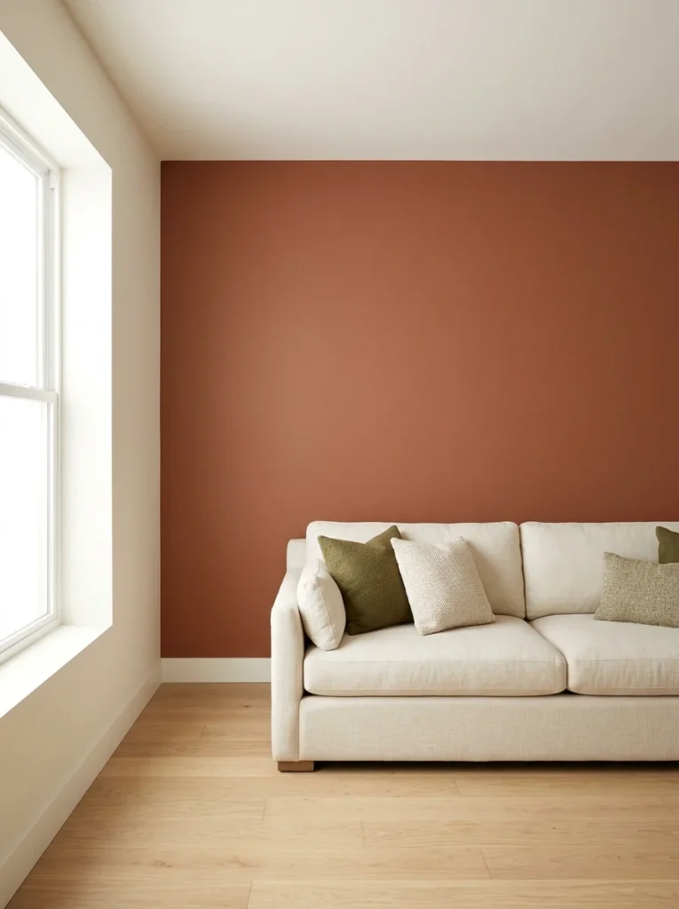
Terracotta creates a beautiful warmth that photographs extremely well, which is why it shows up constantly on Pinterest and Instagram. But it’s not just trending — earthy terracottas have been a feature of Mediterranean and Southwestern design for centuries. This one has real staying power.
Best for: living rooms with natural wood furniture, rattan or woven textures, warm brass or bronze hardware.
6. Dead Salmon — Farrow & Ball
The name is genuinely unfortunate. The color is genuinely extraordinary.
Dead Salmon is a muted, dusty terracotta-pink with gray undertones that prevent it from reading as pink at all. It creates an enveloping, warm quality that feels almost tactile — like the walls are soft. Against white trim and warm brass hardware, it looks expensive in a way that’s difficult to explain until you see it.
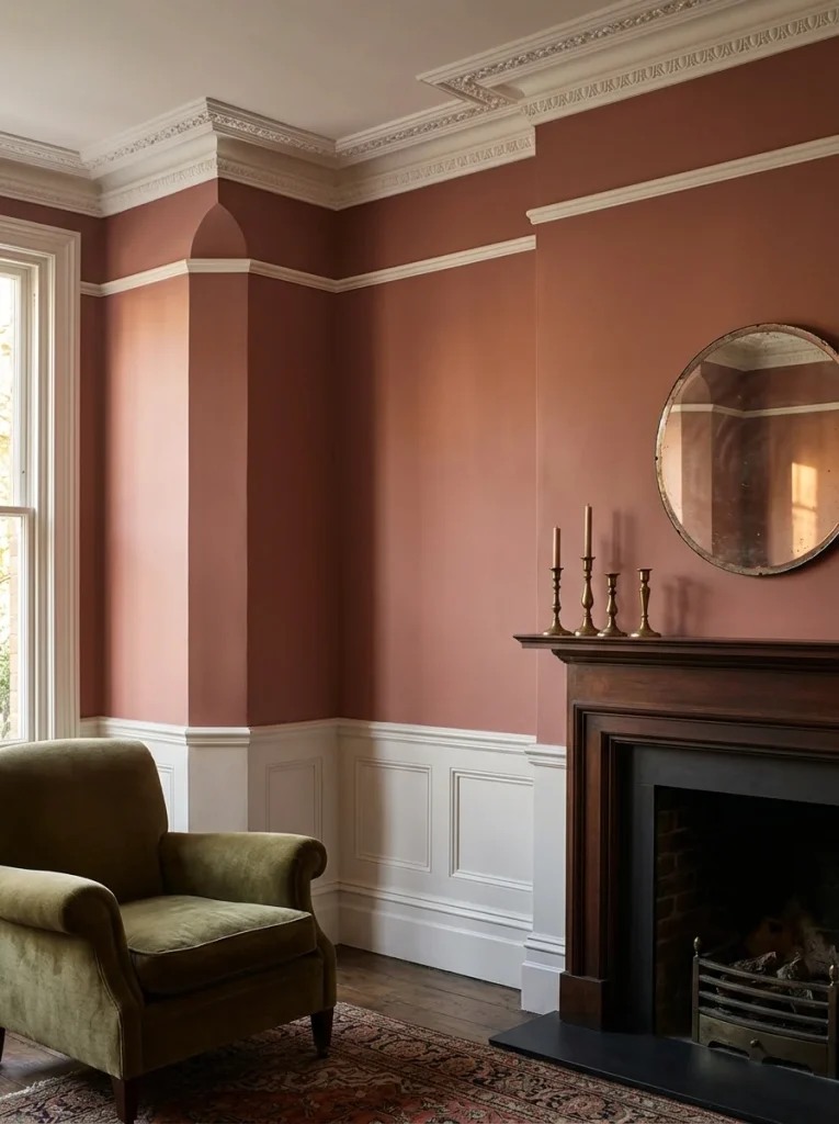
This is one of those colors that’s hard to believe from a chip and revelatory on a wall.
Best for: traditional, eclectic, and maximalist living rooms. Works particularly well in older homes with architectural detail.
7. Caramelized — Benjamin Moore
A warm, honey-amber shade that creates a sense of golden light regardless of your room’s actual light conditions. Named one of the key trending colors for 2026 by multiple design forecasters.
A room painted in Caramelized always feels like late-afternoon golden hour. It’s bold but welcoming — the kind of color that makes a room feel like a destination rather than just a space you pass through.

One caution: test this one carefully. In rooms with very warm existing light, it can push into territory that feels slightly orange. In rooms with neutral or cool light, it’s magic.
Best for: dining-adjacent living rooms, rooms with dark or ebony floors, spaces where you want drama without going dark.
8. Soft Clay (various brands)
If terracotta feels too committed and warm off-white feels too safe, soft clay lives in the middle. It’s a toasty, warm neutral that reads as color in some lights and almost-neutral in others.
Interior designer Lauren Saab puts it perfectly: “These warmer neutrals have depth without shouting for attention, making them perfect for living rooms designed to be lived in rather than styled for show.”
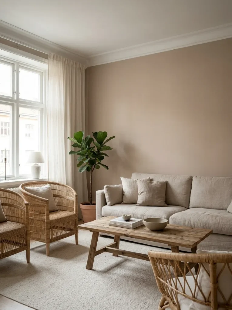
Smaller living rooms can benefit enormously from soft clay — it creates coziness without making the room feel cramped the way darker colors can.
Best for: small to medium living rooms, open-plan spaces, bohemian and organic modern styles.
Greens: The Color Story of 2026
Sage green is the standout trend of 2026, and it’s earned the attention. But there are several distinct greens worth knowing, and they do very different things in a room.
9. Sage Green (Valspar Sage Slate or similar)
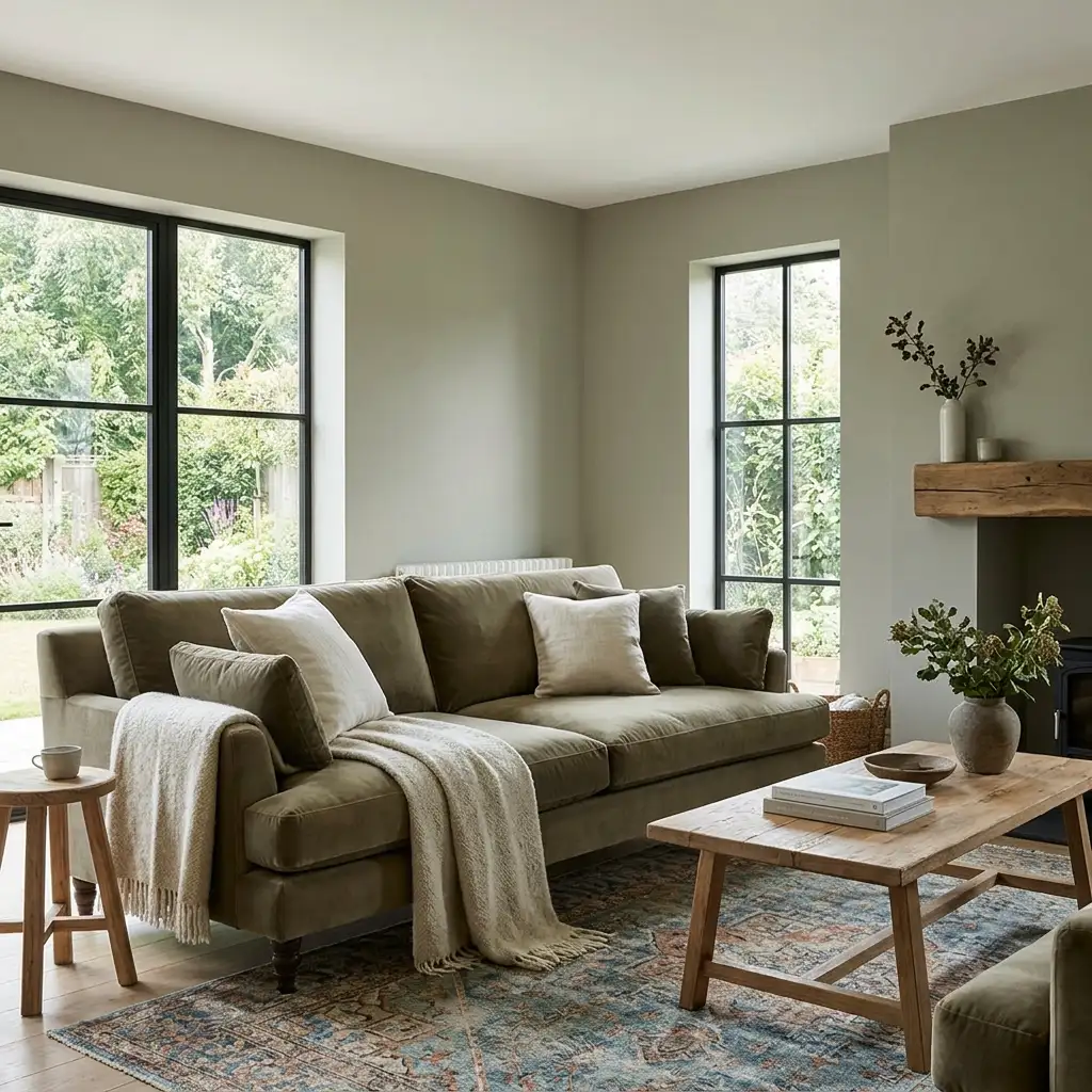
Valspar named a sage their 2026 Color of the Year for a reason. Muted, dusty sage adds a natural, organic presence to a living room without the aggressive coolness of stronger greens. It pairs beautifully with warm wood tones, cream upholstery, and terracotta accents.
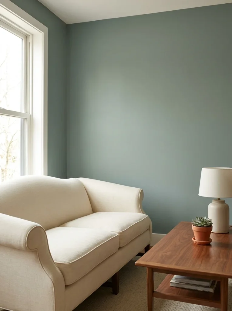
I’ve started noticing this in real homes rather than just staged shoots, which tells me it’s crossed from trend into genuine preference. It’s one of those colors that makes a room feel alive.
Best for: living rooms with wood floors, plants, rattan or natural fiber textures, Japandi or bohemian styles.
10. Olive Green (Benjamin Moore Creekside Green or Sherwin-Williams Muddled Basil)
Where sage is soft and dusty, olive is richer and more complex — it has yellow undertones that add warmth and a slightly moody quality that reads as sophisticated rather than cheerful.

This is green done the grown-up way. Olive walls with velvet armchairs, warm wood tones, and vintage rugs is a combination that always looks intentional and never dates. The yellow undertones make it work particularly well in rooms with warm-toned lighting.
Best for: mid-century modern, eclectic, and traditional living rooms. Pairs well with brass, cognac leather, and jewel-toned accents.
11. Gloucester Sage — Benjamin Moore
A muddy green that interior designer Jessica Perez calls her favorite living room color. It pairs particularly well with artwork — it creates a backdrop against which paintings literally pop off the wall.

“I especially love it with pops of plum, pink, or pale blue,” she notes. “Use brass accents to play into the warmth of this color.”
Best for: art-forward living rooms, gallery walls, and spaces where you want the walls to work as a backdrop rather than a focal point.
12. Salamander — Benjamin Moore
A deep, rich olive that adds serious drama without feeling heavy when balanced with light furniture and natural textures. This is for people who want a living room that feels genuinely distinctive — not one that looks like a Pinterest template.
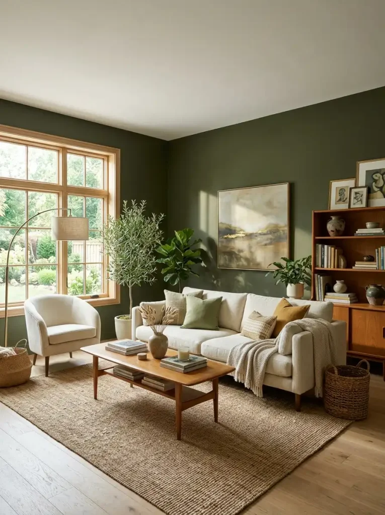
Use it with cream or ivory sofas, warm oak furniture, and plenty of natural light. The contrast does the work.
Best for: larger living rooms, rooms with high ceilings, Japandi and bohemian styles.
13. Inky Forest Green (Dark Hunter or similar)
A nearly-black, deep forest green that replaces black as the sophisticated moody choice for 2026. In low light it reads almost black; in natural light the green reveals itself.

Pair it with Simply White trim, unlacquered brass sconces, a velvet sofa in emerald or mustard, and a vintage Persian rug. The result is a room that looks like it belongs in a boutique hotel, but in the best possible way.
One thing to know: this is a commitment. Test it extensively before painting a full room. In smaller rooms, consider using it on an accent wall only.
Best for: mid-century modern and traditional library-style living rooms with layered lighting.
Blues: Calm, Versatile, and Coming Back Strong
Blues were oversaturated in home design for a while, then overcorrected. In 2026 they’re back — but in a different form. Forget navy feature walls and coastal accents. The blues trending now are subtle, nuanced, and genuinely soothing.
14. Light Blue (various)
Interior designer Meg McSherry explains why light blue is gaining ground again: “This color adds a sense of comfort and ease to a space, allowing homeowners to relax and really just melt into their rooms.”
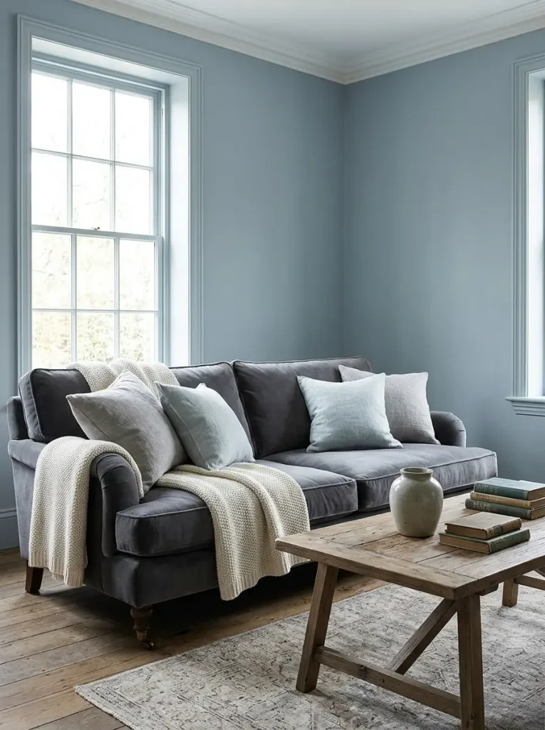
The key is avoiding anything that reads as baby blue or sky blue. Look for light blues with gray or green undertones — they feel sophisticated rather than sweet.
Best for: living rooms where you want calm without warmth, coastal-adjacent styles without the cliché.
15. Blue Gray — Farrow & Ball
A sophisticated, nuanced shade that won’t overpower a living room but still has enough personality to make the room feel considered. It works particularly well in rooms that already have warm tones in the furniture and flooring — the cool blue-gray creates a pleasing contrast.

Best for: traditional and transitional living rooms, rooms with warm wood floors and neutral upholstery.
16. Teal
Teal manages to feel calming and bold at the same time — it has the depth of green and the coolness of blue in a hybrid that’s become one of the most-discussed living room colors of early 2026.

It feels more current than dark green walls and more interesting than blue. If you want something distinctive that won’t date in two seasons, teal is worth considering.
Best for: eclectic, maximalist, and mid-century modern living rooms. Pairs beautifully with warm wood, brass, and rust-toned accents.
17. Navy (Deep Ocean or similar)
Not a trend color — a classic that keeps showing up because it works. Deep navy on an accent wall creates a room-defining focal point that makes everything else look more intentional.
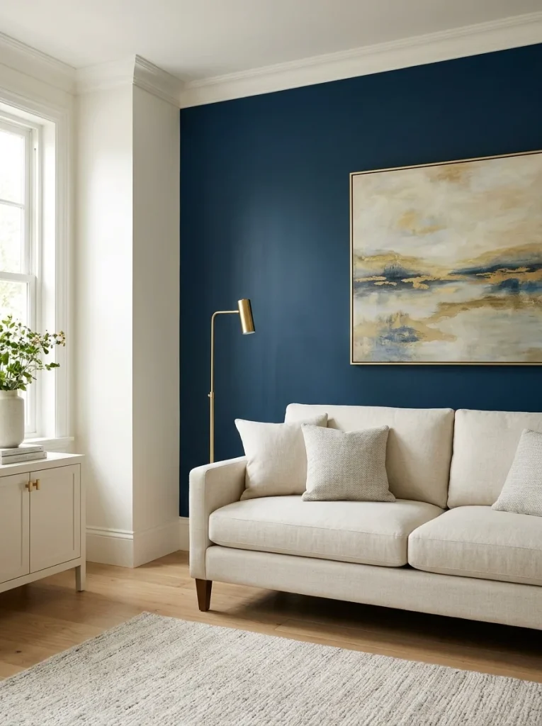
Pair it with warm white walls on the remaining three walls, warm brass hardware, and a lighter sofa (cream, ivory, or warm gray). The contrast between the navy wall and the lighter elements creates depth and sophistication without making the room feel small.
Best for: accent walls in medium to large living rooms, traditional and contemporary styles.
Moody Darks: For People Who Want Drama
These are the colors that make people either immediately love or immediately reject a room. Done well, they’re extraordinary. Done wrong, they’re oppressive. The key is always balance — dark walls with lighter furniture, and enough light sources to prevent the room from feeling like a cave.
18. Charcoal (Iron Ore — Sherwin-Williams)
A striking, charcoal-rich shade with architectural precision. Interior designer Ava Milani describes it this way: “Its depth creates a sculptural quality in low light, offering a dramatic backdrop that accentuates form, materials, and detail. In natural or brighter light, it reveals subtle layers of warmth.”
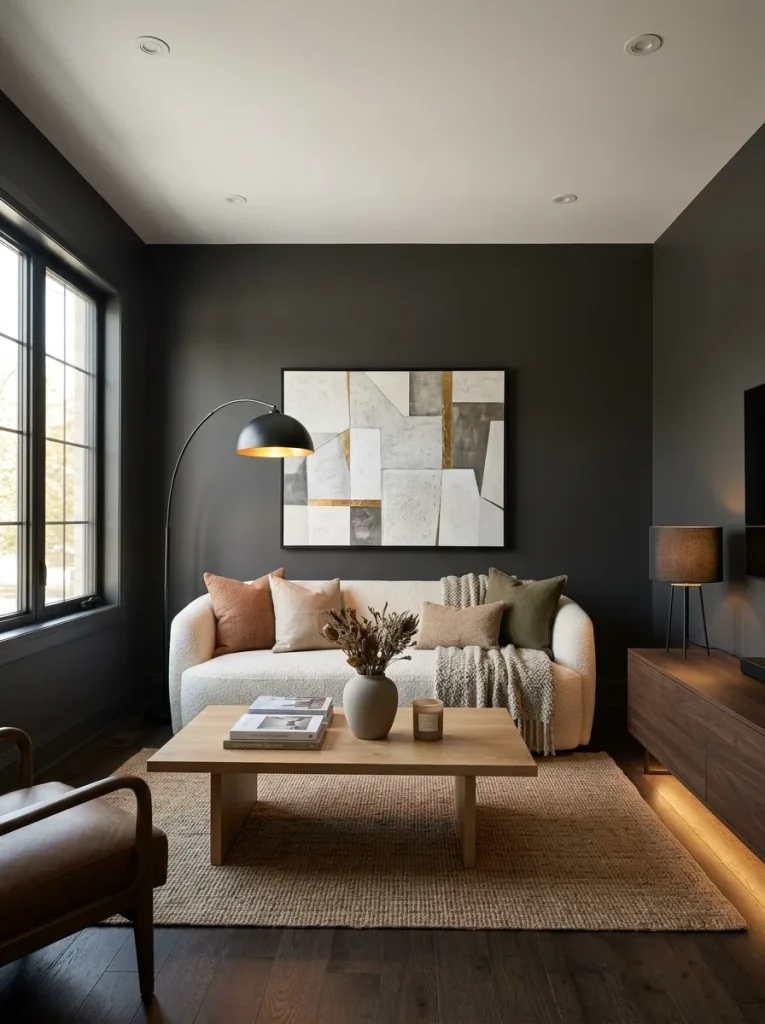
This color works best in rooms with multiple light sources — overhead, lamps, and accent lighting. With just overhead lighting it can feel heavy. With layered lighting it feels intentional and sophisticated.
Best for: living rooms with high ceilings, rooms with extensive natural light, contemporary and industrial styles.
19. Midnight Blue / Outerspace — Sherwin-Williams
A very dark blue that adds drama and a sense of privacy to a room. Paired with warm beige walls on adjacent surfaces and leather sofas, it creates a cozy den-like atmosphere perfect for rooms where you watch films or want to feel genuinely enclosed.
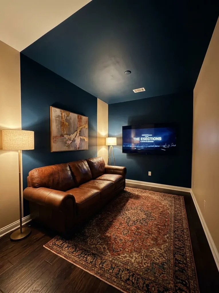
The beige keeps the room from feeling too dark by adding a touch of warm light. The contrast between the dark blue and the warm neutral is what makes the combination work.
Best for: den-style living rooms, media rooms, rooms used primarily in the evening.
20. Plum / Deep Burgundy
Designer Gabrielle Bove has been incorporating deep plum into living rooms and lounges. “Plum evokes a warmth and pairs well with rich woods and green tones.”
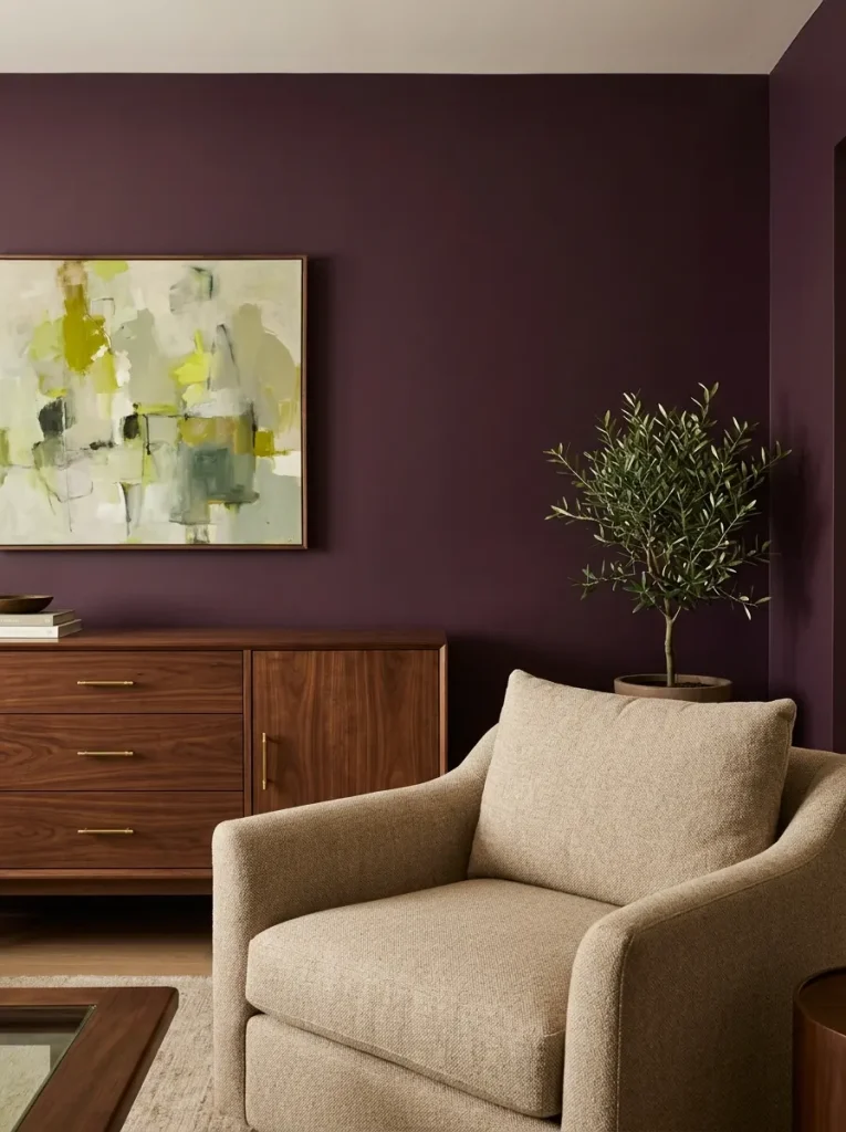
This is a color for people who want their living room to feel genuinely distinctive. It’s bold but it has warmth — unlike black or very dark blue, plum doesn’t feel cold.
Best for: eclectic, maximalist, and Victorian-influenced living rooms.
21. Espresso Brown (Silhouette — Benjamin Moore)
A rich, warm brown with subtle charcoal undertones. Interior designer Ava Milani notes it “adapts fluidly to natural light, transitioning from a soft, inviting tone in dimmer spaces to a polished, layered presence in brighter settings.”

Brown walls are having a genuine comeback in 2026, and Silhouette represents the best of what that looks like. It’s grounding and warm in a way that blue-based dark colors are not.
Best for: traditional and maximalist living rooms, rooms with layered textures and pattern.
Unexpected Choices Worth Knowing
22. Blush Pink (muted)
Not the saturated pink of a teenager’s bedroom — the dusty, muted blush that reads as almost-neutral in some lights. It adds vintage charm and femininity without overwhelming a space.

Works particularly well in living rooms that lean toward eclectic or cottagecore styles. Pair it with sage green accents and warm wood tones for a combination that feels fresh without being trendy.
Best for: eclectic, vintage, and cottagecore living rooms.
23. Mushroom (warm greige)
Greige done warm. Mushroom sits at the intersection of gray, beige, and brown and does something none of them do alone — it creates a deeply calming, sophisticated neutral that feels specific rather than safe.

Designer Alice Moszczynski notes that mushroom creates an “architectural feeling” that appeals to people wanting a departure from minimalist interiors.
Best for: transitional and contemporary living rooms, open-plan spaces.
24. Aristocrat Peach — Sherwin-Williams
Interior designer Alison Hammat calls this “a warm color that feels akin to a vintage look rather than something crisp and cool. It leaves room for layering of textures, patterns, and deeper colors. Patinated antiques look great against this warm color.”

This is for people who want warmth and personality but aren’t ready for terracotta. It’s softer and more subtle — a living room color with a quiet confidence.
Best for: eclectic, vintage, and maximalist living rooms.
25. Hidden Gem — Behr’s 2026 Color of the Year
Behr’s official Color of the Year for 2026 is a smoky jade blue-green that feels both dramatic and soothing. It’s genuinely interesting — not an obvious choice and not a safe one, but it works in the right space.

If you’re considering it, test it extensively. It can read very differently depending on your room’s existing light and the other colors you’ve got in the space. In warm-toned rooms it adds beautiful contrast; in already-cool rooms it can feel slightly clinical.
Best for: contemporary and eclectic living rooms with warm-toned furniture and flooring.
26. Two-Tone: Dark Lower Wall, Light Upper Wall
This isn’t a single color — it’s a technique. Paint the lower third of your living room walls in a dark, saturated shade (charcoal, dark olive, deep navy) and the upper two-thirds in a warm white or light neutral.

The effect is grounding without being oppressive, and it adds architectural detail to rooms that don’t have any. The dark lower section also hides scuffs and marks far better than the upper wall, which is a practical bonus nobody talks about.
Best for: living rooms without crown molding or architectural detail that need visual structure.
27. Warm White + Bold Accent Wall
The reliable option that works in almost every living room. Three walls in a warm white (White Dove, Moonlight, or similar), one focal wall in a bold color of your choice.
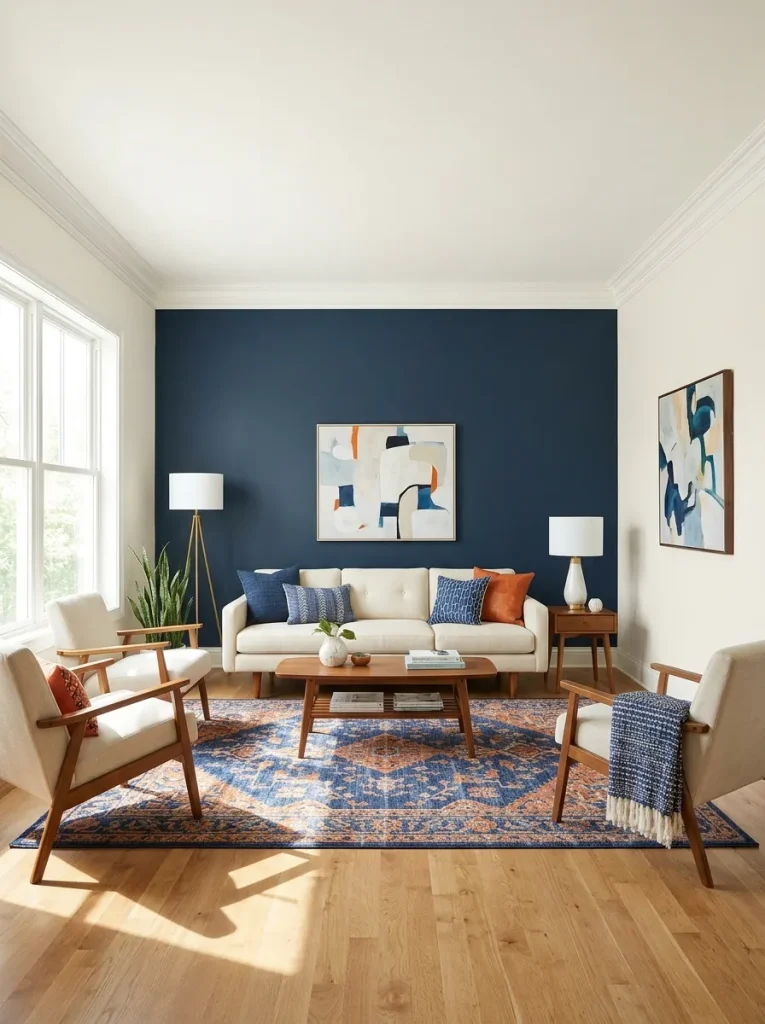
The accent wall is where you can take a risk with a color you love but aren’t ready to commit to on every wall. It’s also the most reversible of all these ideas — one accent wall repainted is a weekend project. Four walls repainted is a significant undertaking.
Best for: anyone who’s unsure, anyone renting, anyone who wants bold without full commitment.
How to Choose the Right Color for Your Specific Living Room
I get asked this constantly, so here’s the condensed version of how I think about it.
If your room gets a lot of natural light: You can go darker than you think. Dark greens, deep blues, and rich browns look extraordinary in sun-filled living rooms because the light prevents them from feeling heavy. Don’t default to white just because the room is bright.
If your room doesn’t get much natural light: Avoid cool colors — they’ll make the room feel cold and slightly depressing in low light. Go warm: warm whites, warm beiges, soft terracotta. These shades create the illusion of warmth even without natural light.
If your room is small: Contrary to popular belief, you don’t always have to go light in a small room. A small room painted in a deep, saturated color can feel intentionally cozy rather than cramped — like a jewel box. The real rule is consistency: paint the trim close to the wall color, and the room will feel larger than if you create strong contrast between wall and trim.
If your room has mixed-temperature lighting: Warm LED bulbs + cool north-facing windows = color that changes throughout the day. In this situation, I lean toward warm neutrals with enough complexity to look good in multiple light temperatures.
If you’re renting: Peel-and-stick wallpaper panels in a bold pattern, temporary fabric wall panels, or large-scale art can achieve a lot of what paint does. If your landlord allows painting, go for it — but stick to colors you can paint over in a single coat of white, which rules out the very dark choices.
The Colors I’d Personally Choose Right Now
If I were painting a living room today, my shortlist would look like this:
For a cozy, warm, personal space: Farrow & Ball Dead Salmon on all four walls, warm white trim, warm brass hardware everywhere. This is the room I’d want to come home to.
For something bold that has staying power: Deep olive (Benjamin Moore Salamander) with cream-colored furniture and vintage rugs. The combination feels like it’s been there for 30 years and always will be.
For a renter or someone not ready to commit: Three warm white walls (White Dove) and one terracotta accent wall behind the main seating. Dramatic enough to feel intentional, reversible enough to not be a commitment.
For the safest possible choice that still looks considered: Sherwin-Williams Accessible Beige. Every single time.
A Final Note on Commitment
The most common reason people don’t repaint their living room is fear of commitment. They worry they’ll choose wrong and be stuck with it.
Here’s what I’ve learned: paint is the most reversible design decision you can make. A gallon of paint and a weekend is all it takes to undo any of these choices. The only thing you’ll regret is staying with the landlord-beige walls because you were afraid to try something.
Pick the color that makes your stomach flip slightly when you imagine it on the wall. That’s usually the right one.
Frequently Asked Questions
What is the most popular living room color for 2026?
Warm neutrals and earthy tones dominate, with sage green as the clear standout trend. Sherwin-Williams Accessible Beige and Benjamin Moore White Dove remain the most-purchased overall, but sage green, warm terracottas, and honey-amber shades are the direction most designers are moving.
What color makes a living room look bigger?
Light warm neutrals — warm white, soft beige, or light sage — make a room feel larger. The key word is warm: cool grays and blues can feel expansive but also clinical. Warm light colors feel open and inviting simultaneously. Painting trim the same color as the walls (or very close) also increases the perceived size of a room.
What’s the best paint finish for living room walls?
Eggshell or satin. Flat/matte paint shows every mark in a high-traffic living room. Eggshell gives you a very slight sheen that makes the surface wipeable without looking shiny. Save semi-gloss for trim and doors.
Should my living room and dining room be the same color?
In an open-plan space, yes. Different colors in connected spaces create visual choppiness that makes both rooms feel smaller. Use the same color throughout, or very closely related tones in the same family.
What’s the best way to test a paint color before committing?
Buy a sample pot ($5–$8 at most paint brands) and paint a 12×12 inch swatch directly on your wall — not on a board you hold up. Look at it in the morning, afternoon, and evening. What you see after 24 hours on the actual wall is what you’ll live with. Trust that, not the chip.
Are dark colors okay in a small living room?
Yes, with conditions. A small room in a deep, saturated color can feel intentionally cozy — like a jewel box — rather than cramped. The key is painting trim close to the wall color (to avoid high contrast that chops up the space) and having adequate lighting sources. Multiple lamps prevent a dark room from feeling oppressive.
Ambar Mitchell is the founder of HomefixTrends. She has been researching and writing about home design since 2022, with a focus on practical, budget-friendly ideas for real homes. She studied interior design research at the University of Texas at Austin.
Related articles you might like: