By Ambar Mitchell · Updated July 2026 · 20 min read
Let me tell you something nobody in the design world likes to admit: most of what makes a home look expensive is paint.
Not the furniture. Not the light fixtures. Not the art on the walls. Paint.
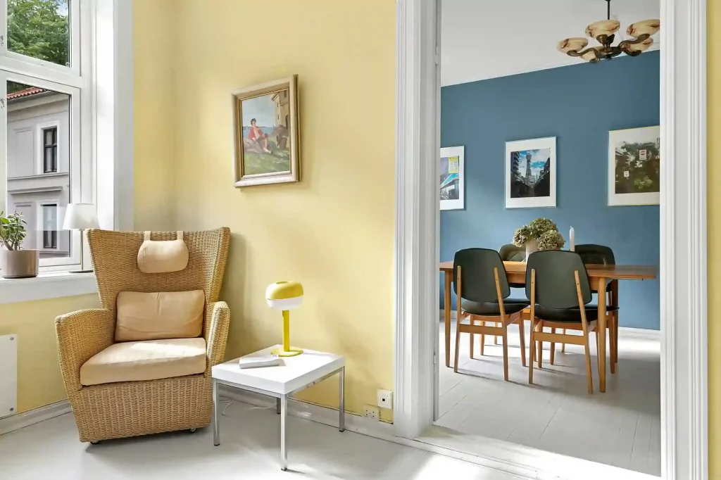
I’ve walked into $2,000-a-month apartments that felt like a budget motel because the walls were painted builder-grade flat white. And I’ve walked into modest rentals that felt like boutique hotels because someone made one very deliberate, very informed color choice.
The difference between a room that looks “nice” and a room that looks expensive is almost always the color on the walls — and more specifically, the quality and intentionality of that color choice.

This guide covers the 25 paint colors that designers reach for when they want a home to look elevated, sophisticated, and genuinely luxurious. I’ve organized them by the effect they create, given you exact paint names and brands for each one, told you what to pair them with, and — because I believe in honesty — told you where each color can go wrong.

I’ve also included a section on technique at the end, because color is only half the equation. The finish, the trim treatment, and how you apply the paint matter just as much as the shade you choose.
What Actually Makes a Paint Color Look Expensive?
Before we get into specific colors, I want to explain what separates a color that looks “expensive” from one that looks ordinary. Once you understand this, you’ll be able to evaluate any color — not just the ones in this list.
Complexity over flatness. Expensive-looking colors have undertones that shift in different light. A flat, one-dimensional color reads as cheap because it looks the same at 8am and 8pm. A color with real depth looks like it belongs in a designer space because it behaves differently depending on the light hitting it. This is why Farrow & Ball and Little Greene charge twice what mainstream brands charge — their pigments are genuinely more complex.
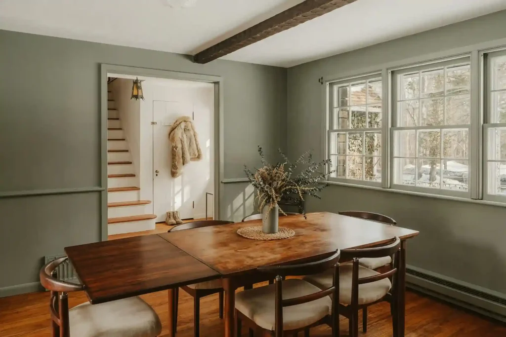
Saturation that’s controlled, not loud. Luxury colors are not usually bright. They’re rich. There’s a difference. A luxury green is deep olive or inky forest, not lime or mint. A luxury pink is muted, dusty, almost-not-pink. The sophistication comes from restraint in saturation.
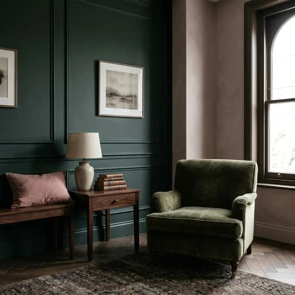
Matte or eggshell finish on walls. High-gloss walls are not luxurious — they look commercial. A matte or eggshell finish on walls absorbs light slightly, giving the surface a depth that reads as expensive. Semi-gloss is reserved for trim and doors, where a subtle sheen creates contrast.
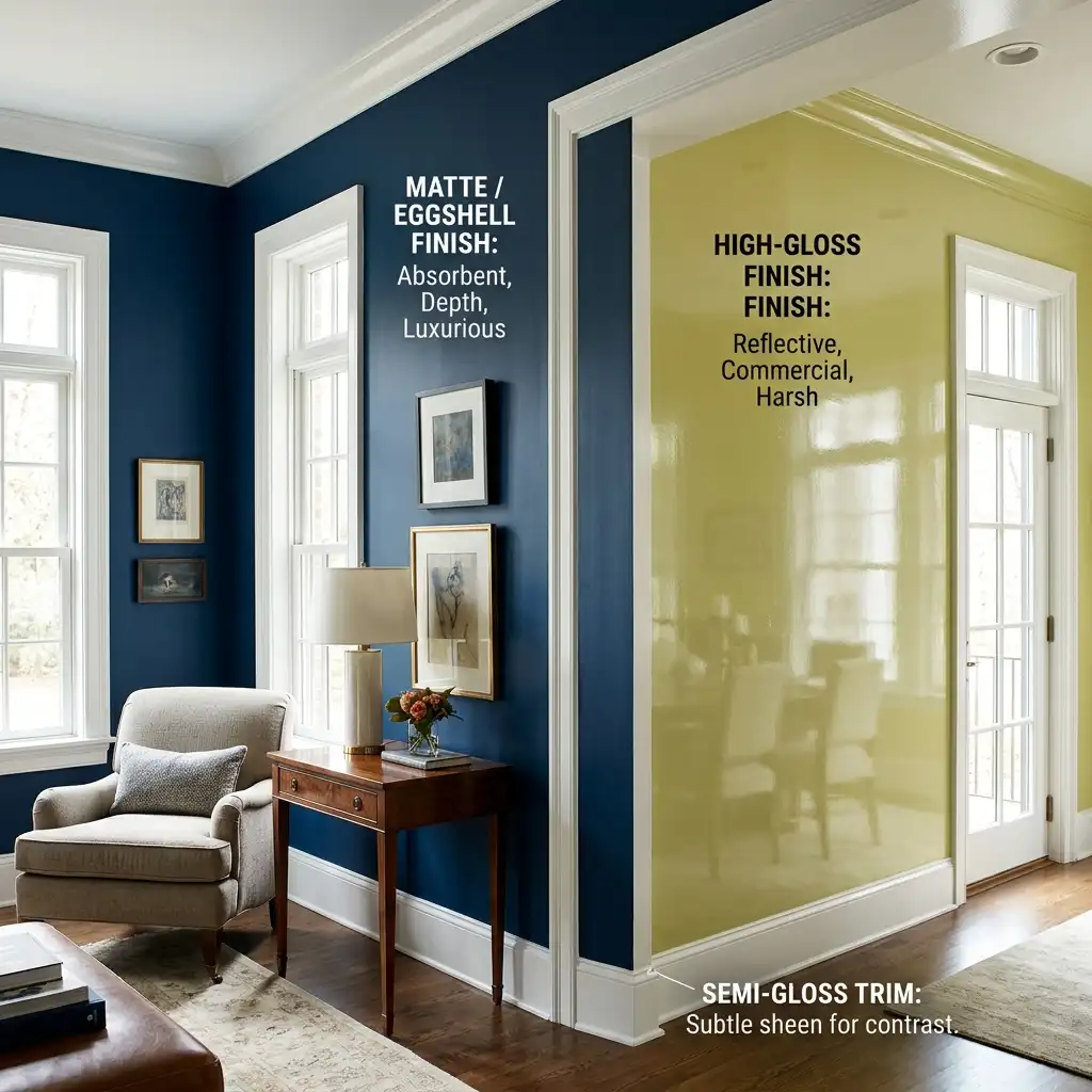
Commitment. Half-measures don’t look expensive. A cautious, light version of a bold color reads as nervous. A full commitment — all four walls, including behind the furniture — reads as intentional. The most expensive-looking rooms I’ve walked into were painted decisively.
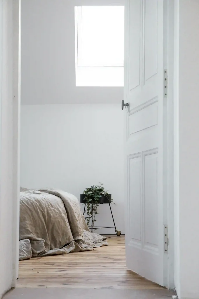
With that foundation, here are the colors.
Part 1: The Quiet Luxury Neutrals
These are the colors that look expensive without trying. They’re not dramatic, not bold — but they’re so carefully chosen that they make every other element in the room look more deliberate.
1. Mushroom Taupe — The “Quiet Luxury” Neutral
If I had to name one color that defined the high-end interior aesthetic of 2026, it would be mushroom taupe. It sits at the intersection of gray, beige, and brown, and it does something none of those colors does alone: it creates a deeply calming, sophisticated neutral that feels specific rather than safe.
The key word there is specific. Cool gray reads as “I didn’t know what to choose.” Beige reads as “I was afraid to choose.” Mushroom reads as “I chose this deliberately, and I know exactly why.”

It pairs beautifully with warm brass hardware, linen upholstery, warm white trim, and dark wood floors. It works in living rooms, bedrooms, dining rooms, and hallways.
What to look for: Warm undertones are essential. A mushroom that pulls too gray will look like a 2015 rental. Look for one with brown or slightly ochre undertones.
Try: Benjamin Moore Pale Oak (OC-20), Sherwin-Williams Accessible Beige (SW 7036), or any mushroom-toned greige with LRV between 55 and 65.
Best paired with: warm brass fixtures, natural linen, oak or walnut furniture, warm white trim.
2. Warm Greige — The Chameleon Neutral
Greige — the combination of gray and beige — has been popular for years, but the 2026 version is specifically warm greige, not the cool, blue-based grays that defined the previous decade and are now widely considered dated.
Warm greige reads as a balanced, adaptable neutral that looks completely different depending on the light in your room — almost golden in morning sun, more neutral in the afternoon, and genuinely cozy under warm lamp light in the evening.
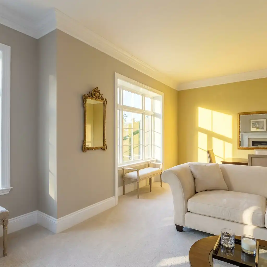
Interior painters and designers increasingly recommend it as “the safest expensive-looking combo” when paired with clean white trim. It’s also the most resale-friendly wall color on this list — buyers respond positively to it because it reads as considered without feeling polarizing.
Try: Sherwin-Williams Agreeable Gray (SW 7029), Benjamin Moore Revere Pewter (HC-172), or Sherwin-Williams Accessible Beige. These three are among the most-purchased premium interior colors in the US for a reason.
Best paired with: crisp white trim, warm wood floors, neutral upholstery in cream or ivory.
3. Creamy Off-White — The Elevated Alternative to Bright White
Bright white walls look clean in photographs and slightly institutional in real life. Creamy off-white does what bright white tries to do — creates a sense of space and light — but with warmth that makes a room feel genuinely inviting rather than clinical.
A Behr survey found that more than half of homeowners believe white walls make rooms look more spacious. They’re right. But the version that makes a room look expensive is off-white, not stark white.
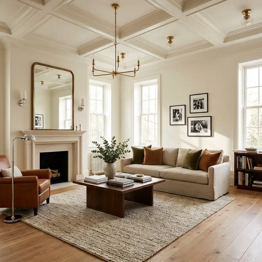
Farrow & Ball’s Pointing (No. 2003) is one of the most beautiful off-whites I’ve encountered. It’s slightly warm, slightly creamy, and it photographs extraordinarily well. Benjamin Moore White Dove (OC-17) is the American equivalent — warm, clean, and endlessly adaptable.
For something with slightly more character, Slipper Satin by Farrow & Ball reads as “white” but carries a rich, enveloping warmth that people consistently notice and ask about. Interior editor Monika Eyers describes it perfectly: “It reads as ‘white’ but not too crisp and not too yellow. Just a rich enveloping tone that works with everything.”
Try: Farrow & Ball Pointing, Benjamin Moore White Dove, Farrow & Ball Slipper Satin, Dutch Boy Melodious Ivory.
Best paired with: any furniture color, natural stone, warm wood floors, polished chrome or brass fixtures.
4. Warm Linen — Texture in a Color
Warm linen shades sit just slightly more colored than off-white — they have a slight warmth that suggests actual texture without any texture being present. In a room with good natural light, a warm linen wall looks almost luminous.
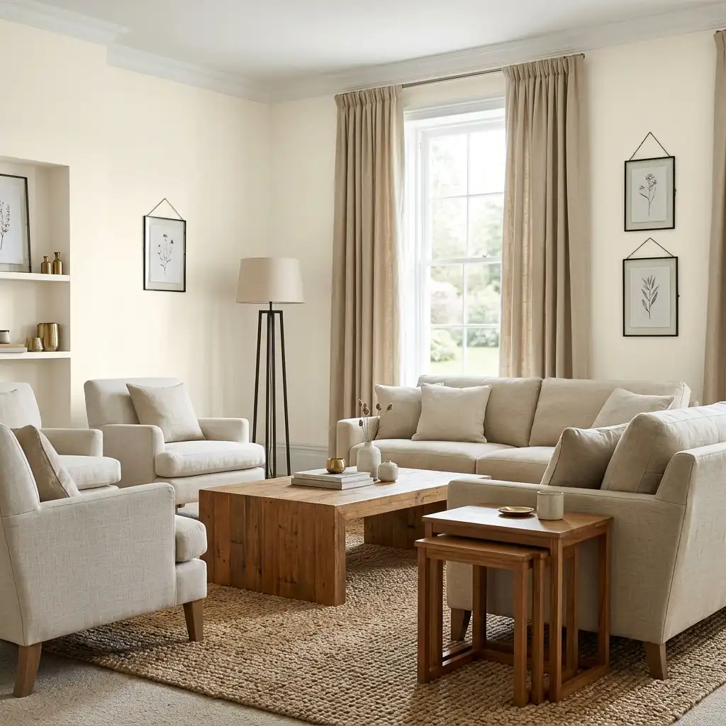
Magnolia Home’s Soft Linen became well known for a reason: it adds warmth without adding color in any visible way. It’s a color that reads as sophisticated in part because most people can’t quite identify it — it just looks right.
Best paired with: natural fiber rugs, linen or cotton upholstery, warm wood tones, black or dark metal fixtures for contrast.
Part 2: The Colors That Signal Sophistication Immediately
These are the colors that make a room feel elevated the moment you walk in. They take confidence to use, but they pay off.
5. Hague Blue — Farrow & Ball No. 30
If there is one Farrow & Ball color that fully earns its reputation and its price, it’s Hague Blue. It’s a near-black navy with a green base that keeps it from going flat and cold. At LRV 6, it sits at the deep end of the palette — rich in daylight, dropping to almost black under evening lamps.
On a study wall, a library of built-ins, or a set of kitchen island cabinets, it looks deliberate in a way that’s genuinely difficult to achieve with a cheaper paint match. The density of Farrow & Ball’s pigment matters here — this is one of the colors where the brand premium is genuinely justified.
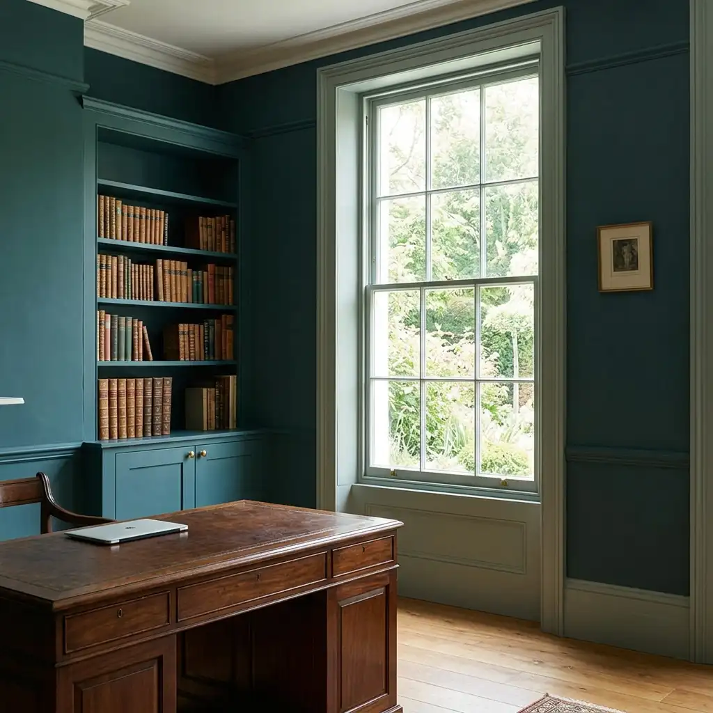
Interior designer Laura Elliott calls navy blue “endlessly versatile, especially in living rooms and kitchens.” It creates a calming effect while reading as expensive because deep navy has a long history in high-end interiors — from Georgian drawing rooms to contemporary boutique hotels.
Pair with: ivory or cream upholstery, warm brass lighting, warm wood floors, and crisp white ceiling to keep the room from feeling too heavy.
Best for: living rooms, studies, dining rooms, kitchen cabinetry, bedrooms with high ceilings.
6. Railings — Farrow & Ball No. 31
The off-black sibling of Hague Blue. Where Hague Blue leans navy, Railings carries a blue-gray undertone that reads as soft charcoal in good light and near-black at night. It’s the British answer to a true black without the harsh flatness that makes pure black walls feel oppressive.
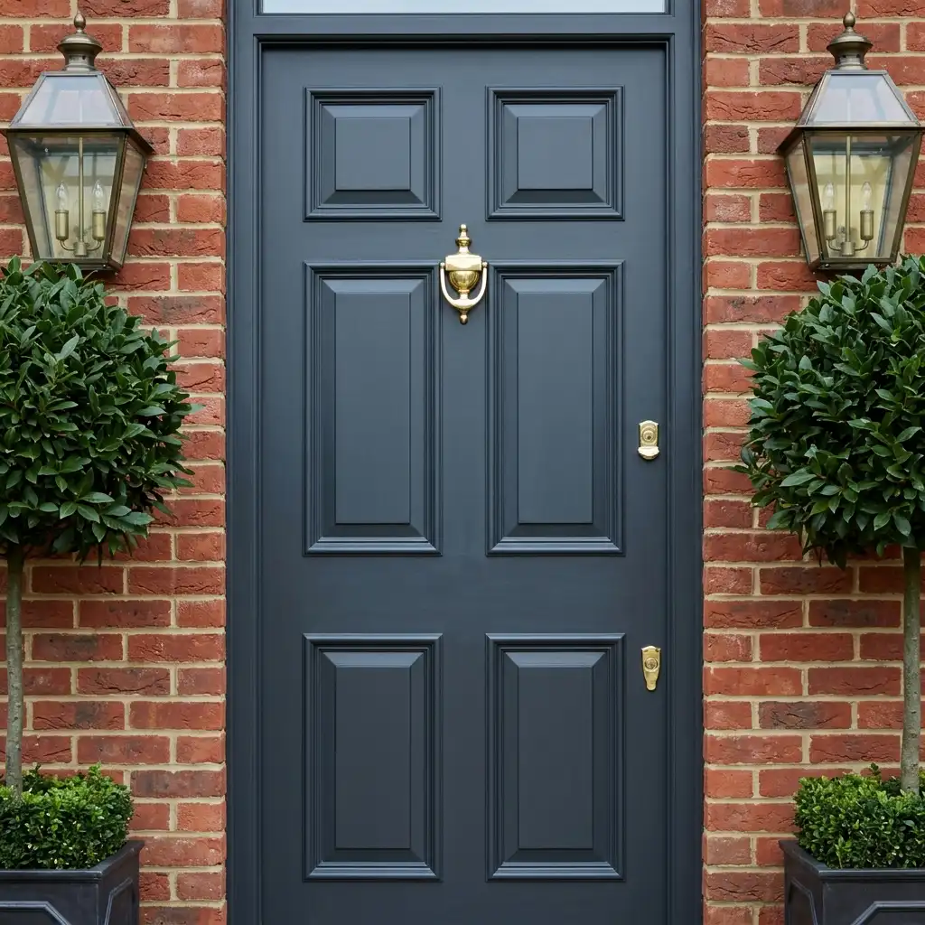
This is one of those colors that works beautifully on doors and trim even when the walls are a completely different color — using it on interior doors creates a punctuation that reads as custom and high-end with relatively little effort.
Best for: doors, trim, accent walls, cabinetry. Also works as an all-over wall color in rooms with substantial natural light.
7. Benjamin Moore Silhouette AF-655 — Espresso Brown With Depth
Benjamin Moore’s 2026 Color of the Year is a rich espresso-brown with subtle charcoal undertones — designed as a sophisticated alternative to black or very dark gray. It feels grounded and luxurious simultaneously.

Interior designers describe it as a color that “adapts fluidly to natural light, transitioning from a soft, inviting tone in dimmer spaces to a polished, layered presence in brighter settings.” In a bedroom, it anchors the space and makes the bed feel like the intentional focal point it should be. In a living room, it creates the kind of rich atmosphere that takes years to achieve with furniture alone.
Paint the trim in warm brass tones or rich cream to prevent the room from feeling heavy.
Best paired with: warm metals (brass, bronze), soft white bedding or upholstery, textured fabrics (velvet, boucle), layered lighting.
8. Charcoal — Sherwin-Williams Iron Ore
Iron Ore by Sherwin-Williams is a striking, charcoal-rich shade with what interior designer Ava Milani calls “architectural precision.” Its depth creates a sculptural quality in low light — it makes walls feel like they have weight and intention. In natural or bright light, it reveals subtle layers of warmth.
This is the color that makes people stop when they walk into a room. Used on all four walls with warm lighting, it creates a space that feels genuinely distinctive. Used on a single accent wall behind a sofa or bed, it anchors the room without overwhelming it.
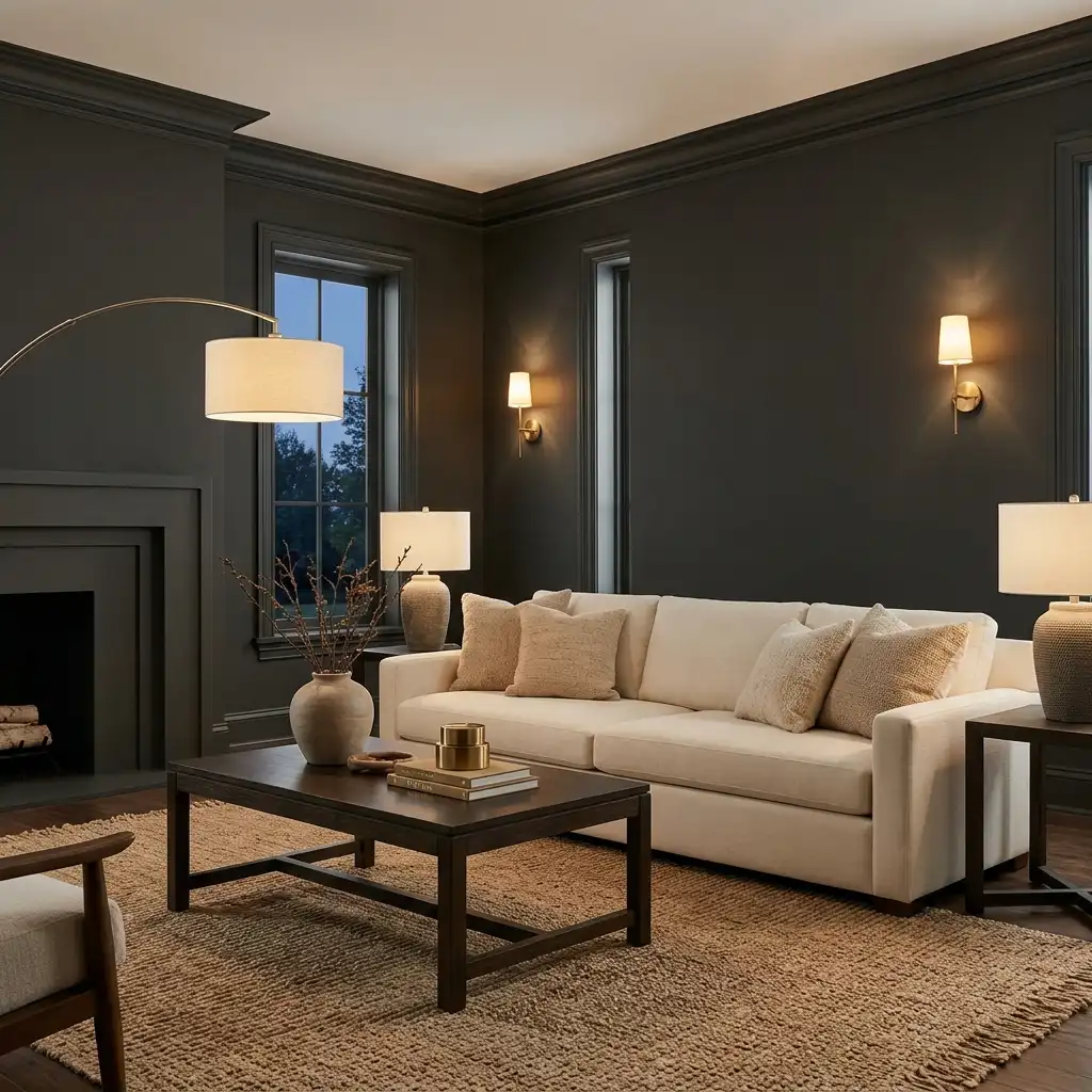
Important: Charcoal walls require solid, layered lighting. A single overhead light will make the room feel like a cave. Three or four light sources — floor lamps, table lamps, sconces — transform it into something extraordinary.
Best for: living rooms with layered lighting, bedrooms, media rooms. Pair with warm brass, cream, and natural textures.
9. Warm Mahogany — PPG 2026 Color of the Year
PPG designated Warm Mahogany as their 2026 Color of the Year — a sophisticated red-toned hue that anchors shared spaces with inviting depth. It appears effectively in living rooms, dining areas, and on kitchen cabinetry, either as a statement wall or a full-room commitment.

Red-toned walls have a long history in luxury interiors — think English manor dining rooms, traditional libraries, and high-end restaurant interiors. Warm Mahogany is the 2026 version: still warm and enveloping, but without the intensity of a true red.
Best for: dining rooms, living rooms, studies. Pair with cream or ivory, warm wood tones, and bronze or antique gold hardware.
Part 3: The Greens That Look Expensive
Green is the dominant story of 2026 in high-end interiors. But not all greens are equal. The ones that look luxurious share specific characteristics: they’re muted rather than bright, complex rather than flat, and they lean toward the earthy, olive, or inky end of the spectrum.
10. Dark Olive / Deep Olive Green
Interior designer Gabrielle Bove puts it plainly: “To me, dark greens, browns, and blues are wonderful colors for elevating any interior.” Dark olive in particular has an “effortless richness” — it feels as though it’s always belonged in a space, giving the room a sense of permanence and depth.
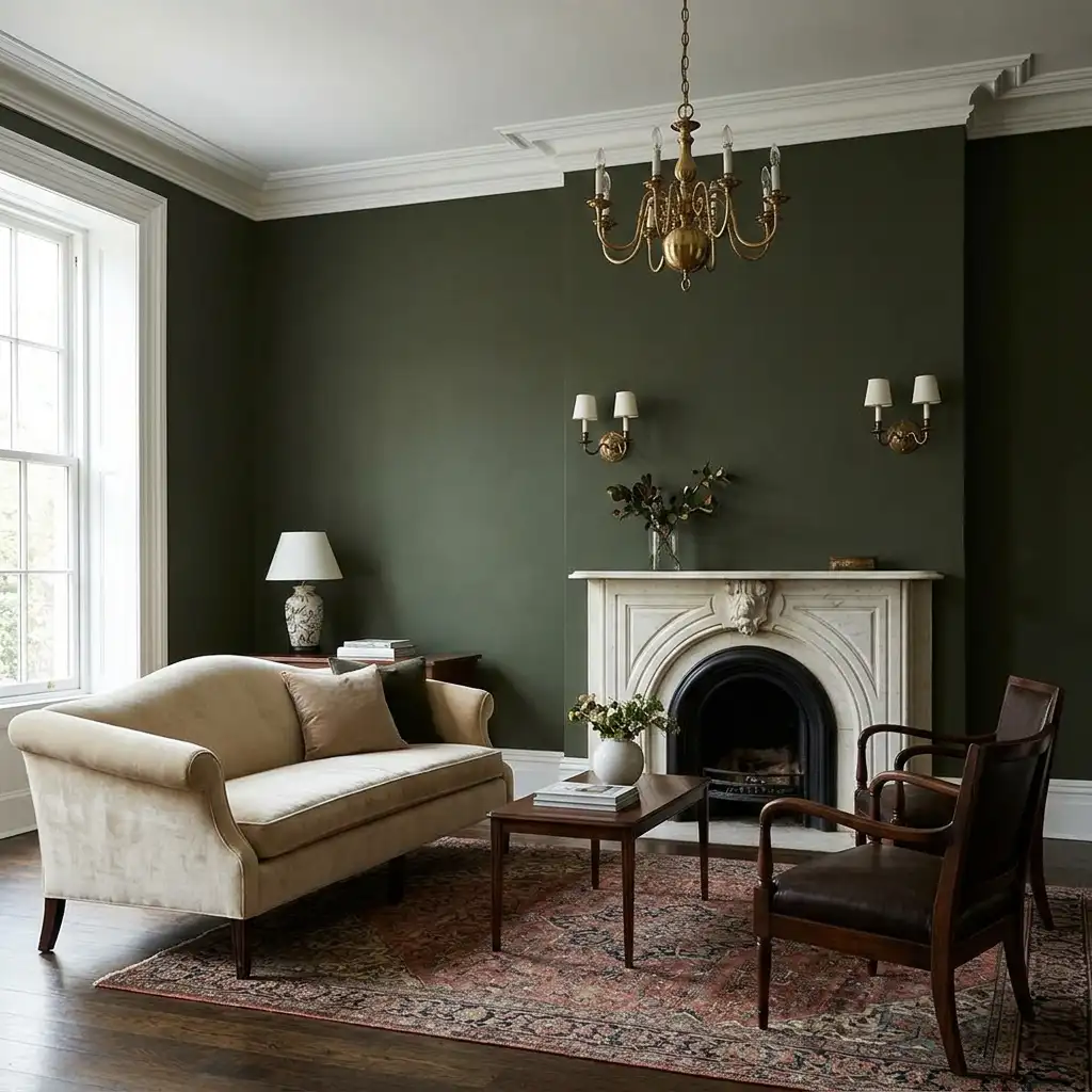
Design writer Sarah Akwisombe describes warm olive greens as having “a quietly understated quality — earthy, grounded tones that don’t shout for attention. There’s a quiet confidence to them.”
Try: Benjamin Moore Salamander, Sherwin-Williams Muddled Basil, Farrow & Ball Broccoli Brown (No. 198).
Best paired with: cream or ivory upholstery, warm brass or antique gold fixtures, vintage rugs, natural wood tones.
11. Farrow & Ball Broccoli Brown (No. 198) — Green-Brown Luxury
Interior designer Katie Lindquist calls this her color for 2026 projects: “I love how it brings an old-world, heritage quality to a space, but when paired with clean-lined furniture or modern art, it suddenly feels incredibly fresh.”

It’s a green-brown hybrid that sits in neither territory fully — which is exactly what makes it interesting. In warm light it reads warm brown; in cooler light it pulls toward green. That complexity is what makes it feel expensive.
Best for: living rooms, dining rooms, studies. Works beautifully with modern furniture (the contrast between heritage color and clean-lined furniture is particularly effective).
12. Hunter Green — “The Color of Money”
Interior designer Dee Dee Taylor Eustace is direct about this one: “When in doubt, go with a true hunter green — the color of money. It’s deep, classic, and always reads as expensive.”
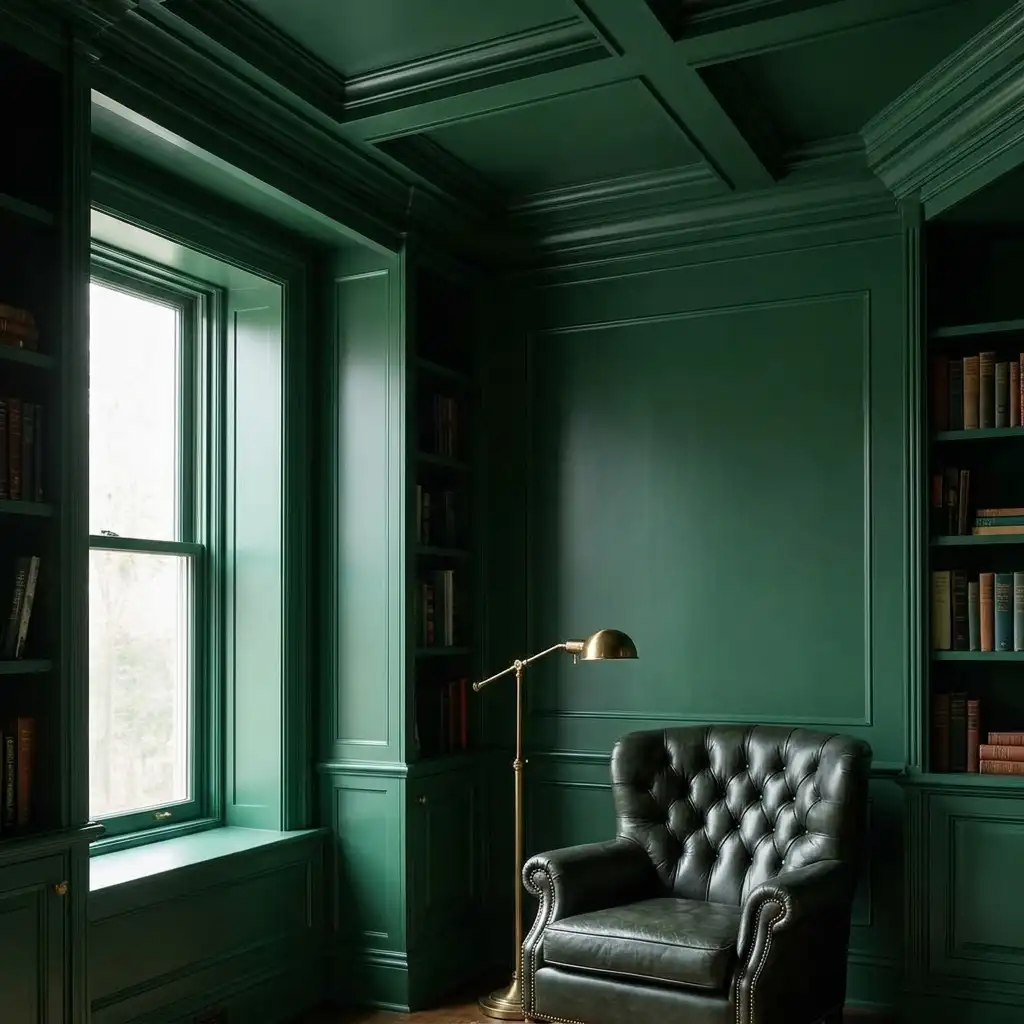
Hunter green works beautifully for color-drenching — painting walls, ceiling, and trim the same shade or closely related shades. In a living room or bedroom, a fully color-drenched hunter green space feels like a jewel box.
Try: Benjamin Moore Regent Green, Farrow & Ball No. 94 Carriage Green.
Best for: living rooms, bedrooms, libraries. Pair with pink accents for a Palm Beach-inspired look, or warm cream and brass for a more traditional approach.
13. Inky Forest Green / Near-Black Green
A nearly black, deep forest green that in 2026 is replacing black as the sophisticated moody choice for premium interiors. In low light it reads almost black; in natural light the green reveals itself — and that reveal is what makes it feel luxurious rather than just dark.
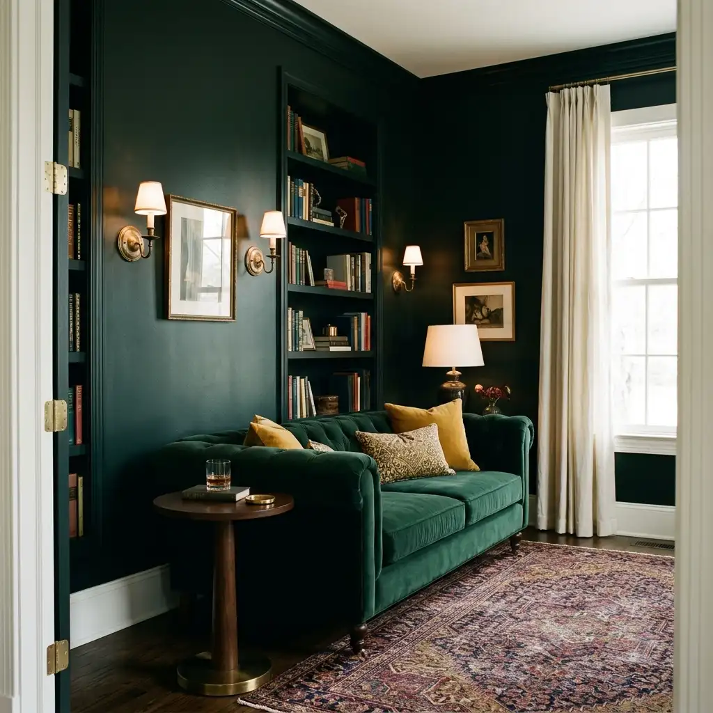
Pair with Simply White trim, unlacquered brass sconces, a velvet sofa in emerald or mustard, and a vintage Persian rug. The result photographs like a boutique hotel interior.
Try: Farrow & Ball Invisible Green, Benjamin Moore Tarrytown Green.
Best for: mid-century modern and traditional library-style rooms with layered lighting.
14. Pigeon — Farrow & Ball No. 25
A rich, smoky green with a soft blue undertone. Interior designer Cyndy Cantley describes it as “irresistibly inviting — it works beautifully on cabinetry, walls, front doors, even in kids’ rooms and offices. It has so much depth and never feels harsh.”
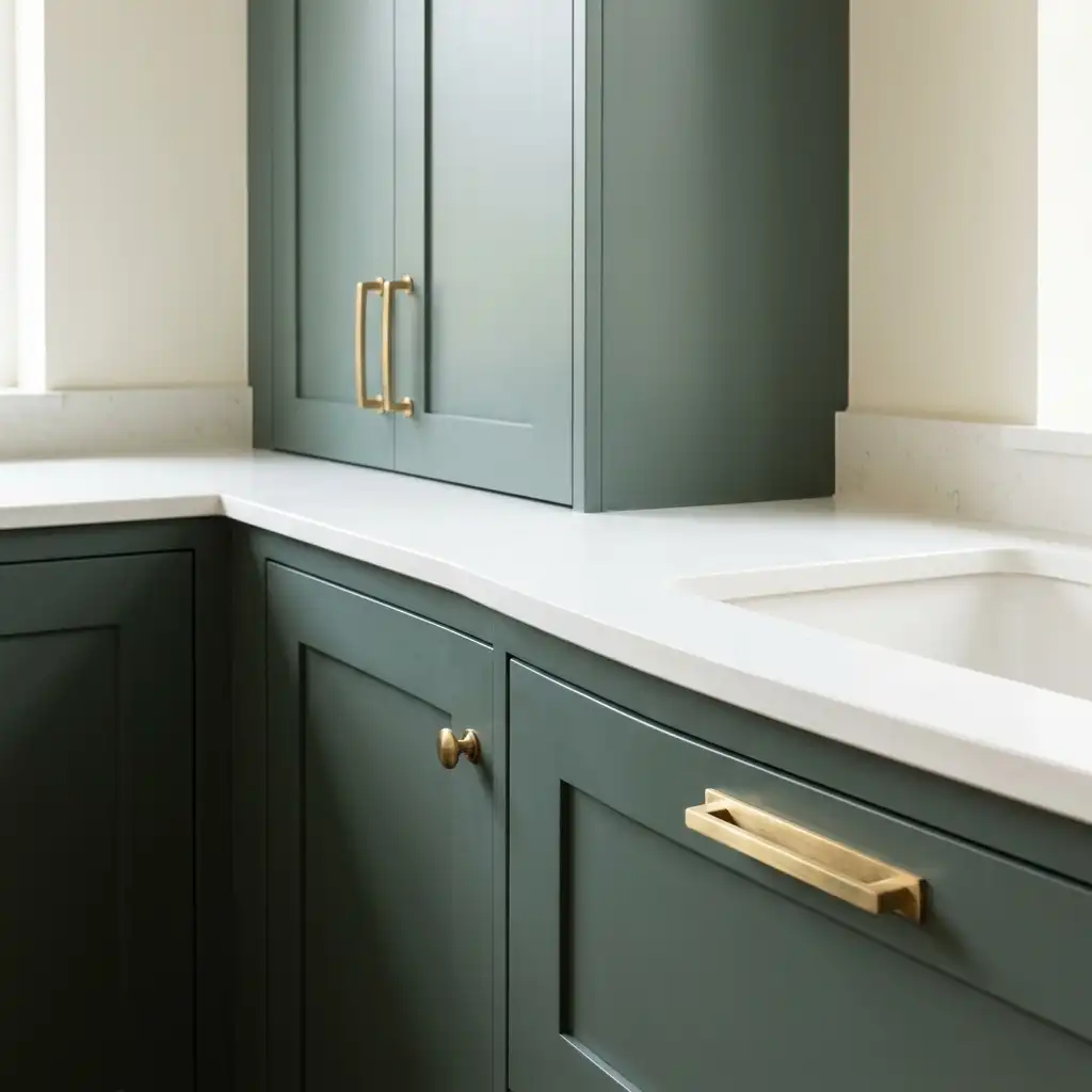
This is one of those colors that works in almost any room and almost any style — traditional, contemporary, Scandinavian, maximalist. Pair it with Farrow & Ball’s Shaded White for a calm, layered look that reads as genuinely considered.
Best for: kitchens (cabinetry), living rooms, bedrooms. Extremely versatile.
15. Sage Green — Valspar Sage Slate (2026 Color of the Year)
Valspar’s 2026 Color of the Year is a naturally restorative, serene sage that feels grounded and organic. Where the other greens on this list are dramatic and bold, sage green earns its place in the luxury category through restraint — it’s a color that makes a room feel alive without demanding attention.
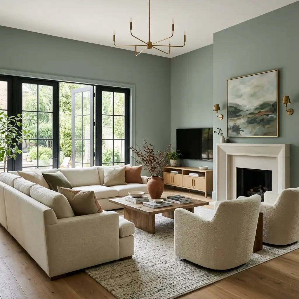
In a high-end context, sage green on walls with warm wood floors, cream upholstery, and unlacquered brass fixtures is a combination that reads as quietly expensive rather than obviously designed.
Best for: living rooms, bedrooms, bathrooms. Pairs with warm wood tones, linen, and terracotta accents.
Part 4: The Bold Choices With History
These are colors that have appeared in luxury interiors for decades or centuries. They’re not trend colors — they’re permanent fixtures in the high-end palette that happen to be particularly popular right now.
16. Oxblood / Deep Burgundy
Oxblood — a deep, dark red with brown undertones — has a centuries-long association with luxury. It appears in the dining rooms of Georgian manor houses, the studies of Victorian gentlemen, and the living rooms of collectors and designers who care more about permanence than trend.
In 2026 it’s experiencing a genuine resurgence, driven by designers moving away from the clinical neutrals of the previous decade toward colors with warmth, history, and personality.

Pair oxblood with dark wood furniture, warm brass or antique bronze fixtures, cream or ivory trim, and layered lighting. The combination reads as genuinely wealthy in a way that’s difficult to fake with lighter colors.
Best for: dining rooms, living rooms, studies, bedrooms. Not for kitchens or bathrooms.
17. Adventurer — Little Greene (Plum Aubergine)
Little Greene’s Creative Director Ruth Mottershead forecasts “a natural progression in the use of burgundy and warm honey tones” for 2026. Their color Adventurer — described as “a reassuring plum aubergine hue” — suggests luxury, intimacy, and a restful environment.
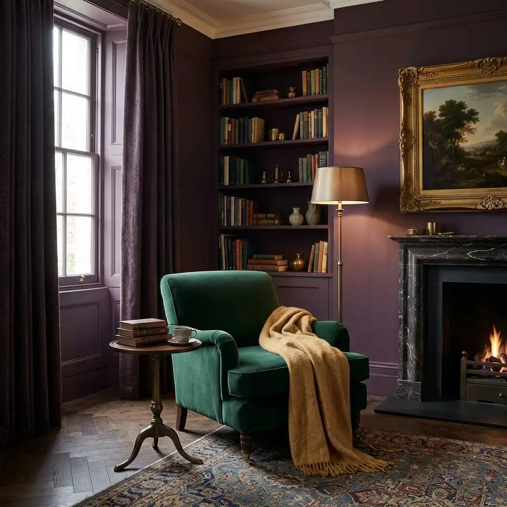
Deep purple has historically been linked with royalty and luxury, and muted versions like Adventurer carry that association without feeling theatrical. It creates a cozy atmosphere well suited to bedrooms, reading rooms, and intimate sitting areas.
Best paired with: soft lighting, velvet fabrics, metallic accents in gold or antique bronze.
18. Dusty Blue / Stiffkey Blue — Farrow & Ball
Interior designer Erica McLain describes dusty blue as bringing “rich and complex tones that feel both modern and nostalgic, drawing inspiration from the deep hues of old world textiles and timeworn patinas.” It adds an air of tailored elegance that’s difficult to achieve with more obvious choices.
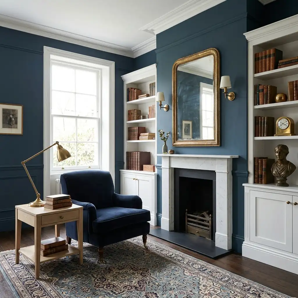
Stiffkey Blue (Farrow & Ball) is the quintessential version — a deep, sophisticated blue with gray undertones that reads as genuinely distinctive without being loud. It pairs beautifully with crisp whites, warm metallics, and light wood tones.
Best for: bedrooms, living rooms, studies, bathrooms. Particularly effective in rooms with period architectural detail.
19. Navy Blue — Timeless Luxury
Navy has been a fixture of luxury interiors for so long that it’s become almost definitionally expensive. It has a calming effect — designer Laura Elliott compares it to “the ocean and the night sky” — while creating a depth that makes every other element in the room look more intentional.

For a genuinely elevated look, pair navy walls with ivory upholstery, warm gold tones (jewel tones pair beautifully with deep blues), warm wood floors, and layered lighting. The contrast between the deep navy and the warm, lighter elements is what creates the luxury effect.
Best for: living rooms, dining rooms, bedrooms, home offices. Works in both traditional and contemporary settings.
20. Farrow & Ball Dead Salmon — The Unexpected Luxury Color
The name is terrible. The color is one of the most beautiful I’ve ever seen on a wall.
Dead Salmon is a muted, dusty terracotta-pink with gray undertones that prevents it from reading as pink at all. Against white trim and warm brass hardware, it looks expensive in a way that’s difficult to articulate until you see it. The gray undertones give it a depth that pure terracotta or pink lacks — it reads as a sophisticated color choice by someone who knows exactly what they’re doing.
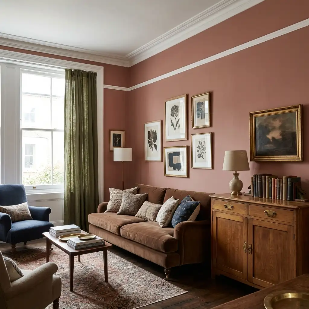
This is one of those colors that converts skeptics. I’ve recommended it to several people who said “absolutely not” when they saw the chip and “I can’t believe how good this is” when they saw it on the wall.
Best for: living rooms, bedrooms, dining rooms. Traditional, eclectic, and maximalist styles.
Part 5: The Statement Colors
For people who want their home to make an unmistakable impression.
21. Hidden Gem — Behr 2026 Color of the Year (Smoky Jade)
Behr describes it as “a smoky jade with an air of mystery and sophistication.” It blends blue-green elegance with a deep, grounded personality that catches attention without feeling overwhelming.
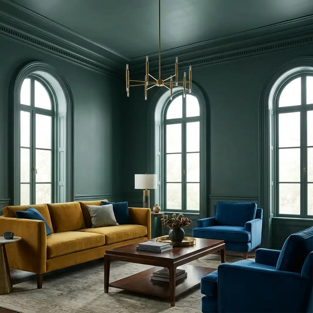
Used for color drenching — walls, trim, and ceiling the same shade — it creates a space that feels genuinely immersive. Used as a statement wall in a neutral room, it grounds the space with a color that reads as expensive precisely because it’s so specific and unusual.
Best for: living rooms, bedrooms, bathrooms. Works beautifully in color-drenched applications.
22. Teal — The Bold Hybrid
Teal manages to be calming and bold simultaneously — it has the depth of green and the coolness of blue in a combination that in 2026 feels more current than either dark green or navy used alone.
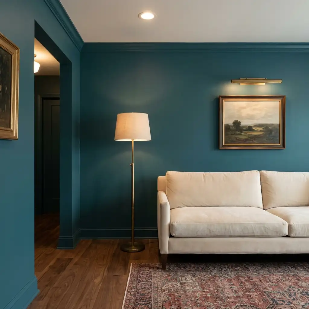
For a luxury application, pair teal walls with warm wood tones, unlacquered brass fixtures, cream upholstery, and layered lighting. The warmth of the wood and brass counterbalances the coolness of the teal, creating a richly layered palette that reads as designed.
Best for: living rooms, bedrooms, dining rooms. Eclectic, mid-century modern, and maximalist styles.
23. Chartreuse / Green Ground — Farrow & Ball No. 206
Interior designer Sherrell Neal calls chartreuse “the it girl of the moment” for 2026, recommending Farrow & Ball Green Ground or Benjamin Moore Citrus Burst in high-gloss lacquer for a genuinely dramatic, high-impact application.
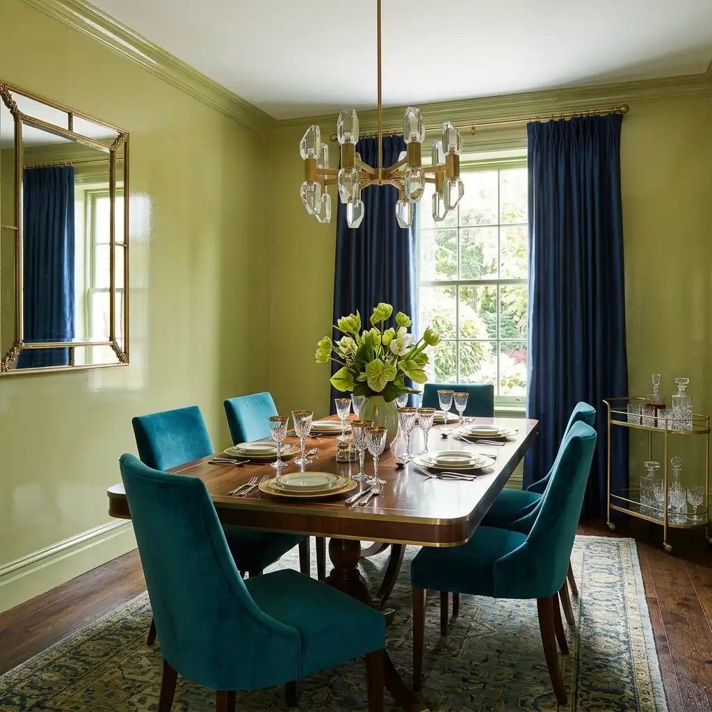
Chartreuse is not a cautious choice. It’s a color for people who want a room that makes an immediate, unforgettable impression. In a high-gloss lacquer finish — particularly on cabinetry or a single feature wall — it reads as extraordinarily sophisticated. The high-gloss finish elevates chartreuse from quirky to genuinely luxurious.
Best for: dining rooms, powder rooms, accent walls. High-gloss finish is essential for the luxury effect.
24. Nancy Blushes — Farrow & Ball (Muted Pink)
Farrow & Ball’s muted pink has been described as capturing the “Rebel Pink” trend in a grown-up way that reads as sophisticated rather than sweet. Unlike saturated pinks, Nancy Blushes has enough gray and beige in its undertones to read as a nuanced, complex neutral in rooms with warm existing elements.
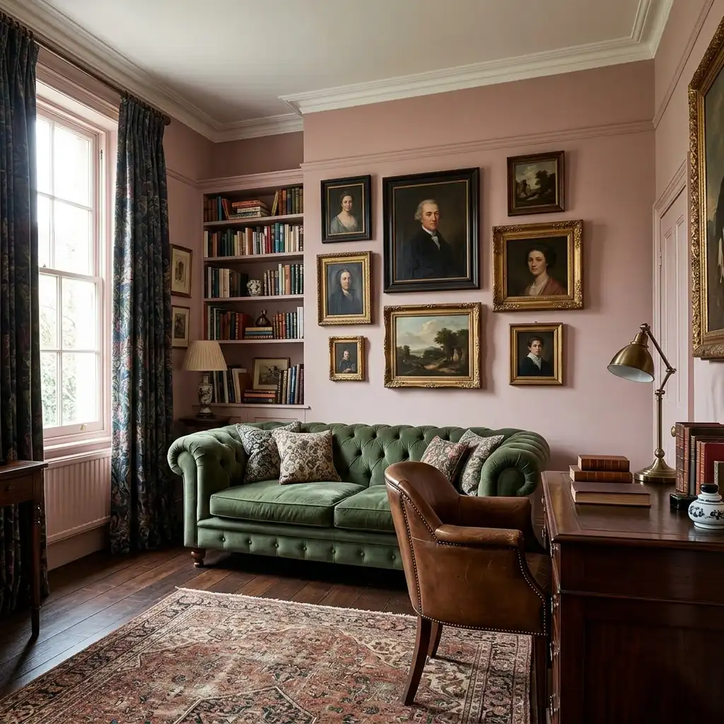
This is the pink that works in a serious room — a study, a living room, a formal bedroom — because it brings warmth and softness without the sweetness that makes pink feel juvenile.
Best for: bedrooms, living rooms, studies. Traditional, eclectic, and maximalist styles.
25. Warm Terracotta — Muted and Earthy
The 2026 version of terracotta is not the bold orange of the 1990s. It’s sun-baked, dusty clay — muted with gray undertones that stop it from feeling loud. It captures what multiple design forecasters describe as the Southwestern and Mediterranean mood driving 2026’s design direction.
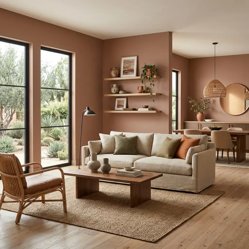
For a genuinely luxurious application, pair terracotta walls with natural linen, warm wood tones, rattan or woven accessories, and matte black or bronze fixtures. The result is a room that photographs beautifully and feels equally good in person.
Try: Farrow & Ball Dead Salmon (lighter, more sophisticated), Behr Burnished Clay, Benjamin Moore Clay Beige.
Best for: living rooms, bedrooms, dining rooms. Particularly effective in homes with natural wood floors.
The Techniques That Make These Colors Look Truly Expensive
Choosing the right color is only part of the equation. Here’s what actually separates a professional-looking result from a DIY paint job.
Always use eggshell or matte on walls
For luxury-looking walls, finish matters enormously. Eggshell (slight sheen, washable) or matte (flat, light-absorbing) are the professional standard for walls. High-gloss or semi-gloss on walls looks commercial — it belongs on trim and cabinetry only.
For deeply pigmented colors (the dark greens, the charcoals, the navy blues), matte finish is essential. The light-absorbing quality of matte paint is what gives these colors their depth.
Commit completely — paint behind the furniture
The most expensive-looking rooms are painted behind the furniture, not just on the visible walls. When you leave a stripe of unpainted wall behind the sofa, it reads as half-committed. Full commitment — all four walls, every surface — is what makes a color choice look intentional.
Pay serious attention to trim
Interior designer Kristina Phillips makes this point clearly: “Painting the trim a deeper tone, or even a contrast color, can add a bespoke, luxurious-feeling detail.”
In most luxury applications, trim is either:
- Crisp white or warm white (creates clean contrast with colored walls)
- The same color as the walls (color drenching — sophisticated and immersive)
- A slightly deeper or related tone (bespoke and distinctive)
What trim should never be in a luxury context: a different, unrelated color chosen carelessly.
Color drench for maximum impact
Color drenching — painting walls, ceiling, and trim in the same shade or closely related tones — is one of the most powerful techniques for making a room look expensive. It eliminates the visual choppiness created by high-contrast trim and creates a cohesive, enveloping quality that feels immersive.
It works particularly well with the deeper colors on this list: hunter green, navy, charcoal, oxblood, and the deep blues. In a small room, color drenching makes the space feel like a deliberate jewel box rather than a room that’s simply small.
Layer your lighting before choosing a color
The single most common mistake people make with bold paint colors is choosing a color without accounting for their lighting. Dark colors in rooms with a single overhead light look oppressive. The same dark colors in rooms with three or four light sources — table lamps, floor lamps, sconces — look extraordinary.
Before committing to any of the deeper colors on this list, walk through your room at night with only your current lighting turned on. If the room feels adequate, the color will likely work. If it feels dim or flat, add light sources before adding a dark color.
Test on the actual wall — not a chip, not a board
I’ve said this before and I’ll keep saying it: paint samples lie. The chip is printed on glossy paper under controlled lighting. A board you hold up to the wall doesn’t behave the same as paint applied to the actual surface.
Buy a sample pot. Paint a 12×12 inch swatch directly on the wall. Look at it at multiple times of day for at least 24 hours before ordering full gallons. Every color on this list can look slightly different from what you expect until you see it on your actual wall in your actual light.
The Colors I’d Choose Right Now
If I were designing a luxury-looking home today on a real budget, here’s exactly what I’d do:
For the living room: Farrow & Ball Dead Salmon on all four walls, with warm white trim (Pointing or Slipper Satin), warm brass light fixtures, cream linen sofa, and natural wood side tables. This is the combination that makes people stop and ask “what color is that?”
For the bedroom: Benjamin Moore Silhouette (the espresso brown Color of the Year) on the wall behind the bed, with warm white on the remaining three walls. Pair with warm brass bedside lighting, cream or ivory bedding, and dark wood furniture. It anchors the room and makes the bed feel like a genuine destination.
For a dining room that impresses: Warm Mahogany (PPG Color of the Year) on all four walls, with warm white trim and ceiling. Dark wood table, antique bronze or warm brass chandelier, and cream or ivory upholstered chairs. The combination looks like it belongs in a high-end restaurant.
For someone not ready to commit: Three warm greige walls (Sherwin-Williams Agreeable Gray) with one deep olive or hunter green accent wall. Add warm brass fixtures throughout. This is the combination that makes a standard rental feel like a considered design choice.
Frequently Asked Questions
What paint color makes a home look most expensive?
There isn’t one single answer, but designers consistently point to deep, complex colors — dark olive green, navy blue, charcoal, and oxblood — as the most reliably expensive-looking choices. Among neutrals, warm greige and mushroom taupe outperform cool gray and bright white in perceived luxury.
Is Farrow & Ball worth the price for luxury-looking results?
For the deeply pigmented colors on this list — Hague Blue, Dead Salmon, Railings — yes. Farrow & Ball’s pigment density genuinely differs from mainstream brands, and it shows particularly with dark, complex colors. For simpler neutrals, a carefully color-matched alternative from Benjamin Moore or Sherwin-Williams performs comparably.
What finish should I use for luxury-looking walls?
Eggshell or matte on walls, semi-gloss or satin on trim. Matte walls with semi-gloss trim is the professional standard for luxury interiors. High-gloss walls look commercial, not luxurious.
Does dark paint make a small room look smaller?
Not necessarily. A small room painted in a deep, saturated color can feel like a deliberate jewel box — intentionally intimate rather than cramped. The key is color drenching (painting trim the same color as walls) and adding multiple light sources. The rooms that feel cramped are the ones where dark walls are paired with high-contrast white trim and inadequate lighting.
What’s the one change that makes the biggest difference?
After years of writing about home design and testing colors in my own homes: switching from bright white or cool gray to a warm, complex neutral — mushroom taupe, warm greige, or an off-white with genuine warmth — is the highest-impact, lowest-risk change you can make. It makes every piece of furniture look more intentional and the whole room feel more considered.
What colors are dated in 2026?
Cool, blue-based grays (the Repose Grays and Revere Pewters of the 2015–2020 period), stark bright white with no warmth, and beige with pink undertones. If your walls are any of those, 2026 is a good year to update.
A Final Thought on Luxury and Budget
I want to be clear about something before you close this article.
Every color on this list is achievable on a real budget. You don’t need to buy Farrow & Ball for most of them — the luxury effect comes from the color choice, not the brand on the can. A well-color-matched Benjamin Moore or Sherwin-Williams version of almost any shade on this list will give you 90% of the same result at half the price.
What you do need is:
- A deliberate color choice (not a default)
- The right finish (eggshell or matte, not flat or semi-gloss)
- Proper preparation (clean walls, good primer for deep colors)
- Full commitment (all four walls, trim treated intentionally)
Luxury in a paint color is about intentionality, not expense. The most expensive-looking rooms I’ve ever walked into weren’t painted with $80-a-gallon British paint. They were painted by people who knew exactly what they wanted and committed to it completely.
That’s available to anyone.
Ambar Mitchell is the founder of HomefixTrends. She has been researching and writing about home design since 2022, with a focus on practical, budget-friendly ideas for real homes. She studied interior design research at the University of Texas at Austin.
Related articles you might like: