Nobody talks about how hard long living rooms are to decorate.
Every layout guide, every design tutorial, every “how to arrange your living room furniture” article on the internet is written for a roughly square room with reasonably proportioned walls and a sensible relationship between width and length. They show you where to put the sofa relative to the television, where to anchor with a rug, how to create a conversation grouping.

None of that advice works particularly well when your living room is fourteen feet wide and thirty feet long, or when it runs the full length of a railroad apartment with a door at each end, or when it is the kind of narrow Victorian terraced house room that is honestly closer to a corridor than a room.

Long rooms break the standard rules. And the people in them — confused and frustrated — end up with furniture pushed against walls and a room that feels like a waiting area no matter what they do to it.
This is the guide for those rooms. All of it specific to the actual problems that long, narrow, and awkwardly proportioned living rooms create.
First: Understand What You Are Actually Working With
Before any furniture is moved, any rug is purchased, or any layout is attempted, spend some time genuinely understanding the room you have. Not the room you wish you had. The one that exists.
Measure it. Write down the dimensions. Note where the windows are, which walls they are on, whether they are centered on their walls or offset. Note where the doors are and which way they swing. Note where the outlets are, where the cable or aerial point is, where the radiators or heating vents are. Note the ceiling height.
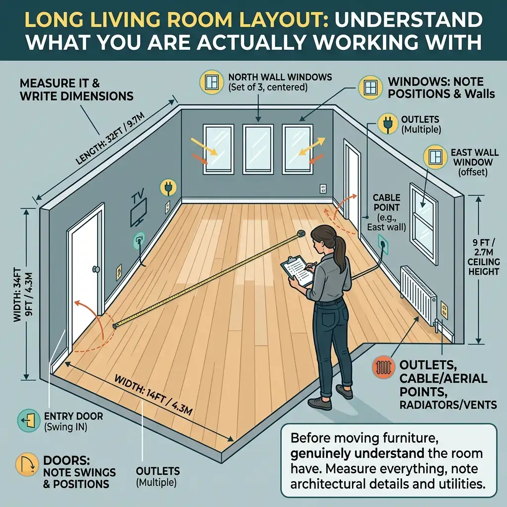
These fixed facts are the constraints your layout must work within, not around. The furniture arrangement that ignores where the outlets are will result in extension cords running across the floor. The arrangement that ignores the door swing will result in furniture that blocks the door from opening fully. Understanding the room before you start saves you from solutions that look good in theory and fail in practice.
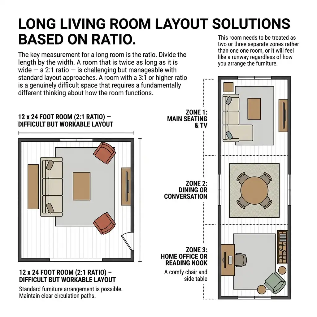
The key measurement for a long room is the ratio. Divide the length by the width. A room that is twice as long as it is wide — a 2:1 ratio — is challenging but manageable with standard layout approaches. A room with a 3:1 or higher ratio is a genuinely difficult space that requires a fundamentally different thinking about how the room functions.
A 12 x 24 foot room is 2:1. Difficult but workable.
A 10 x 35 foot room is 3.5:1. This room needs to be treated as two or three separate zones rather than one room, or it will feel like a runway regardless of how you arrange the furniture.
Also note the ceiling height. A long room with low ceilings (below 8 feet) has a different set of problems than a long room with high ceilings (9 feet and above). Low ceilings in a long room create a tunnel effect — the feeling that the room extends endlessly in one direction with no vertical relief. High ceilings in a long room are actually easier to work with because the vertical dimension provides some of the visual complexity that the horizontal dimension is lacking.
The Fundamental Problem With Long Living Rooms
Here is what is actually happening when a long living room feels wrong, stated simply.
A room feels comfortable and livable when it has focal points — things for the eye to land on and rest — at regular intervals. In a roughly square room, the fireplace or the television or a large window serves as a single focal point that the whole room orients around. This works because nothing in the room is too far from that focal point to feel connected to it.
In a long room, a single focal point at one end creates a hierarchy that the far end of the room never escapes. The end near the focal point feels like the “real” room. The far end feels like overflow space — the area you cannot figure out what to do with, the dead zone where the extra armchair sits looking lost.
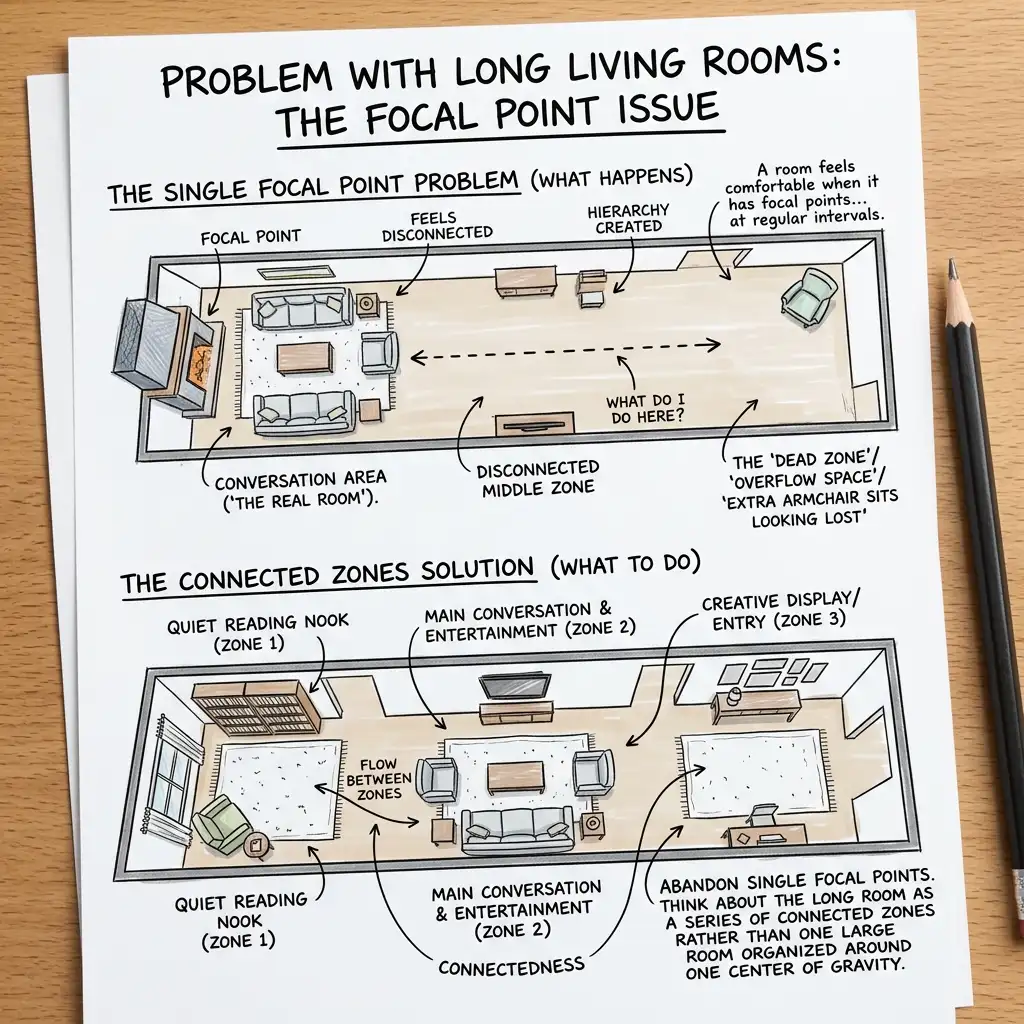
The solution is not to work harder at the single focal point approach. The solution is to abandon it entirely and think about the long room as a series of connected zones rather than one large room organized around one center of gravity.
This is the shift in thinking that changes everything about how long rooms get designed successfully.
The Zone Approach: What It Means Practically
Dividing a long living room into zones means creating two or three distinct areas within the room, each with its own furniture grouping and its own purpose, that feel related and coherent without feeling like one large undifferentiated space.
The zones in a long living room typically do one of the following:
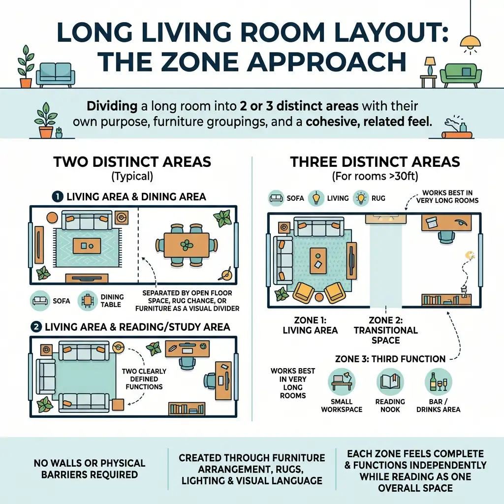
Zone 1 + Zone 2: Living area and dining area, or living area and reading/study area. Two clearly defined functions separated by open floor space, a rug change, or a piece of furniture acting as a visual divider.
Zone 1 + Zone 2 + Zone 3: Living area, transitional space, and a third function — often a small workspace, a reading nook, or a bar/drinks area. Works best in very long rooms above about 30 feet.
The zones do not need to be separated by walls or physical barriers. The separation is created through furniture arrangement, rugs, lighting, and the visual language of each zone. But each zone should feel complete enough to function independently — not like half a room — while still reading as part of the same overall space.
Layout Approach One: The Double Conversation Group
This is the most sophisticated solution for a long living room and also the most frequently avoided because it feels counterintuitive.
Instead of one sofa-facing-television arrangement at one end of the room, create two seating areas facing each other down the length of the room, each anchored by its own rug.
The first grouping — typically near the television or the main architectural feature — is the primary seating area. A sofa, two chairs or a loveseat, a coffee table, a rug that brings them together. Standard living room arrangement.
The second grouping — at the other end or the middle of the long room — is the secondary seating area. Two chairs facing each other across a small table, or a loveseat and a single chair, or a pair of chairs and an ottoman. Its own rug, slightly smaller than the primary area rug, clearly its own space.
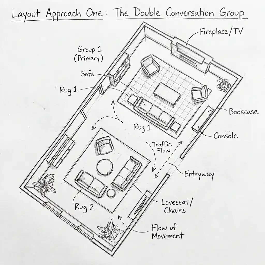
The effect is transformative. The room now has two focal points rather than one. The far end is no longer a dead zone — it has a reason to exist. Guests naturally distribute between the two areas rather than clustering at the primary end and leaving the rest of the room empty.
The gap between the two groupings matters. Leave enough open floor space between them to make clear that they are distinct zones rather than one oversized seating area. Generally 3 to 4 feet of clear floor between the outer edges of the two rugs reads well. Less than that and the zones merge visually. More than that and the gap dominates the room.
The furniture scale in each zone should reflect its purpose. The primary zone typically carries the larger pieces — the main sofa, the larger chairs. The secondary zone typically has lighter, more occasional furniture — the occasional chairs, the smaller loveseat. This creates a hierarchy that makes sense rather than two identical competing groupings.
Layout Approach Two: The Angled Arrangement
One of the most effective and most underused tools for long living rooms is rotating furniture off the parallel-to-the-walls orientation that most people default to.
When all furniture is parallel to the walls — sofa against one wall, chairs against the other, television at the end — the room reads as a long rectangular box, because that is exactly what it is, and the arrangement reinforces rather than counteracts the problem.
Rotating the primary sofa to a 45-degree angle to the walls creates a diagonal that cuts across the room’s long axis. The visual line of the sofa now travels across the room rather than along it. The effect is that the eye no longer follows the room to its far end — it follows the diagonal line of the sofa and then looks around the seating area.
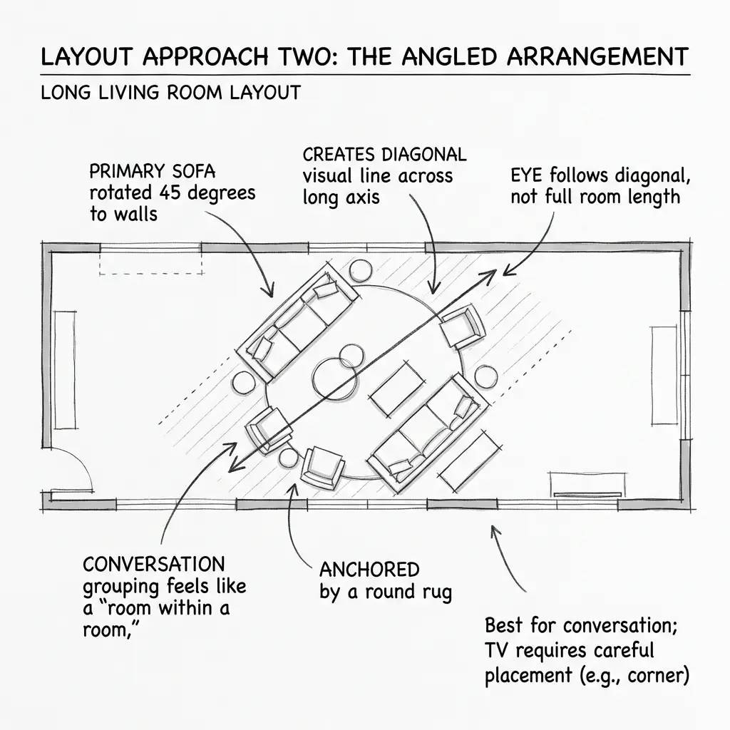
This works best in rooms where the furniture does not need to be oriented toward a television. If the primary purpose of the living room includes television watching, an angled sofa arrangement requires the television to be positioned carefully — typically on a diagonal wall or in a corner — to work functionally. If the primary purpose is conversation, reading, or general gathering rather than screen-forward use, an angled arrangement opens up considerably more options.
A conversation grouping with two sofas facing each other at a 45-degree angle to the room’s walls, anchored by a round rug, creates a zone that feels almost like a room within a room — self-contained and cohesive regardless of what is happening at the rest of the room’s length.
Layout Approach Three: The Furniture Divider
When a long room needs clear zone separation without construction, a piece of furniture positioned perpendicular to the walls — crossing the width of the room rather than running along it — creates a visual and spatial division.
The sofa is the most commonly used furniture divider. Positioned with its back to one zone and its front facing another, the sofa creates a clear boundary without blocking sightlines entirely. Someone in the primary living zone sees the back of the sofa. Someone in the secondary zone sees the front. Both zones are usable and distinct.
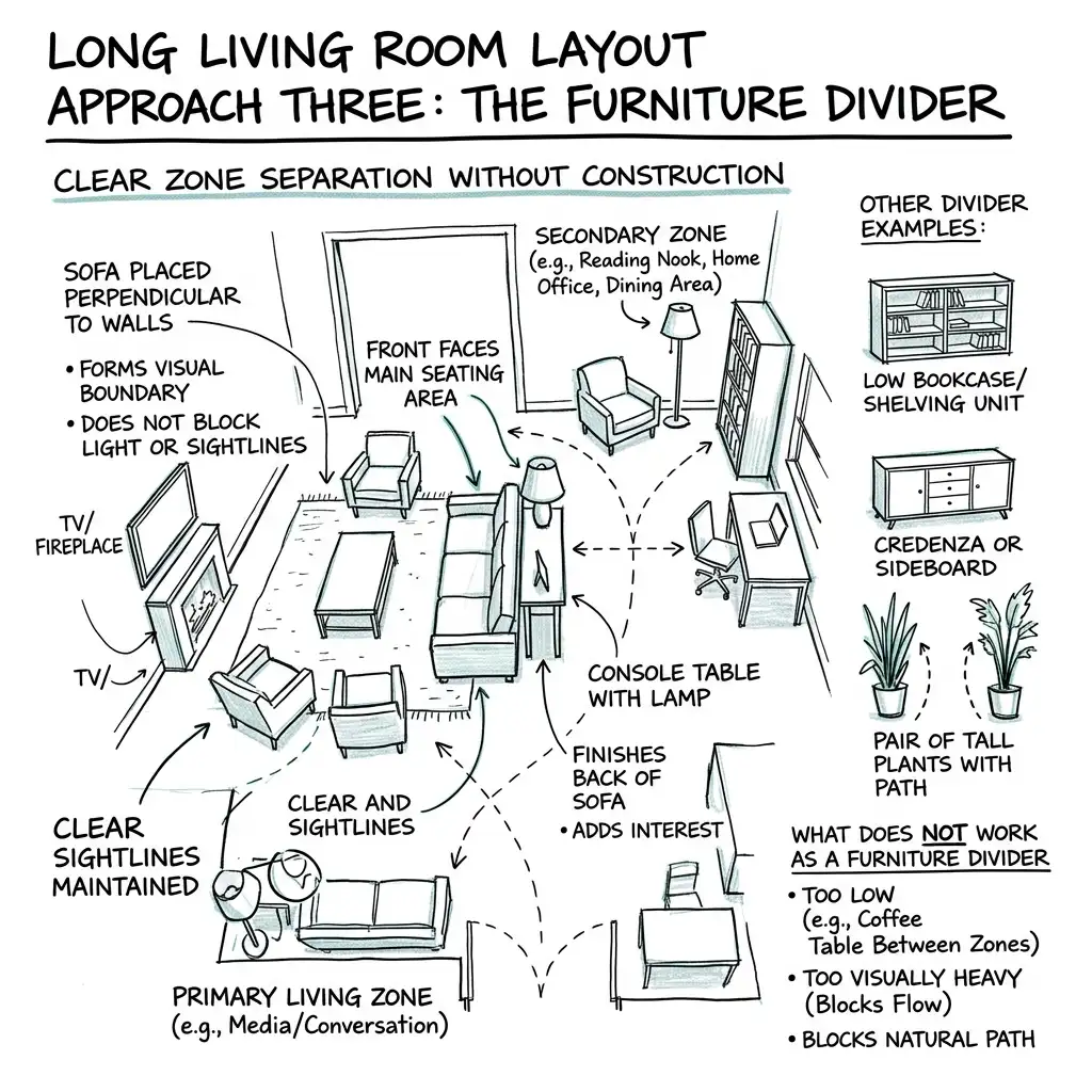
A console table behind the sofa-as-divider finishes the back of the sofa nicely and gives the secondary zone a furnished edge. A lamp on the console table makes the back-of-sofa view more interesting than the back of upholstered furniture usually is.
What can serve as a furniture divider:
A sofa placed perpendicular, as above. A large bookcase or shelving unit that does not reach the ceiling — enough to create visual definition without blocking light and airflow. A credenza or long sideboard. A pair of tall plants on either side of a clear path between zones.
What does not work as a furniture divider: anything too low to be visible at standing height (a coffee table between zones just looks like a misplaced coffee table), anything too visually heavy that blocks the sense of flow between zones, and anything that blocks the natural path through the room.
Layout Approach Four: The Through-Room Solution
Some long living rooms in terraced houses, older apartments, and shotgun-style homes are not living rooms in isolation. They are through-rooms — rooms that connect two other spaces, with doors or openings at both ends and a flow of traffic passing through regularly.
These are the hardest long living rooms to arrange because any furniture grouping that creates a zone also potentially creates an obstacle in the traffic path.
The solution is to embrace the through-room nature of the space rather than fighting it.
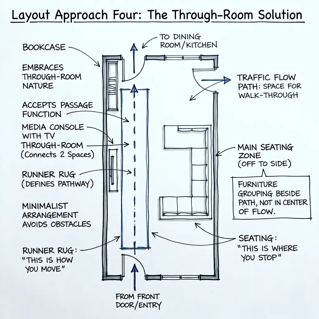
Create the main seating area off to one side of the through-path rather than in the center of it. If the room is wide enough, the primary sofa and chairs can occupy one side of the room’s width while a clear path runs along the other side. The furniture grouping is not in the center of the traffic flow — it is beside it.
Use the traffic path as a design element. A runner rug down the center of the through-room defines the path and acknowledges its existence rather than pretending it is not there. The rug says: this is how you move through the space. The furniture beside it says: this is where you stop.
Accept that the through-room is not only a living room. In a genuine through-room, one or two well-positioned seating pieces and a good light source are sometimes the entire right answer. Trying to create a full living room arrangement in a space that functions primarily as a passage produces furniture groupings that feel like obstacles rather than destinations.
Layout Approach Five: The Long Room as a Galley
The galley kitchen approach applied to a living room: furniture and storage arranged along both long walls, with a clear open center that serves as both the activity space and the traffic path.
This sounds austere but it is actually one of the most functional solutions for genuinely narrow long rooms — rooms where the width is less than 12 feet and every layout attempt at a traditional centered grouping creates a room that feels like a maze of furniture.
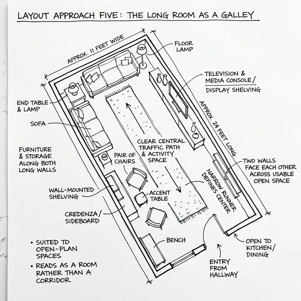
Along one long wall: the sofa or daybed, the television or the primary storage and display, the main lighting.
Along the opposite long wall: shelving or a credenza with secondary seating — a pair of chairs or a bench — positioned to face across the clear center space toward the primary wall.
The center remains open. A narrow runner rug defines it. The two walls face each other across a usable open space that reads as a room rather than a corridor.
The galley living room is particularly well-suited to open-plan spaces where the long living room shares its length with a kitchen or dining area. The galley logic extends naturally — kitchen at one end, dining in the middle, seating at the far end, all arranged along the walls with the center clear.
The Rug Strategy in Long Living Rooms
The rug is more important in a long living room than in any other room configuration. It is the single most powerful tool you have for creating zones, defining spaces, and breaking the tunnel effect of a long narrow room.
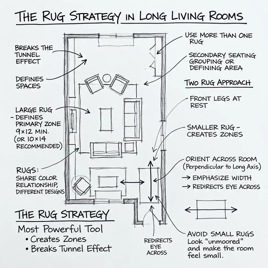
Use more than one rug. This is the most direct practical advice for a long room. One rug in a long room looks like a rug that was bought for the room and placed in it. Two rugs in a long room look like zones — like deliberate spatial thinking applied to a specific problem.
The two-rug approach: a larger rug under the primary seating grouping, a smaller rug under the secondary seating grouping or defining a specific area. The rugs should share a color relationship without being identical — same color family, or rugs that pull from the same palette in different designs.
Rug size is consistently underestimated in long rooms. The standard advice — rug should be large enough for the front legs of all seating furniture to rest on it — is correct but gets ignored regularly. A rug that is too small for the seating group it sits under makes the furniture look unmoored and makes the room look smaller rather than larger. In a long room where you are already fighting the narrow, runway effect, a too-small rug amplifies the problem.
For a primary seating group in a long living room, a 9 x 12 foot rug is the minimum appropriate size for most three-seat sofa arrangements. An 8 x 10 looks almost right and usually is not. A 10 x 14 or larger works beautifully and is consistently the better choice if the room can accommodate it.
Rug orientation can redirect the eye. A rug placed with its long axis running across the width of the room — perpendicular to the long axis — draws the eye across rather than along. This counteracts the tunnel effect by emphasizing the width. A rug placed with its long axis running the length of the room emphasizes the length and makes the room feel longer. In a room you are already trying to visually shorten, orient rugs across the room rather than along it where possible.
The Television Problem in Long Living Rooms
The television is the organizing principle of most living room layouts. In a standard square room, the television goes on one wall and the sofa faces it — simple and effective.
In a long room, placing the television at one end creates a room where half the seating is too far from the screen for comfortable viewing. The back half of a 30-foot room is 20-plus feet from the television — fine for a cinema, not ideal for a conversation room.

Solutions that actually work:
Position the television at the midpoint of one long wall rather than at the end. This keeps all seating within a more reasonable distance from the screen. The television is not at the far end of the room creating a dead zone behind the sofa — it is along the room’s side, which brings the viewing distance down significantly.
Use the television as a zone divider. A television positioned on a media unit placed perpendicularly to the room’s long walls creates a barrier between two zones while facing into the primary seating zone. The back of the media unit faces the secondary zone and can function as a shelf or storage surface for that zone.
Accept two television locations for genuinely long rooms. In a room over 25 feet long that has one end functioning as a living area and another functioning as a different zone, sometimes two smaller televisions — one for each end — is the more honest answer than one large television serving a room that is too long for it to work well.
Consider wall mounting at a mid-room location. A wall-mounted television on the long wall at a point that is genuinely centered between the two ends of the primary seating zone — not at the far end of the room — creates viewing distances that work for actual human use.
Color and Visual Tricks That Help (And the Ones That Do Not)
What actually helps:
Painting the two short end walls in a deeper or contrasting color. This is the classic advice and it works because it visually shortens the room — the eye arrives at the end wall rather than traveling the full length. The closer the end walls appear to be, the less the room reads as a tunnel.
Using the same flooring material throughout the long room rather than breaking it with transitions. Flooring transitions in a long room create visual breaks that interrupt the flow and emphasize the room’s length rather than minimizing it.
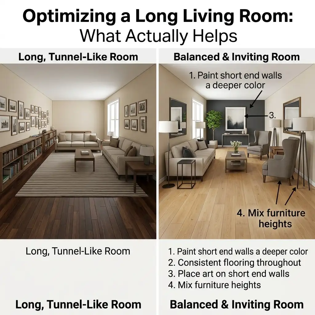
Placing art and decor on the short end walls rather than only on the long walls. Decoration on the long walls emphasizes the room’s length. Decoration on the short end walls draws the eye to the ends of the room and gives it somewhere to stop.
Furniture of varying heights rather than all low or all standard height. A mix of heights creates vertical interest that counteracts the horizontal emphasis of a long narrow room.
What does not help as much as people think:
Mirrors on the long walls. This is frequently suggested as a way to visually widen a narrow room. It can help with light but it also elongates the room by creating reflected depth in the length direction rather than the width. Use mirrors on the short end walls if you want the reflection without the elongating effect.
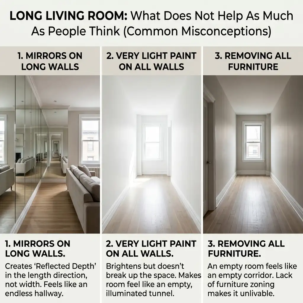
Very light paint on all walls to make the room feel larger. A long room that feels like a tunnel is not made better by making the tunnel brighter. A light color on the long walls with a contrasting color on the short end walls is more effective than overall lightness.
Removing all furniture in an attempt to make the room feel less cramped. An empty long room feels like an empty corridor. Appropriate furniture zoning makes the room feel livable. The goal is not less furniture but better-positioned furniture.
Lighting in a Long Living Room
Lighting in a long room has to work harder than in a proportionally balanced room. A single overhead fixture at the center of a long room illuminates the center adequately and leaves both ends in relative dimness — which reinforces the zone-less, runway effect.
Multiple ceiling light sources along the room’s length. Not necessarily elaborate — a ceiling light or pendant at the center of each zone you have defined creates warm pools of light that reinforce the zone division while keeping the room evenly illuminated.
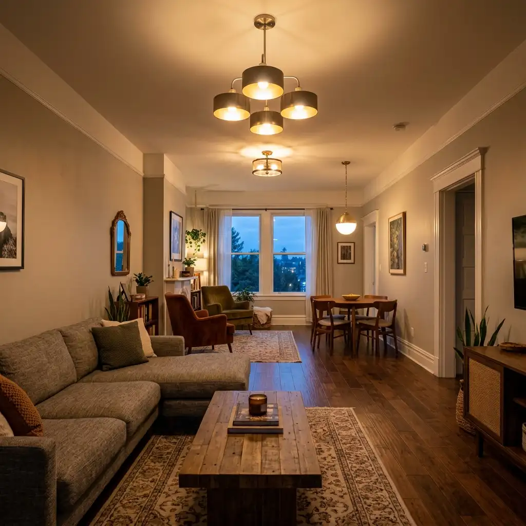
Floor lamps and table lamps at zone boundaries and in secondary seating areas. The secondary zone, the reading corner, the far end of the room — these areas need their own light sources or they will read as dark and unused regardless of how they are furnished.

Use lighting to define zones as clearly as furniture does. A floor lamp positioned at the edge of a rug grouping in a long room reinforces the zone boundary in a way that is visible in daylight and especially noticeable after dark. The pool of light says: something is happening here.

Warm light temperatures throughout. Long rooms with cool, blue-toned lighting feel institutional. The same room with warm 2700K bulbs throughout the length feels like a place you would choose to be. This is not a long-room specific point but it matters more in long rooms because the institutional feeling compounds with the tunnel effect.

Specific Situations and Their Solutions
The railroad apartment living room — long, narrow, doors at both ends, windows on the two short walls only.
This is the most challenging long room configuration because the light sources are at both ends and the room’s center is always the darkest area. The solution is to run a galley arrangement along both long walls as described above, ensure the center is clear as a traffic path, and use supplemental lighting — floor lamps along both walls — to compensate for the limited natural light in the room’s middle section. Do not fight the corridor nature of this room. Work with it by making the corridor beautiful.
The open-plan long living space — living and dining in one long room with no separation except implied spatial zones.
Create distinct zones with distinct rugs — a living area rug and a dining rug that share a color palette but are not identical. Position the dining table perpendicular to the room’s long axis if space allows, which creates a zone boundary that is immediately readable. Use a pendant light over the dining table to anchor the dining zone from above.
The Victorian terraced house living room — typically 11 to 13 feet wide, 24 to 30 feet long, bay window at the front, door to hallway at the side.
Use the bay as the reading or secondary zone and the main room body as the primary seating zone. The bay is naturally defined by its architecture — it does not need additional furniture to feel like a zone, just appropriate furniture for its purpose. The main room body is where the sofa and television live. The transition between bay and main room body is the natural zone division.
The long living room with a fireplace on one long wall — the fireplace creates a natural focal point on a wall that the standard end-wall arrangement does not accommodate.
Arrange the seating perpendicular to the fireplace wall rather than parallel to it. The sofa faces the fireplace across the room’s width. Chairs flank the sofa or float at the sides of the seating group. The arrangement uses the room’s width for the primary seating relationship and reserves the room’s length for circulation and secondary zones.
The Things I Want to Say Plainly
Long living rooms are genuinely hard. That is not a personal failing or a decorating skill deficit. The rooms are hard. The standard rules do not apply to them and the fact that most design advice pretends otherwise leaves a lot of people feeling confused about why their room still feels wrong after following the advice carefully.
The solutions that work share a common thread: they stop trying to make a long room behave like a square room and instead work with what the long room actually is.
A long room is not a failed square room. It is a space with its own logic, its own set of possibilities, and its own specific requirements. A room that is 12 x 30 feet has 360 square feet, which is a meaningful amount of living space. The challenge is not inadequate space — it is organizing that space so it supports how people actually use rooms rather than just accommodating furniture.
Zone it. Give each zone its own purpose. Give each zone its own rug. Give each zone its own light. Connect the zones through color palette and furniture material relationships so they read as one room rather than separate rooms.
Do that and the long room stops being the awkward space you are compensating for and becomes a room with more variety and more functionality than the boring square room you were comparing it to.
If you are working on the full room picture, our guide to coffee table decor ideas covers the styling of the piece that anchors most living room seating groups, and our piece on hidden storage ideas has practical solutions for the storage challenges that long living rooms — with all their wall space — are actually well positioned to solve.