
Let me tell you something that will save you a weekend of regret.
The accent wall is one of those ideas that sounds straightforward until you are standing in the paint aisle holding fourteen sample chips, your phone showing you seventeen conflicting Pinterest boards, and a sales associate asking which wall you are thinking about painting as if that question is easy.
It is not always easy. But it is not as complicated as the overthinking makes it feel either.

I have painted, wallpapered, paneled, and otherwise decorated more bedroom walls than I care to count — my own, my friends’, my sister’s apartment twice because she changed her mind about the color both times — and I have developed some genuinely firm opinions about what works, what fails quietly over time, and what fails loudly and immediately.
Here is all of it.
Which Wall? The Question Everyone Gets Wrong Half the Time
The conventional wisdom is that the accent wall goes behind the headboard. The wall your bed is against. The wall you see when you walk through the bedroom door.
The conventional wisdom is right about 70 percent of the time, which means it is wrong about 30 percent of the time, and that 30 percent matters.
Here is how to think about it properly.
The accent wall should be the wall you see most. Not the wall behind the bed. The wall you look at. In most bedrooms these are the same thing — you sleep facing the wall opposite the headboard wall, and guests entering the room see the headboard wall first. But in some bedroom configurations they are not the same, and in those cases, choose the wall you actually see rather than following the formula.
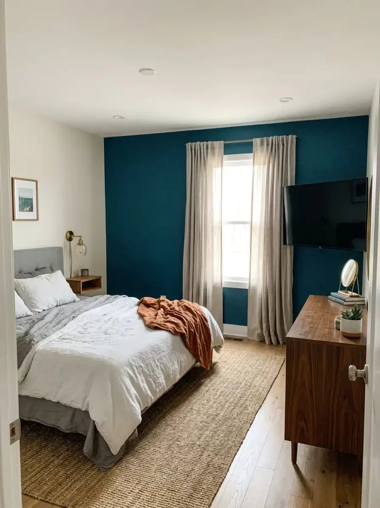
The accent wall needs to have something to anchor it. A dramatically painted or papered wall with nothing in front of it floats oddly. The headboard wall works so consistently because the bed — a substantial piece of furniture — anchors the wall and creates a focal point where the design and the furniture reinforce each other. If your chosen wall has no furniture in front of it, consider whether that is actually the right choice.

The accent wall should not fight the room’s architecture. A bedroom with a fireplace has a natural focal point already. The fireplace wall is the accent wall whether you do anything to it or not. Working with that rather than trying to create a competing focal point on a different wall produces a more coherent room.

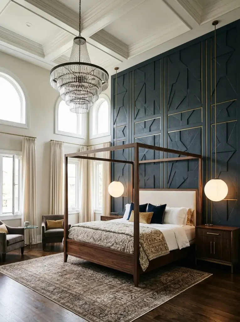
Ceiling height matters for wall choice. In a room with high ceilings, a dramatic accent wall on the headboard wall can make the room feel properly grand. In a room with low or standard ceilings, sometimes the most impactful accent placement is actually on a shorter wall — the end wall of the room, or a wall between two windows — because the proportions work better.
Paint: The Starting Point That Deserves More Credit Than It Gets
Paint is the most accessible accent wall option and also the most misused. Not because people paint bad colors — though they do, sometimes — but because people misunderstand what paint can and cannot accomplish.
Paint can change the entire temperature and feeling of a room with a single wall. It can make a ceiling feel higher or lower. It can advance a wall visually (dark colors come toward you) or recede a wall (light colors push back). It can make a bed feel like it is in a proper alcove even when there is no actual alcove.

What paint cannot do is create texture. It cannot create the kind of depth and dimension that wallpaper or paneling creates. A painted accent wall is always going to read as a flat colored surface — which can be beautiful and is absolutely the right choice for many rooms — but if you are looking for something that rewards the eye the way dimensional materials do, paint alone will not fully get you there.
The colors that work consistently well as bedroom accent walls:
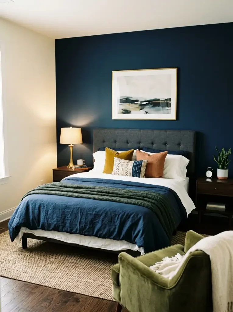
Deep saturated colors — navy, forest green, charcoal, burgundy, deep teal — have a transformative effect on the wall behind a bed. The depth of the color creates the sense of enclosure and intimacy that makes a bedroom feel genuinely restful. These are not colors for people who want a light, airy bedroom. They are for people who want a bedroom that feels like a retreat you disappear into.
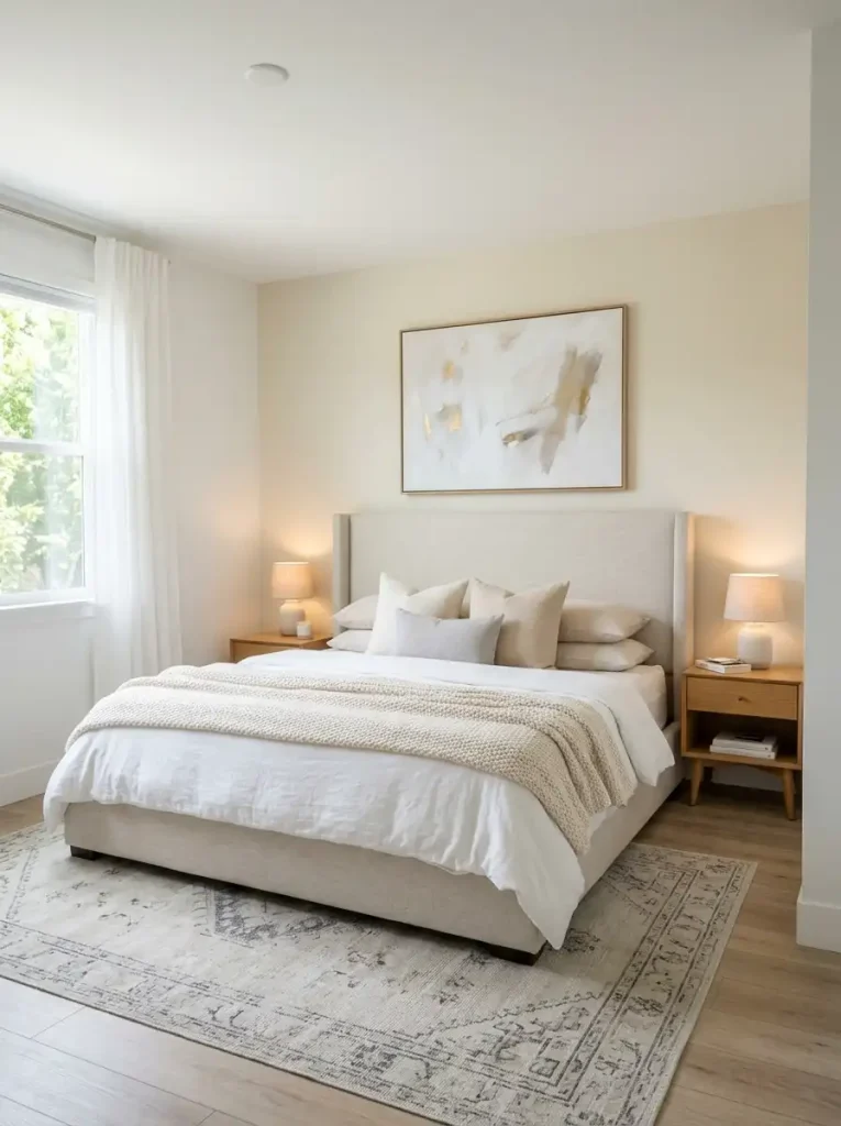
Warm whites and creams used as an accent in a room with one specifically different-toned wall — using a warmer or cooler white on the headboard wall than on the surrounding walls — create a subtle, sophisticated distinction that reads as intentional without announcing itself. This is the low-commitment accent approach and it looks better than no accent and less dramatic than a color accent.
Terracotta, warm rust, and earthy clay tones are the most currently popular accent wall colors and for good reason. They are warm enough to be inviting, earthy enough to feel grounded, and versatile enough to work against wood tones, cream bedding, and metallic accents simultaneously.
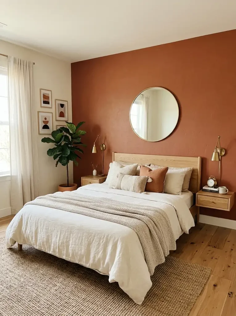
The finish matters more than most people acknowledge. Flat or matte finish for bedroom accent walls. Not eggshell, not satin. Matte absorbs light and makes the color appear deeper and richer. An eggshell or satin finish on a deep saturated wall color will pick up every imperfection in the wall surface and reflect light in ways that undermine the depth you are trying to create.
The practical tradeoff is that matte paint marks more easily than eggshell and does not wipe clean as effectively. In a bedroom where the accent wall is behind the bed and unlikely to be touched regularly, this is not a meaningful concern. In a bedroom shared with small children who might touch the wall, it is worth considering.
Wallpaper: When It Is Right and When It Is Too Much
Wallpaper on an accent wall is genuinely beautiful when chosen well. It is genuinely overwhelming when chosen without thinking through the scale of the room, the complexity of the pattern, and how the paper will read from the distance you typically view it from — which in a bedroom is usually from the bed, which is typically 8 to 12 feet from the headboard wall.
Large-scale patterns work better than people expect. The instinct when choosing wallpaper for a bedroom is to choose something subtle — a small all-over pattern, a fine texture, a barely-there design. The problem is that subtle wallpaper from across a bedroom looks like nothing. The pattern is only visible from close up, which means from the far side of the bed you are looking at what appears to be a colored wall rather than a wallpapered one.
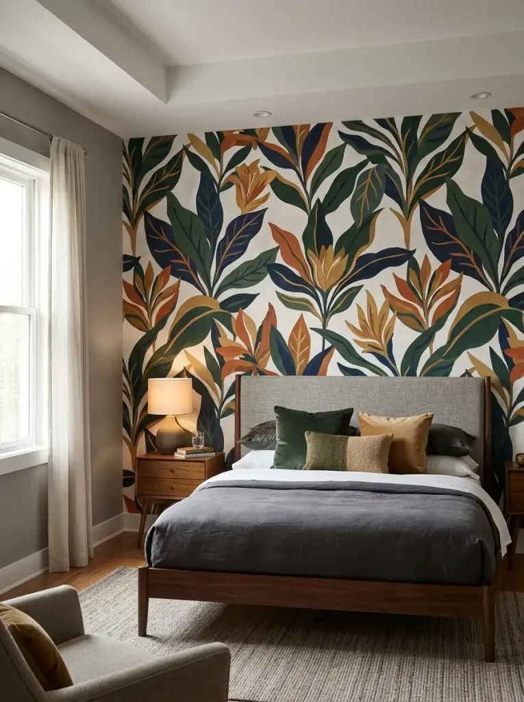
Large-scale botanical prints, oversized geometric patterns, and dramatic painterly designs read correctly from distance. They are the patterns that actually look like wallpaper from across the room rather than disappearing into texture.
The color relationship between wallpaper and the rest of the room is everything. The most common wallpaper accent wall mistake is choosing a paper with a color that has no connection to anything else in the room. An isolated statement that does not relate to the bedding, the rug, the furniture, or the remaining wall color creates a focal wall that looks like it was put in the wrong room.
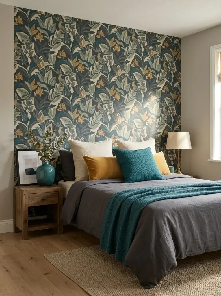
Take one color from the wallpaper and pull it into the room through a pillow, a throw, a vase, or a picture frame. The connection does not need to be literal or matching. It needs to be there.
Peel-and-stick versus traditional wallpaper: Peel-and-stick wallpaper has improved dramatically and the best products now look genuinely close to traditional wallpaper from a normal viewing distance. For a bedroom accent wall where the wallpaper will not be touched regularly or subjected to steam or moisture, peel-and-stick is a perfectly reasonable choice. The advantages — no paste, no professional installer typically required, fully removable — are significant. The disadvantages — seams that are sometimes more visible than traditional wallpaper seams, slightly reduced longevity — are real but manageable.
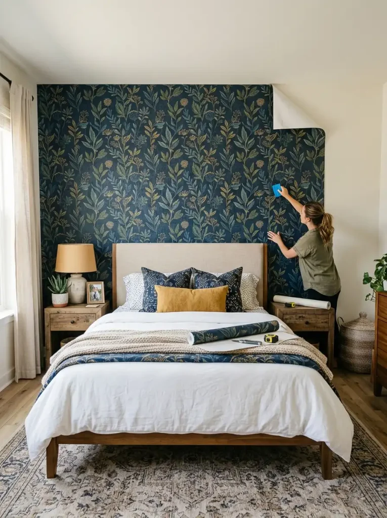
For traditional wallpaper in a bedroom, I typically recommend a professional installer for anyone who has not done it before. The preparation and hanging process for a single accent wall is not enormously complicated but the mistakes that happen when it is done incorrectly — bubbles, misaligned seams, pulling the painted wall beneath when removing — are more frustrating to fix than the cost of professional installation.

Wood Paneling: Every Style Has Its Own Version
Wood paneling has had a more dramatic rehabilitation in interior design over the past decade than almost anything else. What was coded as the most dated, most dated-looking interior choice — fake wood paneling in your parents’ basement, circa 1979 — is now one of the most sought-after bedroom design features. The difference is real wood versus fake wood, and the specific style of paneling.
Shiplap is horizontal planks with a slight gap between them that creates a shadow line. The look is most associated with farmhouse and coastal aesthetics but it translates well into contemporary spaces when painted in the right color. White shiplap behind a bed is one of the most enduringly appealing bedroom accent walls — warm without being heavy, textured without being busy, consistently beautiful in photographs and in person.
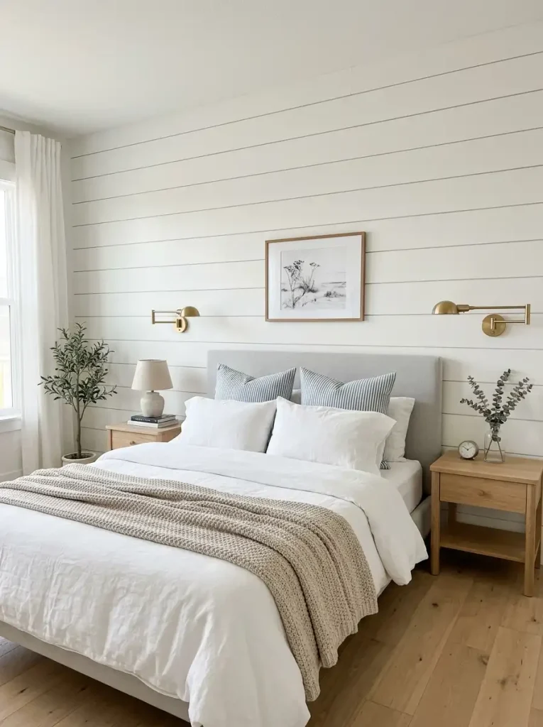
For a bedroom, shiplap in a painted finish — not natural wood — is almost always the right call. Natural wood shiplap tends to read as more casual and country than most bedroom aesthetics benefit from. Paint it in the wall color for a subtle textural effect, or in a contrasting color for a more deliberate statement.
Board and batten is vertical boards with narrower strips of wood (the battens) over the seams and at regular intervals creating a grid of raised vertical lines. It creates height and formality. In a bedroom it tends to read as more architectural and intentional than shiplap, which reads as more casual and coastal.
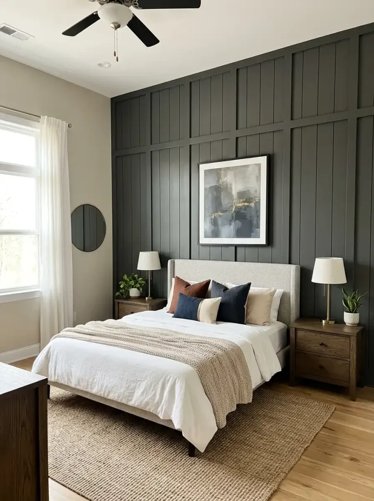
The proportions matter considerably. Board spacing that is too wide loses the impact of the texture. Too narrow looks busy. Battens placed every 16 to 24 inches tend to create the most pleasing visual rhythm for a standard bedroom wall.
Fluted paneling — panels with vertical channel grooves milled into their surface — is the most contemporary of the wood paneling options and currently one of the most popular. The texture is subtler than shiplap or board and batten but reads as unmistakably premium. Fluted panels painted in a deep color behind a bed feel genuinely luxurious.
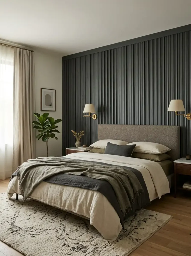
The challenge with fluted paneling is sourcing. MDF fluted panels are the most accessible and the most affordable, but MDF requires proper priming and painting before installation. Solid wood fluted panels are more expensive and more durable. Some suppliers offer PVC fluted panels that are moisture-resistant and dimensionally stable — worth considering for rooms with humidity challenges.
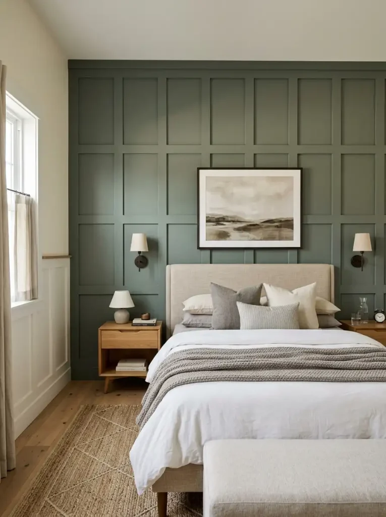
Shaker paneling — recessed flat panels framed by simple molding — is the most traditionally formal of the bedroom paneling options. Half-height Shaker wainscoting creates a dado effect that makes a bedroom feel grounded and considered. Full-height Shaker paneling on the headboard wall creates something that reads as architectural rather than decorative — as if the room was built with intention rather than decorated after the fact.
Textured Plaster and Limewash: The Most Underrated Accent Wall Option
I am going to spend some time on this because it consistently produces the most beautiful bedroom accent walls and is consistently overlooked in favor of more photogenic options.
Limewash paint — a paint made from slaked lime that creates a translucent, variegated surface with depth and movement — and textured plaster applied to the accent wall create results that no other paint or wallpaper can fully replicate. The surface appears three-dimensional. The color shifts with the light throughout the day. The walls look genuinely old in a way that suggests the house has history rather than having been recently decorated.
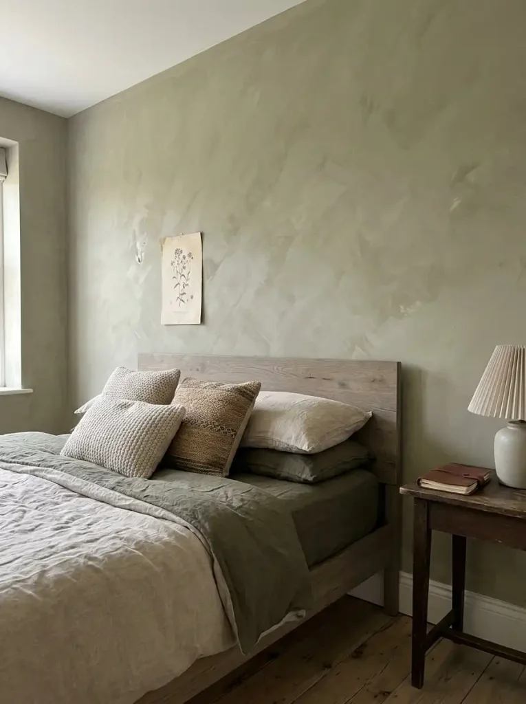
Limewash in particular has exploded in popularity recently and for good reason. Applied correctly, a limewash wall in a warm white or terracotta or muted sage looks like it belongs in a Tuscan farmhouse or a Provençal bedroom — quietly beautiful, deeply atmospheric, and completely different from anything a standard paint finish can produce.
Application is more forgiving than you think. Limewash is applied with a brush in circular strokes, building up translucent layers. The variation in the finish is part of the intended result, which means the technique is considerably more forgiving of imperfection than standard paint. You do not need to be precise. You need to be deliberate and layered.
The texture of textured plaster is more permanent. Venetian plaster and other textured wall finishes require either a professional application or genuine patience and willingness to practice. The finished result is extraordinary — a surface that appears to have depth and dimension, that catches light differently at different times of day, that genuinely cannot be mistaken for flat paint. But application mistakes are harder to correct than paint mistakes.
For a bedroom accent wall where the investment is worth making properly, textured plaster behind the bed is one of the most sophisticated choices available at any price point.
Fabric and Textile Walls: Unexpected and Genuinely Good
This is the accent wall option most people have not considered and that I think about more than is probably warranted.
Upholstered walls — fabric or leather panels attached directly to the wall — have been used in high-end interiors for centuries. The contemporary version is accessible enough for a committed DIYer and produces results that are unlike anything else: warm, quiet, texturally rich in a way that hard materials cannot replicate, and with the practical benefit of mild sound absorption.
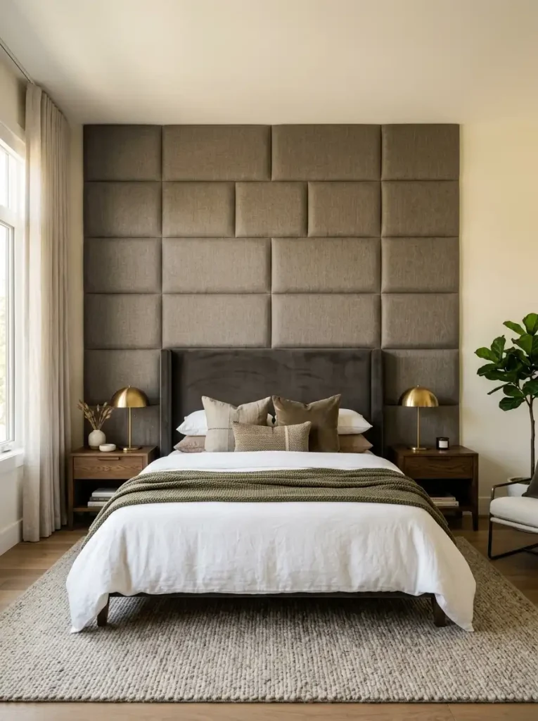
The DIY approach: Attach strips of 1-inch foam batting to the wall with adhesive. Stretch your chosen fabric over the batting and staple into the edges, which will be covered by trim. The result is an upholstered wall panel with a slight padded quality that looks genuinely bespoke.
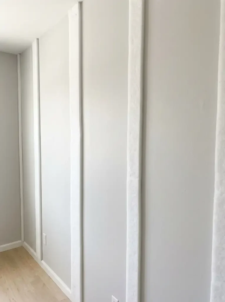
Fabric choices that work well in this application: linen in warm neutral tones, velvet in deep saturated colors, a woven textured fabric in earth tones. Avoid anything with a busy pattern that will be difficult to align across multiple panels.
Hanging fabric as a textile wall: A large piece of fabric — a vintage quilt, a length of beautiful block-printed linen, a handwoven textile acquired on a trip somewhere specific — hung from a dowel or a curtain rod and suspended from the wall behind the bed creates a textile accent that is softer and more personal than any other option. It is also entirely removable, entirely changeable, and costs only the price of the textile and the hanging hardware.
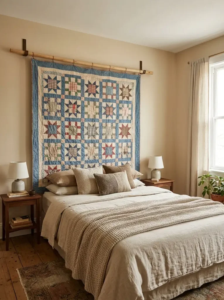
This approach suits bedrooms with a more casual, gathered aesthetic rather than a formal designed one. It does not photograph with the same clean edges as paneling or wallpaper, but in person it creates a warmth that those materials do not always match.
The Arch: One of the Best Things Happening in Bedroom Design Right Now
If you have spent any time on design-focused social media in the last three years you have seen the painted arch on a bedroom wall. A large half-circle or full arch painted in a contrasting color or finish on the wall behind the bed, sized to frame the headboard and pillows.
It works for reasons that are worth understanding rather than just copying.
The arch creates an implied architectural feature — a sense that the bed is in an alcove or a niche — without any actual construction. The curved shape in a room full of right angles creates visual interest and softness simultaneously. The scale, when done correctly, makes the bed feel definitively positioned and the room feel more designed than it was before.
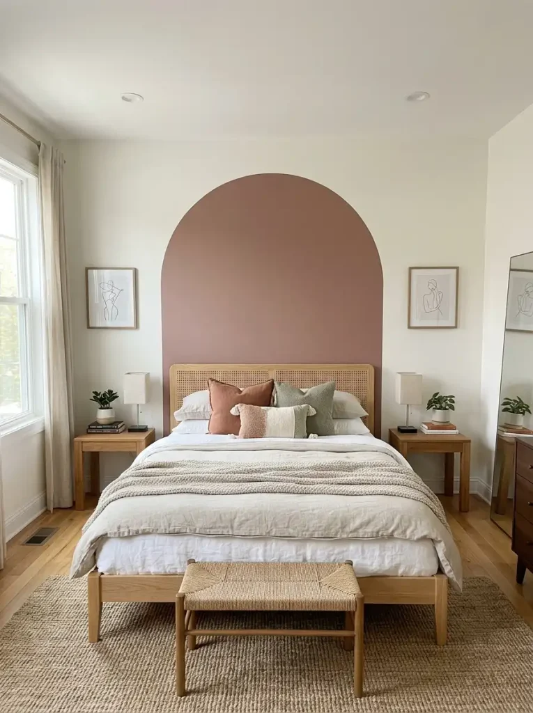
Getting the arch proportions right matters enormously. Too small and it looks like a paint accident. Too large and it overwhelms the wall and loses the sense of framing. A general guide: the arch should be centered on the wall, extend from approximately mattress height on each side, and reach as high as approximately two-thirds of the wall height. But proportion your specific room’s wall and ceiling height rather than following any rule too literally.

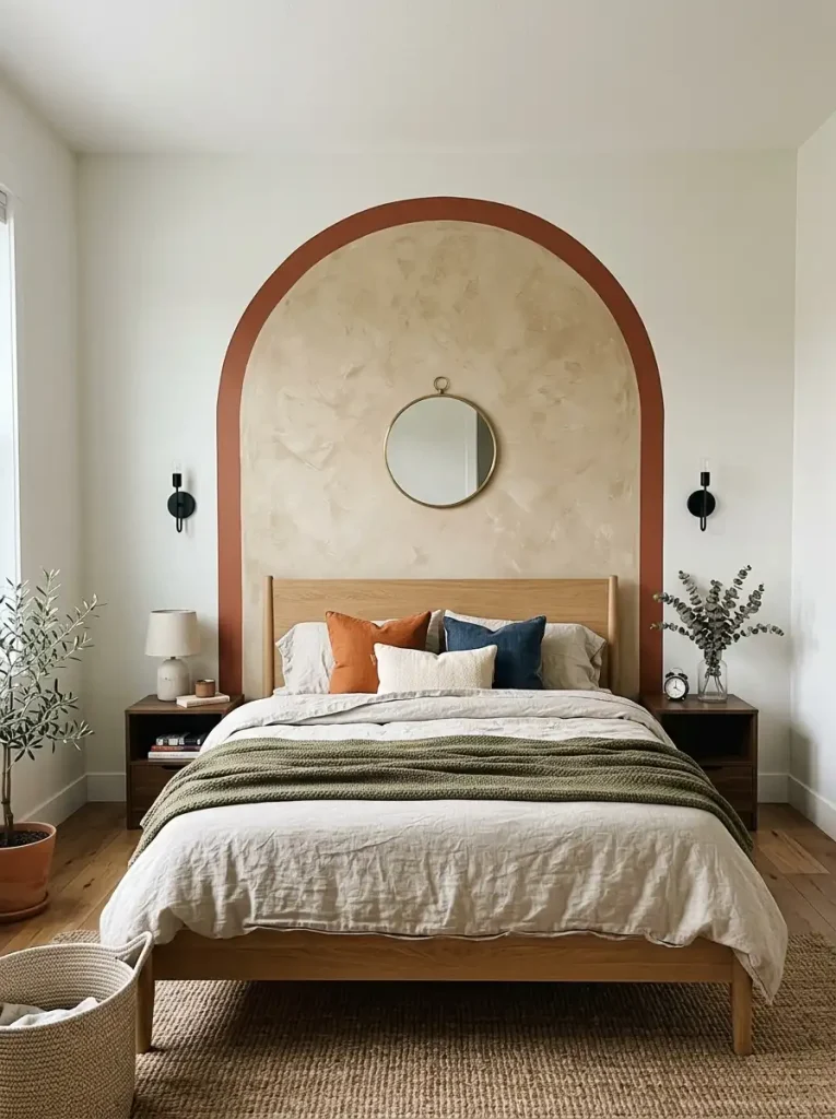
The color relationship with the rest of the room: The arch can be painted in a color that appears nowhere else in the room if it is dramatic enough to carry that isolation — a deep terracotta arch on a white wall, for example. Or it can be in a color that echoes something in the room. What it should not be is a color that is too similar to the wall color to read as distinct — a medium warm beige arch on a light warm beige wall is just a slightly different beige shape, which is not the intended effect.
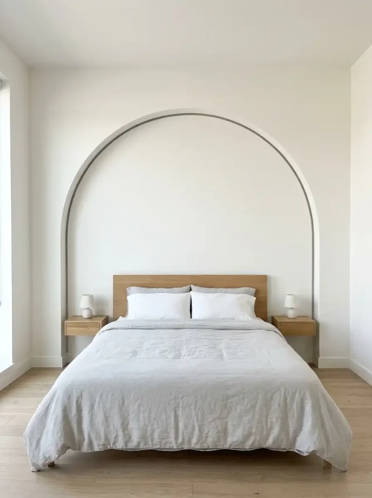
Texture within the arch: One of the most beautiful variations I have seen uses a textured finish — limewash or a contrasting texture application — within the arch while leaving the surrounding wall in standard flat paint. The arch becomes both a color and a material statement simultaneously.
Mirrors as an Accent Wall Approach
An arrangement of mirrors on the headboard wall — a single large mirror, a collection of different-sized mirrors in complementary frames, or a full wall of mirror panels — creates an accent that is functionally different from any other option: it makes the room appear larger and doubles the natural light in the space.

This approach is particularly valuable in small bedrooms where a dark painted or heavily papered accent wall would make the space feel enclosed. A mirrored headboard wall keeps the room feeling open while still creating a focal point.
A single large leaning mirror resting against the headboard wall beside the bed creates a more casual version of the same effect without permanent installation. This is especially useful in rental bedrooms or for anyone who wants the mirror effect without committing to wall-mounting.
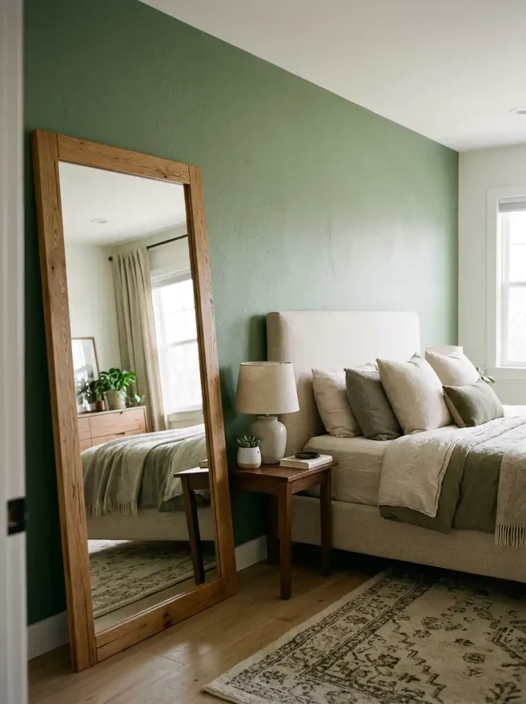
An arrangement of smaller mirrors in different shapes and frames creates something closer to a gallery wall but with the added dimension of reflection. Round mirrors mixed with arched and rectangular mirrors in complementary frames — all in one finish, or all in varied warm finishes — creates a focal wall that is genuinely distinctive.

The maintenance reality of a mirror accent wall: mirrors in a bedroom collect dust and fingerprints and need regular cleaning to look good. A mirrored accent wall in a high-use bedroom shared with children needs to be considered with this in mind.
Gallery Wall as Accent: What Makes It Work
The bedroom gallery wall is different from the living room gallery wall in a few specific ways that matter.
Bedroom gallery walls work best when they are personal in content rather than decorative. The living room gallery wall can be curated art. The bedroom gallery wall should feel like yours — photographs of people and places and things that matter to you specifically, mixed with a few art pieces that speak to your actual taste rather than a cohesive aesthetic.

The frame relationship: In a bedroom, I am more relaxed about frame consistency than in a public-facing room. A bedroom gallery wall can mix black frames with natural wood and a few aged gold frames more successfully than a living room gallery wall can. The intimate context of the bedroom allows for more personal, less designed decisions.
The scale of the arrangement: A bedroom gallery wall should be large enough to fill the headboard wall with some confidence, not a small cluster of frames floating in the center of a wide wall. Extend the arrangement to at least 60 to 70 percent of the wall width. If the wall is wide and the bed is narrow, fill the wall edge to edge.
What to include beyond photographs and art: Mirrors within the gallery (one or two, not all), a small shelf with an object on it, a piece of fabric or textile art, a woven element — these break the gallery wall from the predictable flat-things-in-frames convention and create something with real dimension and texture.
The Colors I Keep Coming Back To
In the interest of being genuinely useful rather than comprehensively neutral, here are the specific accent wall directions I believe in most.
Deep olive green. Not sage. Not bright kelly green. The deep, grey-toned, slightly muddy olive that appears to change color throughout the day — golden in morning light, almost bronze in afternoon, deeply rich by lamplight. Behind a bed with cream linen bedding and warm wood furniture, it is extraordinary.
Warm charcoal. Not black, not cool grey. A charcoal with enough warmth in it to feel rich rather than cold. Warm charcoal behind a bed makes everything in front of it look better — white bedding looks crisper, wood tones look warmer, brass accents look more golden.
Aged terracotta. The popular version is right to be popular. A terracotta wall that looks like it has been on the wall for a long time rather than freshly painted — slightly dusty, slightly varied in tone, slightly limewashed rather than perfectly flat — creates a bedroom that feels like it exists somewhere beautiful.
Deep navy. The most classic of these choices. Deep navy behind a bed with white bedding is the bedroom equivalent of a dark suit with a white shirt — it just works, and it keeps working, and it does not look dated in the way that more trend-dependent choices sometimes do.
What Not to Do
I promised opinions and this is where I will be direct.
Do not paint an accent wall in a color that has no relationship to the rest of the room. I have walked into bedrooms where the headboard wall is a vivid teal and every other decision in the room — the bedding, the curtains, the rug — is warm and beige and brown. The teal wall looks like a mistake rather than a design decision. The accent wall needs to connect to something.
Do not use a busy small-scale pattern on a wallpaper accent wall in a small room. Small rooms with small-pattern wallpaper look like the wallpaper is trying to escape. A small room benefits from a large-scale pattern that has room to breathe, or from a solid or textural treatment that does not compete with the already-limited space.
Do not install fake wood paneling in the original cheap-paneling sense. The specific product — thin composite sheets with a printed wood grain — that was popular in basements decades ago is not what current wood paneling trends are referring to. Real wood planks, MDF shiplap, real or quality MDF board-and-batten — these are what work. The cheap printed composite sheets are still not it.
Do not put the accent wall on a wall that has a window on it. A window interrupts the continuity of the accent wall and the resulting visual — a painted or papered area divided by a window — usually looks fragmented rather than intentional. There are exceptions when the window is centered and symmetrical and the design accounts for it. But in general, accent walls work best on uninterrupted walls.
The Practical Checklist Before You Start
Before any paint is opened, any wallpaper is ordered, or any wood is purchased:
Measure the wall. Write it down. Width, height, and note any outlets, switches, or other interruptions that will affect how wallpaper is placed or how paneling is cut.
Order or buy more than you think you need. For wallpaper, add 15 to 20 percent to the calculated quantity for pattern matching and mistakes. For peel-and-stick wallpaper, add 10 percent. For paint, a quart typically covers a standard bedroom accent wall with two coats — buy a quart plus a small additional amount.
Prepare the wall properly. Fill any holes or cracks. Sand any rough areas. Prime if you are going from a dark color to a light one, from an unfinished surface, or if the current wall is stained. The time spent on preparation is directly reflected in how good the finished wall looks.
Test paint colors in the actual room. Not at the paint store, not from a chip, not from your phone screen. Paint a 12 by 12 inch sample on the actual wall and look at it at different times of day and under the artificial lighting you actually use in the room. A color that looks perfect in the store can look completely different on your specific wall under your specific light.
Accept that you might change your mind once it is on the wall. This is not a failure. This is useful information. Paint over it. Try something else. The worst that happens is you spend a weekend on something that did not work, and that is genuinely fine.
For more ideas on making a bedroom feel genuinely designed, our piece on how to design a Victorian bedroom covers one of the most dramatically beautiful bedroom aesthetics available, and our guide on French country decor ideas gets into the color and material relationships that work specifically well in sleeping spaces.